News: Sign up for "The Monthly Mean," the newsletter that dares to call itself average, www.pmean.com/news.
| P.Mean: Animations in R (created 2012-12-08).
News: Sign up for "The Monthly Mean," the newsletter that dares to call itself average, www.pmean.com/news. |
|
About twenty years ago, computers got fast enough to provide smooth animations of small and moderate sized data sets. There was a lot of effort to incorporate animation, such as 3D rotation of point clouds into statistical software programs. The results looked stunning, but I'm not sure if it led to many great insights. I experimented with programs like JMP, but never really felt too comfortable with them. So, I gave up on animation for the most part. But there is one area where animation makes sense and that is in teaching.
The best example of animation that I've seen on the web is a little Java applet written by Gary McClelland that can illustrate the dangers of dichotomizing a continuous independent variable.
-->
http://psych.colorado.edu/~mcclella/MedianSplit/
It's not really an animation, but I thought I'd show it because it is so cool.
You could do this as two images, but you don't get the sense of how the two data sets are related. The genius in this animation is showing the gradual degradation of the data by squeezing the data on either side of the median until it becomes equivalent to a median split.
I've done a couple of animations, myself, for teaching purposes. The first is an illustration of the Metropolis algorithm.
--> http://www.pmean.com/07/MetropolisAlgorithm.html
The second is an illustration of hard thresholding and soft thresholding for a talk I gave on an alternative to stepwise regression called the LASSO. The page for that talk isn't quite ready for general distribution, so here are the images reproduced below.
Hard thresholding. In many de-noising applications, you decompose a signal into individual components and then zero out the small components and keep the large components. Then you reverse the process. The idea is that the small components are noise and the large components are signals. Exactly how many components do you zero out? There are several approaches that work well. Here's an illustration of the zeroing out process going from an extreme of keeping every component to an extreme of zeroing out almost everything.

The horizontal axis represents the original components and the vertical axis represents the modified data with some of the values zeroed out. The numbers represent the rank of the absolute value, so a 1 represents the data point closest to zero and a 20 represents the point farthest from zero.
Notice the sharp and sudden transition. A data value on the vertical axis is at its normal spot and then all of a sudden it jumps straight to zero. This is called hard thresholding because of the hard and sudden transition.
Soft thresholding. An alternative, called soft thresholding, takes a similar approach, but removes the discontinuity of the hard threshold. This effectively shrinks all the components. Large components are shrunken only slightly towards zero, medium sized components are shrunken more, and small components are shrunken all the way to zero.

Notice that there are no sudden jumps. There's a lot to think about with these two animations. Stepwise regression is somewhat like hard thresholding. A variable is either totally in, or it is zeroed out. There's nothing in between. This discontinuity means that small changes to your data can lead to large changes in the model selected by stepwise regression. The LASSO is comparable to soft thresholding. Some coefficients are zeroed out, some are shrunken much of the way to zero, and some are only shrunken a little bit.
Finally, among my more trivial applications, I animated some of the runs that I do. I have a GPS app for my iPhone that I turn on during my runs. It tracks where I go using the internal GPS of the iPhone. By noting how far I've gone and how much time has elapsed, it can tell me my pace. Afterwards, you can download the data and plot it on Google maps. I did a sequence of these, showing where I was on various runs at ten second intervals.
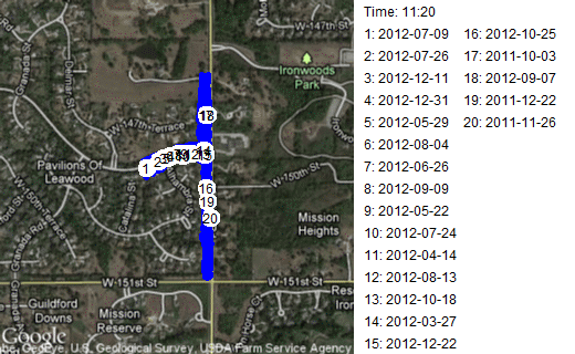
This is a route where I head out from my normal starting point, on 148th Street to Mission road. Then I run along the flat portion of Mission Road stopping before a big hill near 151 Street and before another big hill near the entrance to Ironwoods Park. Notice that about half the time I turn north on Mission Road first and the other half of the time I turn south. It's a short route, about 1.8 kilometers (1.1 miles) that I choose when I'm too tired to run any hills, or when I want to work on speed. This leads to a large disparity in times. My best time, 11 minutes, corresponds to a ten minute mile. My slowest time, 16 minutes, corresponds to about a fifteen minute mile. Some people walk at a faster pace!
I had a bit of fun by mapping the 85 runs that started and ended at my usual starting point.
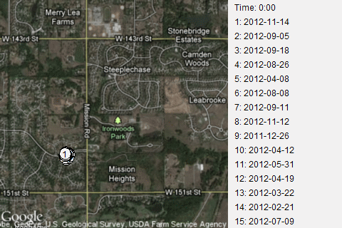
Notice the poor dot #80. It's all the fault of Cinnamon, the dog I take with me with most of my runs. I normally do a warm-up jog along 148th Street. I stop at a certain point near the swimming poor of the Pavilions subdivision.
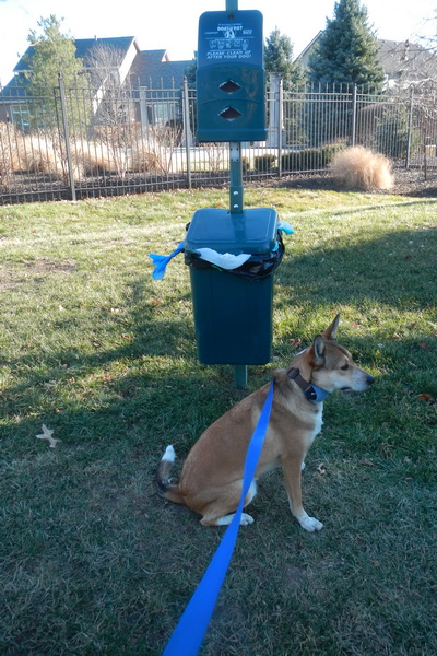
Cinnamon is posing where I start my runs. This is a good place to start because it allows Cinnamon to get one more poop done before I start my serious run and it allows me to dump off any full poop bags that I've accumulated during the run.
Cinnamon and I have different views about running. She thinks it's an opportunity to poop in new and unusual places. I think she needs to poop during my warmup jog or during the cool down after my run, but not during the run. Most of the time she complies with my wishes and does her duty either before or after my runs. When she does poop during the run, it doesn't slow me down too much, but my leg muscles complain about the sudden stop and are reluctant to start up again after she is done and I've scooped up her mess.
On run #30, I had forgotten that I was carrying a full poop bag. I noticed at the turn onto Mission Road. Oops! I forgot that to dump the bag before the start of the run. I had to choose between doubling back or continuing the rest of the run with a full poop back swinging wildly on my leash hand. It was an obvious choice. It slowed me down by a couple of minutes, but that's okay.
Now, how do you do these animations in R? There are several ways, but the easiest way to get started is to download the animation package. This package allows you to do animations on the screen. The example they give is somewhat silly, just a bunch of normal random variables.
### 1. How to setup a simple animation ###
## set some options first
oopt = ani.options(interval = 0.2, nmax = 10)
## use a loop to create images one by one
for (i in 1:ani.options("nmax")) {
plot(rnorm(30))
ani.pause()
## pause for a while ('interval')
}
## restore the options ani.options(oopt)
But it's pretty easy to adapt this to something more useful. Change the plot to a normal probability plot, and you'll get a feel for how much this plot can wiggle and still be indicative of a normal distribution.
### 1. How to setup a simple animation ###
## set some options first
oopt = ani.options(interval = 0.2, nmax = 10)
## use a loop to create images one by one
for (i in 1:ani.options("nmax")) {
qqnorm(rnorm(30),axes=FALSE)
ani.pause()
## pause for a while ('interval')
}
## restore the options ani.options(oopt)
There's a nice example of how you can capture a series of plots as additional data is drawn using points (or segments, polygons, text, or lines).
n = 20

x = sort(rnorm(n))

y = rnorm(n)

## set up an empty frame, then add points one by one

par(bg = "white")

# ensure the background color is white

plot(x, y, type = "n")

ani.record(reset = TRUE)

# clear history before recording

for (i in 1:n) {

  points(x[i], y[i], pch = 19, cex = 2)

  ani.record()

# record the current frame

}

## now we can replay it, with an appropriate pause between frames

oopts = ani.options(interval = 0.5)

ani.replay()
The animation package allows you to create Flash files or animated GIF files, MPEG files, and others, but you have to download some open source packages (ImageMagick, GraphicsMagick, or FFmpeg). I have found better results using a commercial package, Ulead GIF Animator, because it produces much smaller files, but it is less automated than the other approaches.
![]() This page was written by
Steve Simon and is licensed under the
Creative
Commons Attribution 3.0 United States License. Need more
information? I have a page with general help
resources. You can also browse for pages similar to this one at R Software.
This page was written by
Steve Simon and is licensed under the
Creative
Commons Attribution 3.0 United States License. Need more
information? I have a page with general help
resources. You can also browse for pages similar to this one at R Software.