[Previous issue] [Next issue]
Monthly Mean newsletter, July/August 2009
The monthly mean for July/August is 16. Please note that no other mean
across two consecutive months, except December/January, is as large. I
had believed the story that Caesar Augustus had swiped a day from February and
added it to August so "his" month would not be shorter than Julius Caesar's
month (July). Unfortunately, like most good stories, this one is false. See
en.wikipedia.org/wiki/Julian_calendar#Debunked_theory_on_month_lengths.
Welcome to the Monthly Mean newsletter for July/August 2009. This newsletter was sent out on September 11, 2009.
If you are having
trouble reading this newsletter in your email system, please go to
www.pmean.com/news/2009-08.html. If you are not yet subscribed to this
newsletter, you can sign on at
www.pmean.com/news. If you no longer wish to receive this newsletter, there is a link to unsubscribe at the bottom
of this email. Here's a list of topics.
Lead article: You, too, can understand Bayesian data analysis
2. Risk adjustment using reweighting
3. The second deadly sin of researchers: sloth
4. Monthly Mean Article (peer reviewed): Comparison of Registered and Published
Primary Outcomes in Randomized Controlled Trials.
5. Monthly Mean Article (popular press): For Today's Graduate,
Just One Word: Statistics
6. Monthly Mean Book: Understanding Variation
7. Monthly Mean Definition: Weighted mean
8. Monthly Mean Quote: Wall Street indexes predicted ...
9. Monthly Mean Website: Spreadsheet Addiction
10. Nick News: Nicholas the fishmonger
11. Very bad joke: A statistician is someone who enjoys working
with numbers, but...
12. Tell me what you think.
13. Free statistics webinar: Wednesday, October 14, 2009, 10am-noon CDT.
1. Lead article: You, too, can understand Bayesian data
analysis
Bayesian data analysis seems hard, and it is. Even for me, I struggle with
understanding Bayesian data analysis. In fairness, I must admit that much of my
discomfort is just lack of experience with Bayesian methods. In fact, I've found
that in some ways, Bayesian data analysis is simpler than classical data
analysis. You, too, can understand Bayesian data analysis, even if you'll never
be an expert at it. There's a wonderful example of Bayesian data analysis at work
that is simple and fun. It's taken directly from an article by Jim Albert in the Journal of
Statistics Education (1995, vol. 3 no. 3) which is available on the web at
www.amstat.org/publications/jse/v3n3/albert.html.
I want to use his second example, involving a comparison of ECMO to
conventional therapy in the treatment of babies with severe respiratory failure.
In this study, 28 of 29 babies assigned to ECMO survived and 6 of 10 babies
assigned to conventional therapy survived. Refer to the Albert article for the
source of the original data. Before I show how Jim Albert tackled a Bayesian
analysis of this data, let me review the general paradigm of Bayesian data
analysis.
Wikipedia gives a nice general introduction to the concept of Bayesian data
analysis with the following formula:
P (H|E) = P(E|H) P(H) / P(E)
where H represents a particular hypothesis, and E represents evidence (data).
P, of course, stands for probability. I don't like to present a lot of formulas
in this newsletter, but this one is not too complicated. If you follow this
formula carefully, you will see there are four steps in a typical Bayesian
analysis.
The first step is to specify P(H), which is called the prior probability.
Specifying the prior probability is probably the one aspect of Bayesian data
analysis that causes the most controversy. The prior probability represents the
degree of belief that you have in a particular hypothesis prior to collection of
your data. The prior distribution can incorporate data from previous related
studies or it can incorporate subjective impressions of the researcher. What!?!
you're saying right now. Aren't statistics supposed to remove the need for
subjective opinions? There is a lot that can be written about this, but I would
just like to note a few things.
First, it is impossible to totally remove subjective opinion from a data
analysis. You can't do research without adopting some informal rules. These
rules may be reasonable, they may be supported to some extent by empirical data,
but they are still applied in a largely subjective fashion. Here are some of the
subjective beliefs that I use in my work:
- you should always prefer a simple model to a complex model if both predict
the data with the same level of precision.
- you should be cautious about any subgroup finding that was not
pre-specified in the research protocol.
- if you can find a plausible biological mechanism, that adds credibility to
your results.
Advocates of Bayesian data analysis will point out that use of prior
distributions will force you to explicit some of the subjective opinions that
you bring with you to the data analysis.
Second, the use of a range of prior distributions can help resolve
controversies involving conflicting beliefs. For example, an important research
question is whether a research finding should "close the book" to further
research. If data indicates a negative result, and this result is negative
even using an optimistic prior probability, then all researchers, even those
with the most optimistic hopes for the therapy, should move on. Similarly, if
the data indicates a positive result, and this result is positive even using a
pessimistic prior probability, then it's time for everyone to adopt the new
therapy. Now, you shouldn't let the research agenda be held hostage by extremely
optimistic or pessimistic priors, but if any reasonable prior indicates the same
final result, then any reasonable person should close the book on this research
area.
Third, while Bayesian data analysis allows you to incorporate subjective
opinions into your prior probability, it does not require you to incorporate
subjectivity. Many Bayesian data analyses use what it called a diffuse or
non-informative prior distribution. This is a prior distribution that is neither
optimistic nor pessimistic, but spreads the probability more or less evenly
across all hypotheses.
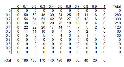
Here's a simple example of a diffuse prior that Dr. Albert used for the ECMO
versus conventional therapy example. Let's assume that the true survival rate
could be either 0, 10%, 20%, ..., 100% in the ECMO group and similarly for the
conventional therapy group. This is not an optimal assumption, but it isn't
terrible either, and it allows us to see some of the calculations in action.
With 11 probabilities for ECMO and 11 probabilities for conventional therapy, we
have 121 possible combinations. How should we arrange those probabilities? One
possibility is to assign half of the total probability to combinations where the
probabilities are the same for ECMO and conventional therapy and the remaining
half to combinations where the probabilities are different. Split each of these
probabilities evenly over all the combinations.
If you split 0.50 among the eleven combinations where the two survival rates
are equal, you get 0.04545. Splitting 0.50 among the 110 combinations where the
two survival rates are unequal, you get 0.004545.
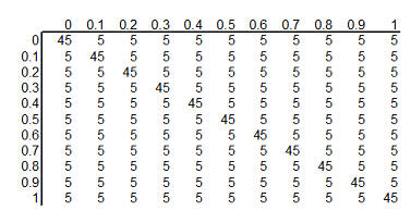
You can arrange these prior probabilities into a rectangular grid where the
columns represent a specific survival rate with ECMO and the rows represent a
specific survival rate with conventional therapy. To simplify the display, we
multiplied each probability by 1000 and rounded the result. So we have 121
hypotheses, ranging from ECMO and conventional therapy both having 0% survival
rates to ECMO having 100% survival and conventional therapy having 0% survival
rates to ECMO having 0% and conventional therapy having 100% survival rates to
both therapies having 100% surivival rates. Each hypothesis has a probability
assigned to it. The probability for ECMO 90% and conventional therapy 60% has a
probability of roughly 5 in a thousand and the probability for ECMO 80% and
conventional therapy 80% has a probability of roughly 45 in a thousand.
The second step in a Bayesian data analysis is to calculate P(E | H), the
probability of the observed data under each hypothesis. If the ECMO survival
rate is 90% and the conventional therapy survival rate is 60%, then the
probability of observed 28 out of 29 survivors in the ECMO group is 152 out of
one thousand, the probability of observing 6 out of 10 survivors in the
conventional therapy group is 251 out of one thousand. The product of those two
probabilities is 38,152 out of one million which we can round to 38 out of one
thousand. If you've forgotten how to calculate probabilities like this, that's
okay. It involves the binomial distribution, and there are functions in many
programs that will produce this calculation for you. In Microsoft Excel, for
example, you can use the following formula.
- binomdist(28,29,0.9,FALSE)*binomdist(6,10,0.6,FALSE)
The calculation under different hypotheses will lead to different
probabilities. If both ECMO and conventional therapy have a survival probability
of 0.8, Then the probability of 28 out of 29 for ECMO is 11 out of one thousand,
the probability of 6 out of 10 for conventional therapy is 88 out of one
thousand. The product of these two probabilities is 968 out of one million,
which we round to 1 out of one thousand.
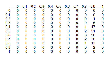
The table above shows the binomial probabilities under each of the 121
different hypotheses. Many of the probabilities are much smaller than one
out of one thousand. The likelihood of seeing 28 survivals out of 29 babies in
the ECMO survivals is very small when the hypothesized survival rate is 10%,
30%, or even 50%. Very small probabilities are represented by zeros.
Now multiply the prior probability of each hypothesis by the likelihood of
the data under each hypothesis. For ECMO=0.9, conventional therapy=0.6, this
product is 5 out of a thousand times 38 out of a thousand, which equals 190 out
of a million (actually it is 173 out of a million when you don't round the data
so much). For ECMO=conventional=0.8, the product is 45 out of a thousand times 1
out of a thousand, or 45 out of a million.

This table shows the product of the prior probabilities and the likelihoods.
We're almost done, but there is one catch. These numbers do not add up to 1
(they add up to 794 out of a million), so
we need to rescale them. We divide by P(E) which is defined in the wikipedia
article as
P(E) = P(E|H1) P(H1) + P(E|H2) P(H2) + ...
In the example shown here, this calculation is pretty easy: add up the 121
cells to get 794 out of a million and then divide each cell by that sum. For more complex setting, this
calculation requires some calculus, which should put some fear and dread into
most of you. It turns out that even experts in Calculus will find it
impossible to get an answer for some data analysis settings, so often Bayesian
data analysis requires computer simulations at this point.
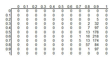
Here's the table after standardizing all the terms so they add up to 1.
This table is the posterior
probabilities, P(H | E). You can combine and manipulate these posterior
probabilities far more easily than classical statistics would allow. For example, how likely are we to believe the hypothesis that ECMO
and conventional therapy have the same survival rates? Just add the cells along
the diagonal (0+0+...+5+57+97+0) to get 159 out of a thousand. Prior to
collecting the data, we placed the probability that the two rates were equal at 500 out of a thousand, so the
data has greatly (but not completely) dissuaded us from this belief. You can
calculate the probability that ECMO is exactly 10% better than conventional
therapy (0+0+...+1+13+84+0 = 98 out of a thousand), that ECMO is exactly 20%
better (0+0+...+13+218+0 = 231 out of a thousand), exactly 30% better
(0+0+...+7+178+0 = 185 out of a thousand), and so forth.
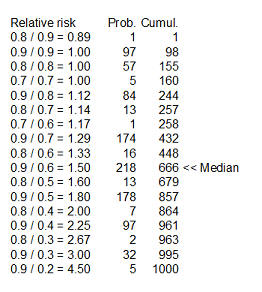
Here's something fun that Dr. Albert didn't show. You could take each of the
cells in the table, compute a ratio of survival rates and then calculate the
median of these ratios as 1.5 (see above for details). You might argue that 1.33
is a "better" median because 448 is closer to 500 than 666, and I wouldn't argue
too much with you about that choice.
Dr. Albert goes on to show an informative prior distribution. There is a fair
amount of data to indicate that the survival rate for the conventional therapy
is somewhere between 10% and 30%, but little or no data about the survival rates
under ECMO.
The table above shows this informative prior distribution. Recall that the
rows represent survival rates under conventional therapy. This prior
distribution restricts the probabilities for survival rates in the conventional
therapy to less than 70%. There is no such absolute restriction for ECMO, though
the probabilities for survival rates of 70% and higher are fairly small.
In future newsletters, I'd like to show other simple examples of Bayesian
data analysis.
2. Risk adjustment using reweighting
In the May/June newsletter, I introduced a dataset on average salaries at
colleges/universities in each of the 50 states plus the District of Columbia.
Each state had a different mix of Division I, IIA, and IIB colleges/universities
and this could potentially distort the statewide average. I then showed how
covariate adjustment could be used to produce estimates that removed this effect
from the calculation.
This month, I'd like to show a different approach, reweighting, that can
adjust for the variations in proportions of I, IIA, and IIB in a particular
state. West Virginia is an interesting state because it has one of the lowest
average faculty salaries, averaged across all of its colleges/universities, but
it also has a disproportionate share of Division IIB colleges. The average
salary is $45 thousand among the Division I schools which represent 6% of the WV
schools. The average salary is $40 thousand among the Division IIA schools,
which also represents 6% of the total. The remainder of the schools (88%) are
Division IIB schools with a much lower average salary ($34 thousand).
You can compute the overall salary for WV by multiplying the individual
averages by their respective proportions. The overall average salary in WV is
$35.1 which is computed as 0.06*45 + 0.06*40 + 0.88*34.
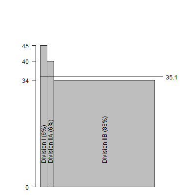
The graph shown above demonstrates how the large number of IIB schools drags
down the overall average.
What would happen if you could transform WV to a state that had the same
proportion of I, IIA, and IIB schools as the overall proportions in the United
States (16%, 32%, and 53%, respectively). The calculation using different
weights would be 0.16*45 + 0.32*40 + 0.53*34 which equals $38 thousand. This
adjusted estimate shows that almost $3 thousand in the relatively low WV overall
average can be accounted for by the disproportionately large number of IIB
schools in the state.
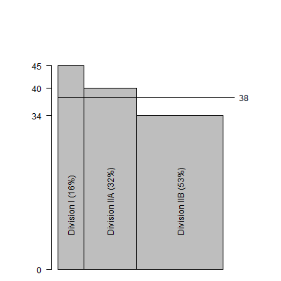
The graph shown above demonstrates how the higher adjusted average would be
computed by shrinking the IIB bar and expanding the I and IIA bars to reflect
proportions observed across the entire US.
The salaries observed in the District of Columbia exhibit a different
problem. In DC, the average salary across all Division I schools is $57
thousand. These schools account for a disproportionately large proportion of DC
schools (56% versus 16%). The average salaries across all Division IIA and IIB
schools are $50 thousand and $33 thousand respectively, and the proportions of
these schools (22% and 22%) are both below the nationwide proportions. If you
computed a simple average across all the schools is would be 0.56*57 + 0.22*50
+0.22*33.
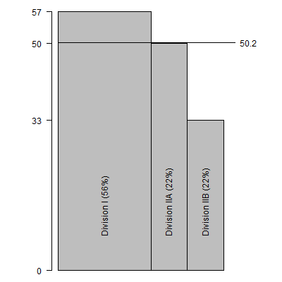
The above graph shows this calculation, which produces an overall average of
$50.2 thousand, an average higher than most states. But how much of this
is because of the relatively large proportion of Division I schools?
If you change the weights and recalculate the average would be 0.16*57 +
0.32*50 + 0.53*33.
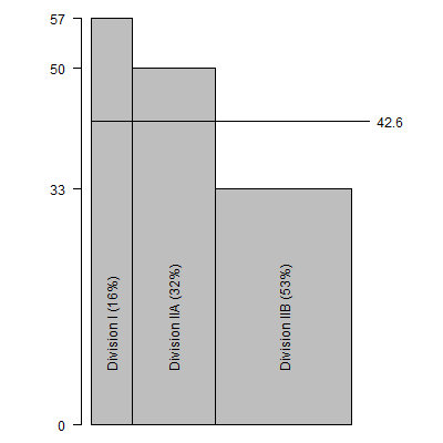
This figure illustrates the recalculation with a much narrower bar for
Division I and wider bars for Division IIA and IIB. The adjusted estimate is
$42.6 thousand. Thus $7.6 thousand dollars of the average DC salary is accounted
for by the disproportionately large number of Division I schools.
There are still other approaches to risk adjustment, such as the case mix
index and propensity scores, that I will discuss in future newsletters. This
work was part of a project I am helping with: the adjustment of outcome measures
in the National Database of Nursing Quality Indicators. The work described in
this article was supported in part through a grant of the American Nursing
Association.
3. The second deadly sin of researchers: sloth
In the last newsletter, I mentioned the first deadly sin of researchers,
pride. Researchers are too proud to use an existing survey/scale and want to
develop one of their own. They know things better than anyone else.
Unfortunately, the proliferation of surveys/scales leads to a fragmented body of
research.
The second deadly sin of researchers is sloth. Researchers often take the
easy way out. Again, the evidence for this comes from a large scale review by Ben Thornley and Clive Adams of research on schizophrenia. You can find the full
text of this article on the web at
bmj.com/cgi/content/full/317/7167/1181.
Thornley and Adams noted that the vast majority of studies were conducted in an
inpatient setting. Inpatients are easier to study because you just walk down the
hallway to collect data. But community based studies which are harder to
conduct, are used in only 14% of the studies, though this proportion did
increase somewhat over time.
This sort of thing occurs too often in psychology studies, where tests are
conducted on college age volunteers. Given that most Psychology researchers work
at colleges and universities, it is clearly easy to recruit college age
students, but it is unclear whether results from the group will extrapolate well
to other segments of society.
Thornley and Adams also suggested that a good study of schizophrenia should
last at least six MONTHS, but most studies (54%) lasted six WEEKS or less. In
general, short term outcomes require less effort, but the clinical relevance of
those outcomes is questionable. In a weight loss study, just about any diet,
exercise, or other intervention will get people to lose weight for a few weeks
or a month. The true value of the intervention, though, is in whether that
intervention can maintain that weight loss over a span of one or more years.
Finally, Thornley and Adams suggested that a total sample size of 300 would
be needed to have reasonable power and precision, but the average study had just
65 total participants. Only 3% of the studies met or exceeded a total sample
size of 300. This last point has also been emphasized by other researchers. The
typical research study is too small and provides too little power and precision.
But researchers are too lazy to take the effort to collect an appropriate sample
size, as it would require too much time. You can increase sample size by
considering mutli-center trials, but this is also too much effort for most
researchers.
Too many researchers take the easy way out, by studying the easy-to-study
patients, studying them for too short a period of time, and recruiting far too
few patients. There is some value in starting with the easy research, picking
the low-hanging fruit. Still the general research opus is skewed too heavily in
this direction. Not enough of the research makes the leap to the more difficult
to recruit but more relevant population. Not enough research examines long term
outcomes. Not enough research collects an adequate sample size.
4. Monthly Mean Article (peer-reviewed): Comparison of Registered and
Published Primary Outcomes in Randomized Controlled Trials.
Mathieu S, Boutron I, Moher D, Altman DG, Ravaud P. Comparison of
Registered and Published Primary Outcomes in Randomized Controlled Trials.
JAMA. 2009;302(9):977-984. Comment: Only the abstract is freely available
today (September 3, 2009), but if the full article is consistent with the
abstract, this is a very shocking finding. Most registered trials are ambiguous
about the primary outcome measure. The ones that are not ambiguous frequently show a
major discrepancy between the primary outcome as reported in the publication
versus the primary outcome specified in the registry. Available at:
jama.ama-assn.org/cgi/content/abstract/302/9/977 [Accessed September
3, 2009].
5. Monthly Mean Article (popular press): For Today's
Graduate, Just One Word: Statistics
Lohr, Steve (2009, August 5). For Today's Graduate, Just One Word:
Statistics. The New York Times, August 5, 2009. Available at
www.nytimes.com/2009/08/06/technology/06stats.html. This article gives a
somewhat narrow interpretation of statistics as data mining on web data. It does
show how important Google views Statistics in their efforts to optimize their
search engine, and you have to love an article with the quote "The rising
stature of statisticians, who can earn $125,000 at top companies in their first
year after getting a doctorate, is a byproduct of the recent explosion of
digital data." I think I'm going to have to raise my consulting rates.
6. Monthly Mean Book: Understanding Variation
Wheeler, Donald (2000). Understanding Variation: The Kay to Managing Chaos, SPC Press, Knoxville, TN. ISBN: 0945320531.
I've recommended this book to people more than any other book in my collection.
It gives you a good understanding of how and why you want to use control charts
to improve quality at your workplace. It's written at a level that anyone can
understand, no matter how little mathematics background you have.
7. Monthly Mean Definition: Weighted mean
The weighted mean is a mean where the relative contribution of
individual data values to the mean is not the same. Each data value (Xi)
has a weight assigned to it (Wi). Data values with larger weights
contribute more to the weighted mean and data values with smaller weights
contribute less to the weighted mean. In the simpler unweighted mean, each data
value is added together and the sum is divided by the number of values in the
sample. A formula for the weighted mean would be
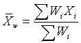
If the weights are computed so that their sum is 1, then the formula shown
above can dispense with the denominator.
There are several reasons why you might want to use a weighted mean.
- Each data value might actually represent a value that is used by multiple
people in your sample. The weight, then, is the number of people associated
with that particular value.
- Your sample might deliberately over represent or under represent certain
segments of the population. Some of the nationwide surveys produced by the
Centers for Disease Control and Prevention deliberately oversample
African-American and Hispanic groups so that there would be sufficient
precision to track statistics in these minority groups. To restore balance,
you would place less weight on the over represented segments of the population
and greater weight on the under represented segments of the population.
- Some values in your data sample might be known to be less variable (more
precise) than other values. You would place greater weight on those data
values known to have greater precision.
This definition originally appeared in my old website at:
www.childrensmercy.org/stats/definitions/weightedmean.htm.
8. Monthly Mean Quote: Wall Street indexes predicted ...
To prove that Wall Street is an early omen of movements still to come in GNP,
commentators quote economic studies alleging that market downturns predicted
four out of the last five recessions. That is an understatement. Wall Street
indexes predicted nine out of the last five recessions! And its mistakes were
beauties. -- Paul Samuelson, "Science and Stocks," Newsweek, September 1966, as cited in
www.barrypopik.com/index.php/new_york_city/entry/wall_street_indexes_predicted_nine_out_of_the_last_five_recessions/
9. Monthly Mean Website: Spreadsheet Addiction
Burns P. Spreadsheet Addiction. Available at:
www.burns-stat.com/pages/Tutor/spreadsheet_addiction.html [Accessed August
18, 2009]. Excerpt: The goal of computing is not to get an answer, but to
get the correct answer. Often a wrong answer is much worse than no answer at
all. There are a number of features of spreadsheets that present a challenge
to error-free computing.
10. Nick News: Nicholas the fishmonger
Nicholas bought a blue betta on Saturday. It's the first pet that is "his"
and not Mom's or Dad's. Here's a picture.

Find out the name we chose at
http://www.pmean.com/personal/fishmonger.html.
11. Very bad joke: A statistician is someone who enjoys
work with numbers, but...
...doesn't have enough personality to be an accountant.
This is one of my favorite jokes to tell and it always gets a laugh. I
don't believe this joke, by the way, but a little bit of self deprecatory
humor goes a long way. Various versions of this joke are around on the
Internet, and sometimes economist or actuary is substituted for statistician.
Go to
www.math.utah.edu/~cherk/mathjokes.html for an example.
12. Tell me what you think.
How did you like this newsletter? I have
six short questions
that I'd like to ask. It's totally optional on your part. Your responses will
be kept anonymous, and will only be used to help improve future versions of
this newsletter.
Only two people sent feedback (that's okay, I know that you all love my
newsletter). I got compliments on my description of mosaic plots. I also got
compliments on the material on covariate adjustment from one person, but
another person found that material confusing.
Suggestions of future topics included meta-analysis statistics, Bayesian
statistics, various methods for smoothing and checking for interactions with
applications to survival analysis, and the problem with ROC curves. That's
quite an ambitious list.
13. Free statistics webinar: Wednesday, October 14, 2009, 10am-noon CDT.
I want to offer statistics webinars (web seminars) on a variety of topics. A
possible list of topics appears at
http://www.pmean.com/09/TentativeTraining.html.
To get the ball rolling, I am offering the first webinar for free. This is
not free to me, of course, as there are substantial expenses associated with the
production of a webinar. In exchange for the free seminar, I'm asking you to
send me some suggestions about future statistics webinar topics prior to the
webinar and to offer constructive criticism of my first webinar afterwards.
The topic of my first statistics webinar is "What do all these numbers mean?
P-values and confidence intervals and the Bayesian alternatives." I don't have
the vendor selected yet, but I am looking at Webex and Vcall.
If the free webinar is successful, I plan to hold additional webinars for a
reasonable fee, one per month. If you are interested in attending the October
webinar or future webinars, please respond to this email or send an email to
mail (at) pmean (dot) com with the words "Statistics webinar" in the title. I'll
send out another reminder in early October, hopefully along with the September
issue of The Monthly Mean.
What now?
Sign up for the Monthly Mean newsletter
Review the archive of Monthly Mean newsletters
Go to the main page of the P.Mean website
Get help
 This work is licensed under a
Creative
Commons Attribution 3.0 United States License. This page was written by
Steve Simon and was last modified on
2017-06-15. Need more
information? I have a page with general help
resources. You can also browse for pages similar to this one at
Category: Website details.
This work is licensed under a
Creative
Commons Attribution 3.0 United States License. This page was written by
Steve Simon and was last modified on
2017-06-15. Need more
information? I have a page with general help
resources. You can also browse for pages similar to this one at
Category: Website details.