
[The Monthly Mean] January/February 2011--Retracted articles don't die and they don't fade away
The Monthly Mean is a newsletter with articles about Statistics with occasional forays into research ethics and evidence based medicine. I try to keep the articles non-technical, as far as that is possible in Statistics. The newsletter also includes links to interesting articles and websites. There is a very bad joke in every newsletter as well as a bit of personal news about me and my family.
Welcome to the Monthly Mean newsletter for January/February 2011. If you are having trouble reading this newsletter in your email system, please go to www.pmean.com/news/201102.html. If you are not yet subscribed to this newsletter, you can sign on at www.pmean.com/news. If you no longer wish to receive this newsletter, there is a link to unsubscribe at the bottom of this email. Here's a list of topics.
Lead article: Retracted articles don't die and they don't fade away
2. Two alternatives to the Bonferroni adjustment
3. Can you believe the results of a subgroup analysis?
4. Monthly Mean Article (peer reviewed): Missing the forest (plot) for the trees? A critique of the systematic review in tobacco control
5. Monthly Mean Article (popular press): Push for more trials may hurt patients
6. Monthly Mean Book: The Panic Virus: A True Story of Medicine, Science, and Fear
7. Monthly Mean Definition: What is the Poisson distribution?
8. Monthly Mean Quote: Not even the most subtle...
9. Monthly Mean Video: Hans Rosling's 200 Countries, 200 Years, 4 Minutes - The Joy of Stats
10. Monthly Mean Website: The Facts in the Case of Dr. Andrew Wakefield
11. Nick News: Nicholas competes in his first Pinewood Derby
12. Very bad joke: They say that statisticians use...
13. Tell me what you think.
14. Join me on Facebook and LinkedIn
1. Retracted articles don't die and they don't fade away.
In a logical world, when an article is retracted (usually because of error or fraud), researchers would stop citing the article and would no longer include that data in their systematic overviews. Any systematic overview that included results from a retracted article would be reworked.
It doesn't work that way, though. Medline links published retraction in its database to the original article, but it is unclear how often researchers take the time to check for retractions. The International Committee of Medical Journal Editors has a policy on retractions that demands prominent placement of retractions in the journal. A retraction has to appear on a numbered page and in the table of contents of the journal. There is evidence, though, that these policies are not followed uniformly.
One review examined 82 retracted articles and found that they were cited 733 times AFTER BEING RETRACTED. In almost every case, the citing papers did not note the retraction.
Retracted papers also have found their way into systematic overviews. In one investigation, work by Scott Reuben which was incorporated into 6 separate systematic overviews, was later retracted because Dr. Reuben had fabricated the data in those studies. This is troubling, though exclusion of the retracted papers frequently had no impact on the overall conclusion.
What should be done to insure that retracted articles don't continue to have an influence on medical practice? There are several published recommendations, which I have paraphrased here.
* The party responsible for retracting a paper should search for any publications citing those retracted papers and notify the authors of those results.
* Any retractions should be easily available (open access or free full text on the web), even if the original article was not.
* If a journal promoted an article with press releases, then if that article is later retracted, the journal should promote the retraction with a similar level of press releases.
* Researchers should take better care in preparing bibliographies for their research papers and should review Medline citations for all papers prior to submitting an article for publication.
* Similarly, editors should routinely scan prior to publication the bibliographies of papers that have been accepted to verify that none of the cited articles have been retracted.
* Authors of systematic overviews should note any summary measures that are dominated by unusual results from a single researcher. This is not automatically a problem, but it does merit a closer look when it happens.
Sources for this article:
* Atlas MC. Retraction policies of high-impact biomedical journals. J Med Libr Assoc 2004: 92(2); 242-50. http://www.ncbi.nlm.nih.gov/sites/ppmc/articles/PMC385306/
* Eysenbach G, Kummervold PE. "Is CybermedicineKilling You?"--The story of a Cochrane disaster. J Med Internet Res 2005: 7(2); e21. http://www.jmir.org/2005/2/e21/
* Adams Marcus, Ivan Oransky. Retraction Watch. http://retractionwatch.wordpress.com/
* M P Pfeifer, G L Snodgrass. The continued use of retracted, invalid scientific literature. JAMA. 1990;263(10):1420-1423. http://www.ncbi.nlm.nih.gov/pubmed/2406475
* James C Eisenach. Data fabrication and article retraction: how not to get lost in the woods. Anesthesiology. 2009;110(5):955-956. http://journals.lww.com/anesthesiology/Fulltext/2009/05000/Measurement_of_Pain_in_Children__State_of_the_art.2.aspx
* Emmanuel Marret, Nadia Elia, Jørgen B Dahl, et al. Susceptibility to fraud in systematic reviews: lessons from the Reuben case. Anesthesiology. 2009;111(6):1279-1289. http://journals.lww.com/anesthesiology/Fulltext/2009/12000/Data_Fabrication_and_Article_Retraction__How_Not.23.aspx.
2. Two alternatives to the Bonferroni adjustment
In some research studies, you have a large and difficult to manage set of outcome measures. This is especially true in microarray experiments, where for thousands or tens of thousands of genes, you are measuring the difference in expression levels between two types of tissue. A simple p-value is worthless in this situation, because it will be swamped by thousands of other p-values.
The simplest (and least effective) adjustment to the p-values is a Bonferroni correction. It simply multiplies each p-value by the number of outcome measures. It's impossible for a p-value to be larger than 1, so any Bonferroni adjusted p-values larger than 1 are set equal to 1. So if you have a thousand p-values, the Bonferroni adjustment changes a p-value of 0.0002 to 0.2.
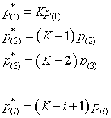
You can get a slight improvement in Bonferroni by using a step down procedure. The Holm step-down procedure is the easiest to understand. First, sort your thousand p-values from low to high. Multiply the smallest p-value by one thousand. If that adjusted p-value is less than 0.05, then that gene shows evidence of differential expression.
That's no different than the Bonferroni adjustment. But now that we know that the first gene is differentially expressed, we have 999 genes for which we are not sure what is going on. So multiply the next smallest p-value by 999 (not one thousand) and see if it is less than 0.05.
Multiply the third smallest p-value by 998, the fourth smallest by 997, etc. Compare each of these adjusted p-values to 0.05.
Now that is not quite the Holm step down procedure. One problem that crops up is that the adjusted p-values may not be in the same order as the unadjusted p-values. The third p-value was multiplied by 998 and the fourth by 997. If they were close enough, the order of the adjusted p-values might be reversed.
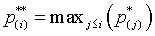
To avoid this problem, you should insure that any adjusted p-value is at least as large as any preceding adjusted p-value, by computing the maximum of this adjusted p-value and any adjusted p-values that preceded it.
Here are the official mathematical details for the Holm step-down procedure.
Step 1. Sort the p-values from low to high:
Step 2: Multiply the p-values by K, K-1, K-2,...
Step 3: Correct for any p-values out of their proper order.
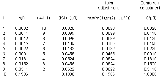
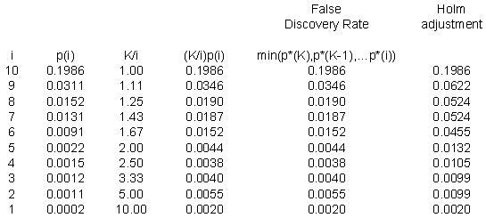
Here's a small example. Suppose I have ten p-values: 0.0002, 0.0011, 0.0012, 0.0015, 0.0022, 0.0091, 0.0131, 0.0152, 0.0311, and 0.1986. These are impressively small, even after accounting for the fact that we have ten of them.
Notice that the first part of the Holm adjustment (the fourth column) leaves a few of the adjusted p-values out of order. The third p-value is smaller than the second and the eighth p-value is smaller than the seventh. When you take the maximum of any preceding p-values (the fifth column), that puts a proper order to the adjusted p-values.
The last column is the Bonferroni adjustment, which simply multiplies each p-value by 10. Notice that there is a slight difference, since the Bonferroni adjusted p-value for the sixth row is not statistically significant, though it is significant using the Holm step-down procedure. The Holm step-down procedure controls the overall alpha level just as well as Bonferroni and will reject at least as many hypotheses as Bonferroni and possibly more. The difference, though, is often slight. So you may prefer to stick with Bonferroni because you know that many of your readers will have an easier time understanding this simpler approach.
A radically different approach than either Bonferroni or the Holm step-down procedure is to define a false discovery rate and control that value rather than controlling the overall Type I error rate.
To understand the false discovery rate better, suppose that there are K genes, that a procedure declared R genes to be statistically significant and that V of these genes are false positives. Both Bonferroni and the Holm step-down procedure insure that P[V>0] is no more than alpha. In a microarray experiment, this is a rather stringent standard. You should be willing to tolerate a handful of false positive genes. A microarray experiment is often an exploratory study. Most of the time, you would follow up on any positive findings with additional testing anyway. So a small number of false positives is tolerable. You just don't want the number of false positives to dominate the list.
Suppose you ran an microarray experiment with 10,000 genes. If you included no adjustment, an individual alpha level of 0.05 would lead to 500 false positive results. Now suppose the largest p-value before any adjustment was 0.05. This is like hitting the lottery jackpot, since every gene is statistically significant. Your 500 false positives are a tolerable number among 10,000 positive results.
Let's suppose though that only half of your genes (5,000) are statistically significant at an unadjusted alpha level of 0.05. Now your 500 false positives represents 10% of the significant genes. Are you starting to get a bit worried? Maybe not, but now suppose a quarter of your genes (2,500) are statistically significant at an unadjusted alpha level of 0.05. Your 500 false positives now represents 20% of the genes. Are you starting to feel a bit uncomfortable? Suppose that 10% of your genes (1,000) are statistically significant at an alpha level of 0.05. Now the false positives are half of the list. Yikes!
So perhaps you should apply a stricter standard when fewer of your genes are statistically significant. In the last situation, it might make sense to test at an alpha level that is one-tenth as large (0.005), because then the expected number of false positives (50) is only 5% of the total number of genes again.
So to control the false discovery rate, don't bother adjusting the largest p-value, adjust the p-value halfway through the list by doubling it, adjust the p-value three quarters of the way towards the smallest p-value by quadrupling it, adjust the p-value nine-tenths of the way down by multiplying by 10, etc.
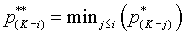
Notice that the false discovery rate proceeds in the opposite order from the Holm adjustment. It looks at the largest p-value first. You need to insure consistency in the ordering of the false discovery rates, but here you make sure that the second largest false discovery rate is not larger than the largest, that the third largest false discovery rate is not larger than the previous two, etc..
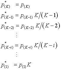
The formal mathematical definition is
Step 1. Sort the p-values from high to low:
Step 2. Multiply the p-values by 1, K/(K-1), K/(K-2), ..., K.
Step 3. Correct for any p-values out of the proper order.
Here's the same example using the ten p-values discussed above. It seems a bit silly to apply the false discovery rate to such a small number of p-values, but it does help to illustrate the calculations.
The p-values for the Holm adjustment are listed at the end for comparison.
The false discovery rate is not a p-value. Instead, think of it as the proportion of false positive results that you are willing to tolerate among the results that are flagged.
To understand this better, define (as I did above) R as the number of genes that are flagged as differentially expressed by a procedure (note that I did not say the number of genes that are statistically significant). Let V represent the number of false positives among those R genes. I'm using the notation which appears in the book
* Amaratunga and Cabrerea, Exploration and Analysis of DNA Microarray and Protein Array Data.
The Bonferroni approach (and the Holm adjustment) control the familywise error rate, which is defined as
This is saying that even a single false positive is intolerable and you must control this scrupulously. For a microarray experiment, this may be too strict. Instead you should focus on the ratio of false positives, V/R. A formal mathematical definition here is a bit tricky, because we can't allow even a small probability that the denominator is zero. It turns out that the false discovery rate is equal to
Once you let go of the concepts of p-values, then you can drop the dogmatic insistence on an alpha level of 0.05 as well.
How many false positives can you tolerate in a sample of genes that are flagged as differentially expressed? In many situations, I suspect that your tolerance would be fairly high maybe 10% or 20%. Amaratunga and Cabrera suggest that in some situations, a false discovery rate of 50% might still be tolerable.
Think carefully about this choice. What is the cost of a false positive? In a microarray experiment, it means tracking down a lead that ends up being a dead end. This is not a trivial cost, but your perspective here is quite different than testing a new drug, for example. There, a false positive means allowing an ineffective drug onto the market.
This article was originally published at
* http://www.childrens-mercy.org/stats/weblog2005/MultipleComparisons.asp
3. Can you believe the results of a subgroup analysis?
Subgroup analysis is a method for looking at whether a treatment has a beneficial effect in a specific subgroup of patients. It has raised a fair amount of controversy in the research community, though it would be wrong to characterize this as a blanket condemnation. If subgroup analysis is applied cautiously, it can be useful.
First, you should recognize that testing for a subgroup effect is harder than the simplistic "I have a small p-value in one group and a large p-value in the other group". A formal test for a subgroup involves an interaction. The type of interaction is important. If one group has a large degree of efficacy and another group has a moderate degree of efficacy, that does not constitute a subgroup finding. This is similar to distinguishing between a quantitative and a qualitative interaction.
Second, you can sometimes get overwhelmed by the number of possible subgroups that can be examined. A new therapy might not be effective overall, but is it possible that it is effective just for women? just for patients over 85 years of age? just for patients who are only mildly ill? just for patients with hypertension? The list can go on and on.
But subgroup findings are important to look for. In this era of personalized medicine, you should avoid overuse of a "one size fits all" therapy. Looking for subgroups is a way of trying to find when a therapy is appropriate or inappropriate for specific subgroups in your population.
Findings from a subgroup analysis are a weak form of evidence, but weak evidence can still be persuasive if you have sufficient corroborating evidence. Here are some of the things that you should look for in a subgroup analysis that would strengthen your belief in the findings.
* was the size of the effect in the subgroup large (large in a clinical sense)?
* was there a plausible biological mechanism that would lead you to expect the therapy to be effective only in this subgroup?
* has this subgroup finding been replicated in other studies?
* was the subgroup analysis planned for prior to data collection?
* was the analysis limited to just this subgroup or only to a few other subgroups?
* was the subgroup defined clearly and unambiguously?
* was the subgroup assessed solely on baseline values and not on values measured after the interventions had started?
In the next newsletter, I want to write a bit also about a closely related topic: extrapolating results from one subgroup of patients who were in a clinical trial to a different subgroup of patients who haven't been studied yet.
4. Monthly Mean Article (peer reviewed): Missing the forest (plot) for the trees? A critique of the systematic review in tobacco control.
Laura Rosen, Michal Ben Noach, Elliot Rosenberg. Missing the forest (plot) for the trees? A critique of the systematic review in tobacco control. BMC Medical Research Methodology. 2010;10(1):34. Abstract: "BACKGROUND: The systematic review (SR) lies at the core of evidence-based medicine. While it may appear that the SR provides a reliable summary of existing evidence, standards of SR conduct differ. The objective of this research was to examine systematic review (SR) methods used by the Cochrane Collaboration ("Cochrane") and the Task Force on Community Preventive Services ("the Guide") for evaluation of effectiveness of tobacco control interventions. METHODS: We searched for all reviews of tobacco control interventions published by Cochrane (4th quarter 2008) and the Guide. We recorded design rigor of included studies, data synthesis method, and setting. RESULTS: About a third of the Cochrane reviews and two thirds of the Guide reviews of interventions in the community setting included uncontrolled trials. Most (74%) Cochrane reviews in the clinical setting, but few (15%) in the community setting, provided pooled estimates from RCTs. Cochrane often presented the community results narratively. The Guide did not use inferential statistical approaches to assessment of effectiveness. CONCLUSIONS: Policy makers should be aware that SR methods differ, even among leading producers of SRs and among settings studied. The traditional SR approach of using pooled estimates from RCTs is employed frequently for clinical but infrequently for community-based interventions. The common lack of effect size estimates and formal tests of significance limit the contribution of some reviews to evidence-based decision making. Careful exploration of data by subgroup, and appropriate use of random effects models, may assist researchers in overcoming obstacles to pooling data." [Accessed May 1, 2010]. Available at: http://www.biomedcentral.com/1471-2288/10/34.
5. Monthly Mean Article (popular press): Push for more trials may hurt patients
Anup Malani, Tomas J. Philipson. Push for more trials may hurt patients. Washington Examiner. 2010. Excerpt: "U.S. pharmaceutical companies are increasingly going abroad to conduct clinical trials required by the FDA. Recently, the Department of Health and Human Services released a report suggesting that the FDA lacks the resources to adequately monitor these foreign trials. Four of every five new drugs sold in the U.S. are tested in foreign trials, and the FDA inspects less than one in 10 of these. This is half the rate of inspection for domestic trials." [Accessed July 27, 2010]. Available at: http://www.washingtonexaminer.com/opinion/columns/Push-for-more-clinical-trials-may-hurt-patients-1002114-98875969.html.
6. Monthly Mean Book: The Panic Virus: A True Story of Medicine, Science, and Fear
Seth Mnookin. The Panic Virus: A True Story of Medicine, Science, and Fear. Simon & Schuster; 2011. Description: Why is it that Andrew Wakefield, a scientist accused of fraud and deception, has become a hero to many parents? Why is it that Jenny McCarthy, a former playmate and actor, has exerted tremendous influence on public health policy? Why is it that parents will subject their children to dangerous therapies like chelation while avoiding relatively safe immunizations? Seth Mnookin outlines the story of the anti-vaccination movement, with a particular emphasis on those who believe there is a link between childhood vaccines and autism. He also offers a historical perspective on earler anti-vaccination efforts. This book tries to explain why people abandon evidence based medicine in favor of their emotions ("Mommy instinct" is Jenny McCarthy's term for this).
7. Monthly Mean Definition: What is the Poisson distribution?
The Poisson distribution is a commonly used distribution to represent counts. Some examples where the Poisson distribution might be used are:
* the number of Emergency Department visits by an infant during the first year of life,
* the number of pollen spores that imact on a slide in a pollen counting machine,
* the number of white blood cells found in a cubic centimeter of blood.The Poisson is closely related to the binomial distribution, but has some important distinctions from the binomial. The binomial distribution represents the number of successes among n trials of an experiment, and thus has a sharp constraint on the high end. You can't have more successes than the number of trials. In contrast, the Poisson distribution has no obvious upper bound.
We live in a finite universe, so everything that can be counted has some upper bound. But often that upper bound is not obvious from the description of the problem. How many Emergency Department visits could an infant have during its first year of life? It couldn't be a million, or even a thousand, but there is no obvious firm upper limit.
The Poisson distribution will produce a probability for any non-negative whole number. The Poisson distribution depends on a single parameter λ. The probability that the Poisson random variable equals x is
for any value of x from 0 all the way up to infinity. Although there is no theoretical upper bound for the Poisson distribution, in practice these probabilities get small enough to be negligible when x is very large. Exactly how large x needs to be before the probabilities become negligible depends entirely on the value of λ. Here are some examples of Poisson distributions and their probabilities.
λ=0.1

  P[X=0] P[X=1] P[X=2] P[X=3]

  0.9048 0.0905 0.0045 0.0002


  λ=0.5
 P[X=0] P[X=1] P[X=2] P[X=3] P[X=4] P[X=5]

0.6065 0.3033 0.0758 0.0126 0.0016 0.0002


  λ=1.5

  P[X=0] P[X=1] P[X=2] P[X=3] P[X=4] P[X=5] P[X=6] P[X=7] P[X=8]

  0.2231 0.3347 0.2510 0.1255 0.0471 0.0141 0.0035 0.0008 0.0001
There is some probability associated with values not shown (e.g., 4, 5, ... for λ=0.1) but these probabilities are all smaller than 0.0001.
Notice that for λ=0.1, more than 90% of the probability is concentrated at zero, and there is almost no chance of observing 2 or more events. This Poisson random variable would produce a bunch of zeros with a 1 popping up once in a while, but values of 2 or more are very rare.
When λ=0.5, the probability is still mostly concentrated at zero, but there is a pretty good chance of seeing a count of 1. There is also a non-negligible chance of seeing a count of 2 or 3.
For λ=1.5, the count of 1 occurs slightly more frequently than a count of 0 and values of 3, 4, or even 5 have a small chance of appearing.
For larger values of λ it is easier to display the probabilities in a graph.
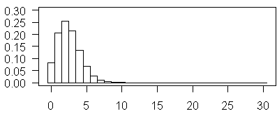
The plot shown above illustrates Poisson probabilities for λ=2.5. The most probable value is now 3, and values of 5 and 6 are not too rare.
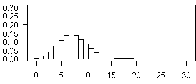
The above plot illustrates Poisson probabilities for λ = 7.5. The most probable vale is now 7 and values as large as 15 have non-negligible probabilities.
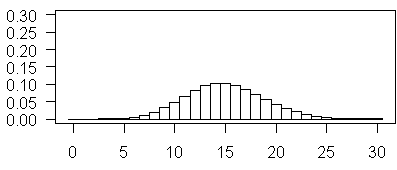
and this plot illustrates Poisson probabilities for λ=15. Notice how this looks almost like a bell shaped curve. Also notice, in contast to some of the earlier examples, it is now 0 that appears to be highly improbable.
The mean of the Poisson distribution is λ. For the Poisson distribution, the variance, λ, is the same as the mean, so the standard deviation is √λ. Also notice that the Poisson distribution looks very close to a bell shaped curve for moderate and large values of λ.
The Poisson distribution is often derived in terms of an observed count over time interval (for example, the number of infections in a hospital in a week) or an observed count over an area (for example, number of polyps per meter of intestine). Information about how the data was generated can help you decide whether the Poisson distribution fits. The Poisson distribution is based on four assumptions.
1. The probability of observing a single event over a small time interval or area is approximately proportional to the size of that interval.
2. The probability of two events occurring in the same narrow interval is negligible.
3. The probability of an event within a certain interval does not change over different intervals.
4. The probability of an event in one interval is independent of the probability of an event in any other non-overlapping interval.
You should examine all of these assumptions carefully, but especially the last two. If either of these last two assumptios are violated, they can lead to extra variation, sometimes refered to as overdispersion.
Here's an example of a counting situation where you might want to consider a Poisson distribution.
The infection rate at a Neonatal Intensive Care Unit (NICU) is typically expressed as a number of infections per patient days. This is obviously counting a number of events across both time and patients. Does this data follow a Poisson distribution?
* We need to assume that the probability of getting an infection over a short time period is proportional to the length of the time period. In other words, a patient who stays one hour in the NICU has twice the risk of a single infection as a patient who stays 30 minutes.
* We also need to assume that for a small enough interval, the probability of getting two infections is negligible.
* We need to assume that the probability of infection does not change over time or over infants. In other words, each infant is equally likely to get an infection over the same time interval and for a single infant, the probability of infection early in the NICU stay is the same as the probability of infection later in the NICU stay.
* And we need to assume independence. Here independence means two things. The probability of seeing an infection in one child does not increase or decrease the probability of seeing an infection in another child. We also need to that if an infant who gets an infection during one time interval, it doesn't change the probability that he or she will get another infection during a later time interval.
The last three assumptions are questionable. It is possible to get infected with two different organisms at the same time. The infection rate is probably not proportional to the time interval, since older infants have better immune systems. If one infant gets an infection it increases the chance that other infants will get the same infection, and in infection at one time point would almost certainly influence the chances of getting another infection.
So the Poisson distribution might not be a good choice here, though in certain cases the violations of assumptions might not be too bad. Is the infectious agent difficult to transfer from one child to another? That might make the independence assumption more reasonable.
This article was originally published at
* http://www.childrensmercy.org/stats/definitions/poisson.htm
8. Monthly Mean Quote: Not even the most subtle...
Not even the most subtle and skilled analysis can overcome completely the unreliability of basic data. - R. G. D. Allen.
9. Monthly Mean Video: Hans Roslingʼs 200 Countries, 200 Years, 4 Minutes - The Joy of Stats
BBC Four. Hans Roslingʼs 200 Countries, 200 Years, 4 Minutes - The Joy of Stats. 2010. Hans Roslingʼs famous lectures combine enormous quantities of public data with a sport's commentator's style to reveal the story of the world's past, present and future development. Now he explores stats in a way he has never done before - using augmented reality animation. In this spectacular section of "The Joy of Stats" he tells the story of the world in 200 countries over 200 years using 120,000 numbers - in just four minutes. Plotting life expectancy against income for every country since 1810, Hans shows how the world we live in is radically different from the world most of us imagine. More about this programme: http://www.bbc.co.uk/programmes/b00wgq0l [Accessed December 2, 2010]. Available at: http://www.youtube.com/watch?v=jbkSRLYSojo.
10. Monthly Mean Website: The Facts in the Case of Dr. Andrew Wakefield
Darryl Cunningham. The Facts in the Case of Dr. Andrew Wakefield. Description: I have been thinking about a graphic novel format for case studies in research ethics. Mr. Cunningham has already done this for the Wakefield case and for another case study involving homeopathy. This work will inspire me, I hope, to finish up my first case study on the TGN 1412 trial and start developing a second case study. Available at http://darryl-cunningham.blogspot.com/2010/05/facts-in-case-of-dr-andrew-wakefield.html.
11. Nick News: Nicholas competes in his first Pinewood Derby
One of the yearly traditions of Cub Scouts is the Pinewood Derby races. You get a wooden block with four wheels and four nails. There is a cut in the wood to show where the wheels should go, but otherwise it is an ordinary block of wood. Your job is to carve the block of wood into an interesting car design and then race that car against those created by other Cub Scouts. There is a weight restriction, five ounces, and you can't move the wheels from their designated locations.
Parents are encouraged to help, but the Cub Scout should do the design by himself. Nicholas was very excited to get to use a saw to cut wood. He did the initial cuts and I straightened out the lines a bit with a second cut. The wedge that was cut off to create a streamlined front was reglued back a bit to provide a windshield. We sanded everything down to further even out the cuts and to shape things a bit.
We spray painted the car a dark blue. Handing a can of spray paint to an eight year old is one of the most terrifying things I have done in the past year. We did this outside and far away from the house. Other than a bit of blue snow in our front yard, no damage was done.
We glued a couple of lego bricks to the car to serve as car seats and then attached lego people to those brick seats. We found some fun stickers to add as a final touch.
He did reasonably well in the first round of competion with other members of the the Bears den. It was a complex series of races that mixed up the competitors and allowed each car to race in each of the four lanes. When all the dust had settled, Nick won third place among the Bears and went on to compete in the finals.
The first race of the finals saw disaster strike. The repeated jostling of the previous races caused one of the wheels to come loose. We got an emergency shot of superglue for the loose wheel, but the car just wasn't the same. Still, it was an interesting competion.
Here's a picture of Nicholas with his third place trophy.
12. Very bad joke: They say that statisticians use...
They say that statisticians use a lot of jargon, but doctors are ten time worse. These are the folks who take a simple ear ache and call it "otitis media." To them, a runny nose is "rhinorhea" and a tummy ache is "gastrointestinal distress." It's enough to make me produce lacrimal secretions. This is an original joke of mine. The alternate punchline is "If I hear the word 'emesis' one more time, I'm going to throw up."
13. Tell me what you think.
Thank you for taking the time to provide feedback for the January/February 2011 issue of the Monthly Mean. Your responses will be kept anonymous. I have three short open ended questions at
* https://app.icontact.com/icp/sub/survey/start?sid=6306&cid=338122
You can also provide feedback by responding to this email. My three questions are:
* What was the most important thing that you learned in this newsletter?
* What was the one thing that you found confusing or difficult to follow?
* What other topics would you like to see covered in a future newsletter?One person provided feedback to the last newsletter. That person liked the description of an internal pilot study and the link to the Emily Rosa study (which was not on the newsletter, but could be found through my website).
* http://www.childrens-mercy.org/stats/weblog2006/EmilyRosaExperiment.asp
This person suggested an article about subgroup analysis, which I was able to accomodate in the current newsletter.
14. Join me on Facebook and LinkedIn
I'm just getting started with Facebook and LinkedIn. My personal page on Facebook is
* www.facebook.com/pmeanand there is a fan page for The Monthly Mean
* www.facebook.com/group.php?gid=302778306676I usually put technical stuff on the Monthly Mean fan page and personal stuff on my page, but there's a bit of overlap.
My page on LinkedIn is
* www.linkedin.com/in/pmeanIf you'd like to be a friend on Facebook or a connection on LinkedIn, I'd love to add you.
What now?
Sign up for the Monthly Mean newsletter
Review the archive of Monthly Mean newsletters
![]() This work is licensed under a
Creative
Commons Attribution 3.0 United States License. This page was written by
Steve Simon and was last modified on
2017-06-15. Need more
information? I have a page with general help
resources. You can also browse for pages similar to this one at
Category: Website details.
This work is licensed under a
Creative
Commons Attribution 3.0 United States License. This page was written by
Steve Simon and was last modified on
2017-06-15. Need more
information? I have a page with general help
resources. You can also browse for pages similar to this one at
Category: Website details.
![P[V>0]](images/201102/02i.gif)
![E[V/R|R>0]P[R>0]](images/201102/02j.gif)