
[The Monthly Mean] September/October 2012 -- Is "data is" okay? Released 2012-11-07.
The Monthly Mean is a newsletter with articles about Statistics with occasional forays into research ethics and evidence based medicine. I try to keep the articles non-technical, as far as that is possible in Statistics. The newsletter also includes links to interesting articles and websites. There is a very bad joke in every newsletter as well as a bit of personal news about me and my family.
Welcome to the Monthly Mean newsletter for September/October 2012. If you are having trouble reading this newsletter in your email system, please go to www.pmean.com/news/201209.html. If you are not yet subscribed to this newsletter, you can sign on at www.pmean.com/news. If you no longer wish to receive this newsletter, there is a link to unsubscribe at the bottom of this email. Here's a list of topics.
--> Is "data is" okay?
--> Rates and number needed to treat
--> Independent predictor
--> Monthly Mean Article (peer reviewed): Do health care institutions value research?
--> Monthly Mean Article (popular press): The Internet Blowhard's Favorite Phrase
--> Monthly Mean Book: Comparing Clinical Measurement Methods
--> Monthly Mean Definition: What is a probit?
--> Monthly Mean Quote: Science is the belief...
--> NEW!! Monthly Mean Trivia Question: What Elvis Presley song...
--> Monthly Mean Video: What doctors don't know about the drugs they prescribe
--> Monthly Mean Website: Are Surveys Scientific?
--> Nick News: Nick gets creative
--> Very bad joke: How many researchers...
--> Tell me what you think.
--> Join me on Facebook, LinkedIn and Twitter
--> Permission to re-use any of the material in this newsletter
--> Monthly Mean Trivia Answer
--> Is "data is" okay? A debate occurs regularly on various forums (fora?) about the proper grammar for sentences with the word "data." Should you say "data are" or should you say "data is"? I believe that "data is" is just as good as "data are" but I always use the latter in my writing.
The argument for "data are" is that data is a plural noun. The singular form of "data" is "datum." This word follows a Latin method for singular and plural: medium and media, ovum and ova, bacterium and bacteria, and so forth. The plural form of the verb (are) is always used with a plural noun.
The argument for "data is" is that "data" has evolved to a singular noun, just like "agenda." Think about the last time that someone has used the word "agendum" in a conversation. Now think about the last time that someone has used the word "datum" in a conversation. I bet you can't recall a single episode in either case.
You can also make an argument that it depends. The noun "data" can be thought of as a collective noun or a mass noun. The rules for these types of nouns are tricky. Sometimes they are properly considered as singular and sometimes as plural. Consider the noun "jury." It refers to twelve people, but you can still say "the jury is out." If you can use a singular verb for a group of twelve people, why can't you use a singular verb for a group of twelve data points?
I do not criticize people who say or write "data is." I do believe that either "data is" or "data are" is correct, depending on the context. But, the people who use "data is" will never criticize you when you say "data are." On the other hand, the Latin lovers are a bunch of sour pusses. They'll complain about any grammatical construction that does not respect the fact that "data" is the plural of "datum." So always say "data are" and you'll keep out of trouble. I go through my website every so often and fix any "incorrect" uses of "data is." I'm not fixing an error, I'm just making a change to keep the peace.
I had to face this with the title of my book. The title is "Statistical Evidence in Medical Trials" but the book has the subtitle as well. If it were me, I would have used a subtitle of "What Does the Data Really Tell Us" but I could imagine the shrill comments from the book reviewers. So I settled for "What Do the Data Really Tell Us?"
There are lots of resources on the web about this, and I summarize a few at
--> http://www.pmean.com/03/data_is.html
Did you like this article? Visit http://www.pmean.com/category/WritingResearchPapers.html for related links and pages.
--> Rates and number needed to treat. Dear Professor Mean, I'm reviewing some data that shows a rate of mortality of 105 per 100 patient years. Does this mean that the probability of death within one year is 105%? I know that this statement is nonsense, and it makes me wonder if I can calculate a number needed to treat (NNT) for something like this that clearly is not a probability?
This is an area of confusion, so it helps to review some basic mathematical definitions.
A proportion is a ratio of two counts, where the numerator is the count in a subset of the set being counted in the denominator. Using an example I worked on a while back: there were 70,412 infants born in the state of Missouri in 1995, and 29,637 of these infants had one or more visits to the ER during the first year of their life. The proportion, 0.42, is the probability that a randomly selected infant will visit the ER during their first year of life.
A proportion, by definition, must be between 0 and 1.
Contrast a proportion with a rate. A rate is a count divided by a measure of time or area. In health care, it is usually a measure of patient days of exposure.
Here's an example of a rate. There were 22 central line infections in 2006 in a critical care unit of a hospital. There were 7,560 patient days of exposure, meaning that on an average day, there were 20.7 (7560/365) beds filled in that unit. The central line infection rate was 0.0029 (22/7560) infections per patient day.
Often the denominator will be rescaled to make the numbers more manageable. In this example, you can multiply the rate per patient day by 365 to get a rate per patient year. It works out to be 1.06 central line infections per patient year.
Notice that the rate does not have to be between 0 and 1. In fact, you can always create a rate that is bigger than 1 if you change the unit of time by a large enough factor. In the infection example, you have the added possibility of more than one infection per patient, but even without this, the rate can exceed one.
There is a bit of ambiguity, though, in the common usage of the word "rate." Often you will see it in a sentence like "The final infant mortality rate in the United States for 2008 was 6.61 infant deaths per 1,000 live births." (Source: http://www.sidscenter.org/Statistics.html).
While that is described as a "rate" and it is indeed larger than 1, it is just a rescaled proportion. The mortality rate per 1,000 live births is always bounded above by 1,000, unless you can find a way to sneak extra babies into the hospital without anyone noticing.
Now, can you calculate a NNT from a rate (actually from two rates)? Yes, you can but the interpretation is a bit tricky. Subtract rate 1 from rate 2 and invert it. It represents the amount of time (rather than the number of patients) that you have to treat with the new therapy until you see one additional cure (or one additional harm).
For example, aspirin as a primary prevention of heart attacks has a positive benefit. "There was a 44 percent reduction in the risk of myocardial infarction (relative risk, 0.56; 95 percent confidence interval, 0.45 to 0.70; P less than 0.00001) in the aspirin group (254.8 per 100,000 per year as compared with 439.7 in the placebo group)." (Source: Final Report on the Aspirin Component of the Ongoing Physicians' Health Study. New England Journal of Medicine. 1989; 321(3): 129-135.)
Take the difference in these two rates and invert it. You get 1/(439.7-254.8)=0.0054. Multiply by 100,000 to get 540. That means that you need to wait 540 patient years to see one fewer myocardial infarction. The numbers of ulcers in the two groups were 169 and 138 respectively. With about 54,500 patient days of observation in each group, you can calculate an NNH of about 1,800 patient years.
The typical patient is unlikely to see any benefit or harm, so the benefits versus risk really only make sense from a population perspective. I only wish that I could find a way to accumulate 1,800 patient years of exposure in my lifetime. It'd be worth the ulcer.
The ratio of NNT to NNH is usually interesting. In this example, it is about 3. So aspirin prevents about 3 myocardial infarctions for every ulcer that it causes. I'm not a doctor, but that sounds like a good trade-off to me.
Here's another way of looking at it. There are about 80 million people in the United States between the ages of 45 to 64. If all of them took aspirin, we would see 80,000,000/540 = 150,000 fewer myocardial infarctions per year, but we'd be stuck with 80,000,000/1,800 = 44,000 more ulcers.
There are several big cautions here. First, you have to assume uniformity across time because 1,800 patient years could mean 900 patients each seen for two years or 180 patients each seen for a decade or 20 paitents, each seen for four score and seven years. The NNT calculation presumes that both groups are equivalent. You must assume that events occur independently of time. That's never true in theory, and many times it is not true in practice either (for example, when events either occur very early or not at all). But in some settings, independence over time is reasonable enough that you can treat it as a rough approximation to reality.
Second, although the aspirin example I cited above is an exception, rates are very frequently used in observational studies. Can you calculate the NNT or NNH for an observational study? Maybe, but most times it requires a large leap of faith.
Third, the NNT for a rate is no longer bounded below by 1.0. An NNT of 0.5, for example, means that you'd see one fewer event for every half of a patient year of treatment.
Finally, as I noted, I am not a doctor, so I may have mangled the aspirin example.
Did you like this article? Visit http://www.pmean.com/category/MeasuringBenefitRisk.html for related links and pages.
--> Independent predictor. Dear Professor Mean, What cut-off do you use to establish that a variable is an independent predictor of mortality? It seems to me that no possible variable can be independent of other causes of mortality.
The terminology is a bit unfortunate. An independent predictor does not imply statistical independence. What it means is that the effect of the predictor persists, even when all other covariates are included in the model.
Did you like this article? Visit http://www.pmean.com/category/ModelingIssues.html for related links and pages.
--> Monthly Mean Article (peer reviewed): Michele P. Hamm, Shannon D. Scott, Terry P. Klassen, David Moher, Lisa Hartling. Do health care institutions value research? A mixed methods study of barriers and facilitators to methodological rigor in pediatric randomized trials. BMC Medical Research Methodology. 2012;12(1):158. Pediatric randomized controlled trials (RCTs) are susceptible to a high risk of bias. We examined the barriers and facilitators that pediatric trialists face in the design and conduct of unbiased trials. [Accessed on October 24, 2012]. http://www.biomedcentral.com/1471-2288/12/158/abstract
Did you like this article? Visit http://www.pmean.com/category/ChildrenInResearch.html for related links and pages.
--> Monthly Mean Article (popular press): Daniel Engber. The Internet Blowhard's Favorite Phrase. Why do people love to say that correlation does not imply causation? Slate. October 2012. Excerpt: "The correlation phrase has become so common and so irritating that a minor backlash has now ensued against the rhetoric if not the concept. No, correlation does not imply causation, but it sure as hell provides a hint." [Accessed on October 9, 2012]. http://www.slate.com/articles/health_and_science/science/2012/10/correlation_does_not_imply_causation_how_the_internet_fell_in_love_with_a_stats_class_clich_.htm.
Did you like this article? Visit http://www.pmean.com/category/TeachingResources.html for related links and pages.
--> Monthly Mean Book: Bendix Carstensen. Comparing Clinical Measurement Methods: A Practical Guide. Description: Most people (and I fall into this group too often) rely on some measure of correlation, such as an intraclass correlation, to compare competing clinical measurement methods. Dr. Carstensen explains that this is inappropriate because correlations change, often radically, when the scaling of the measurements change. Instead, he starts with the Bland-Altman plot and then fits various regression models to the data. This book is fairly mathematical, but there is an R library, created by the author, to fit these models.
Did you like this book? Visit http://www.pmean.com/category/MeasuringAgreement.html for related links and pages.
--> Monthly Mean Definition: What is a probit. The word "probit" can refer either to a mathematical function or to regression model. The mathematical function is useful for transforming data bounded below by zero and above by one in order to remove "floor" and "ceiling" effects. Probit regression is useful for making predictions involving data constrained to be between zero and one.
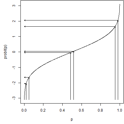
The probit function is the inverse cumulative density function for a standard normal distribution. It takes a number between zero and one and transforms it to the appropriate percentile from a standard normal distribution. The probit value for 0.5, which represents the median of the standard normal distribution, is 0.0. The probit value for 0.1 represents the 10th percentile of a standard normal distribution or -1.28. The probit value for 0.9 represents the 90th percentile of a standard normal distribution or +1.28.
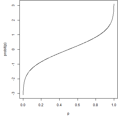
This is a graph of the probit function. It is a useful function for transforming data that is bounded between zero and one. Data like these (this?) often suffer (suffers?) from floor effects or ceiling effects. Floor effects occur when most of the data are (is?) close to the lower bound of zero. In this setting, the data are (is?) bunched together tightly with only a bit of variation on the high end. A similar problem in the opposite direction occurs when most of the data are close to the upper bound of one. Floor or ceiling effects make it difficult to spot patterns in your data because of the limitations on variation. They also sometimes produce problems with skewed distributions and/or unequal variances.
The probit function fixes problems with floor or ceiling effects by stretching out values near zero and one. The closer you are to either extreme, the more the data are stretched. In the middle there is actually a bit of squeezing going on. The graph above shows the stretching effect at the extremes.
A closely relative of the probit function is the logit function, defined as
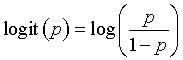
This function takes a probability, converts it from a probability to an odds, and then computes the logarithm of the odds.
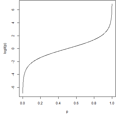
This is a graph of the logit function. It is on a different scale, but has the same shape as the probit function.
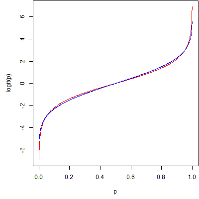
In fact, if you scale them, they differ by only a trivial amount. Here's a comparison with the logit function in red and a scaled probit function (multiplied by 1.798) in blue. There are several ways to scale the two functions. This picture uses a least squares approach, but other scaling methods produce similar pictures.
Probit regression is a form of regression which is linear on the probit scale. It is most commonly used for dose-response models, though it could be applied to other settings as well. Probit regression is equivalent to finding a cumulative normal distribution that fits a set of probabilities that, on average, increase as the dose increases. It can also flip that normal cumulative distribution around to fit a set of probabilities that, on average, decrease as the dose increases.
Here's a set of data on mortality rates for beetles related to increasing doses of a pesticide (Source: http://www.statsci.org/data/general/beetles.html).
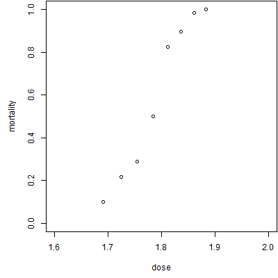
As expected, the mortality increases as the dose increases. Here are some possible probit fits to the data.
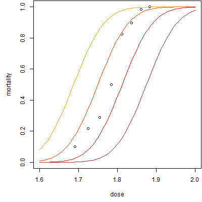
For these probit fits, the slope is 16 and the intercepts range from -30 (brown) to -29 (red) to -28 (orange-red) to -27 (orange). There is a complex interplay between the slope and the intercept and the intercept often does not have a meaningful interpretation independent of the slope. The theoretical interpretation is the estimated average probit value when the dose equals zero. Note that as the intercept increases, the curve is shifted to the left.
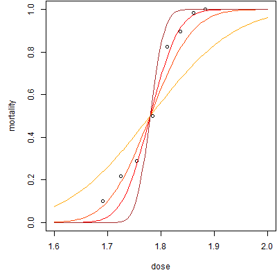
Here are some graphs with varying slopes (with appropriate adjustments in the intercept to keep them in the same location). The slopes range from 8 (orange) to 16 (orange-red) to 24 (red) to 32 (brown). Note that the curve becomes steeper as the slope increases.
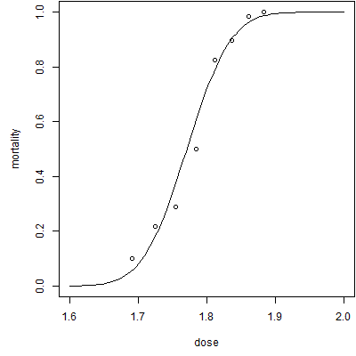
Here's the best fitting probit regression model. The intercept is -34.94 and the slope is 19.73. You might be interested in the point where the probit regression curve hits 0.5 (representing half of the beetles living and half dying). There are various terms for this depending on the context, such as LD50. You can compute this value by taking the negative of the intercept and dividing it by the slope. In this model, that value is 1.771.
If you've looked at these models, they look strikingly similar to logistic regression models. In fact, the only difference is that a probit regression fits a curve that is linear on the probit scale while logistic regression fits a curve that is linear on the logit (or log-odds) scale. The two models produce almost identical values (save for a scaling factor) and there is little empirical reason to prefer one over the other. Often the choice depends on how you want to interpret the results when you are done.
Did you like this article? Visit http://www.pmean.com/category/LogisticRegression.html for related links and pages.
--> Monthly Mean Quote: Science is the belief in the ignorance of experts. - Richard Feynman.
-->Monthly Mean Trivia Question: What Elvis Presley song has "number forty seven" talking to "number three"? Answer at the bottom of this email.
--> Monthly Mean Video: Ben Goldacre. What doctors don't know about the drugs they prescribe. Description at ted.com: "When a new drug gets tested, the results of the trials should be published for the rest of the medical world -- except much of the time, negative or inconclusive findings go unreported, leaving doctors and researchers in the dark. In this impassioned talk, Ben Goldacre explains why these unreported instances of negative data are especially misleading and dangerous. Ben Goldacre unpicks dodgy scientific claims made by scaremongering journalists, dubious government reports, pharmaceutical corporations, PR companies and quacks." [Accessed on October 9, 2012]. http://www.ted.com/talks/ben_goldacre_what_doctors_don_t_know_about_the_drugs_they_prescribe.html.
Did you like this video? Visit http://www.pmean.com/category/PublicationBias.html for related links and pages.
--> Monthly Mean Website: Kyle Hill. Are Surveys Scientific? Excerpt: "What I think many people fail to realize is that surveys can indeed be very scientific instruments. To throw away surveys because they happen to fit into the same cognitive framework as do online polls is to throw away much of social science. Like any science, conducting a valid survey is tremendously complex and the results hard to interpret. But, when done correctly, surveys can tell us a lot about how we think and behave. " [Accessed on October 4, 2012]. http://www.randi.org/site/index.php/swift-blog/1862-are-surveys-scientific.html.
Did you like this website? Visit http://www.pmean.com/category/SurveyDesign.html for related links and pages.
--> Nick News: Nick gets creative. Nick has been doing some interesting creative activities recently.

Here's a jack-o'-lantern. He carved it all by himself without severing any digits. The opening on either side are "scars."

Here's a creation with a building kit that uses tubes instead of bricks. This is obviously a gun, and we discourage such things, but it is no different than what every other boy does. I think it is something in all those snakes and snails and puppy dog tails.

Here is a cracker tower. We had asked Nick to arrange some crackers nicely on a plate where we had already laid out some cheese and salami. He was obviously thinking of an arrangement that stretches into all three dimensions.

Finally, here's a dry erase artwork. If you can't read the writing, it says "Dad" on the left top and "dressed up as a statistician" on the right top. Nick also documents that I am holding a "clip board" and a "pencil." What, no calculator? He did this on his own without any prompting and without me posing. He did ask for help spelling "statistician" though.
--> Very bad joke: How many researchers does it take to screw in a light bulb? Sixteen. One to screw in the light bulb and fifteen to serve as co-authors. This is an original joke of mine, as I am often the sixteenth author on a research paper.
--> Tell me what you think. How did you like this newsletter? Give me some feedback by responding to this email. Unlike most newsletters where your reply goes to the bottomless bit bucket, a reply to this newsletter goes back to my main email account. Comment on anything you like but I am especially interested in answers to the following three
questions.
--> What was the most important thing that you learned in this newsletter?
--> What was the one thing that you found confusing or difficult to follow?
--> What other topics would you like to see covered in a future newsletter?
I received feedback from four people. One person who obviously knows more about fish than me pointed out that both of the first two fish in the last "Nick News" were catfish. But I can say with confidence that Nick has also caught a large mouth bass, as it was confirmed by the leader of the Cub Scout group on a recent Cub Scout fishing trip. But when it's just me and him, I can't tell the difference between a flounder and a fugu.
I got compliments on the tips on writing a discussion section, on archiving data, and on the inner/outer fences of a box plot. I also was commended on the link to the journal article on why studies fail. I received suggestions on explaining what an independent predictor is (easy enough that I could write something up for this newsletter) and on hierarchical models. The latter is important, but it would take some work to do the topic justice.
Someone asked me about odds ratios, and I have a pretty good summary on my website
--> http://www.pmean.com/01/oddsratio.html
that I shared. You are always welcome to ask questions. I almost always respond, though I must admit that email is often quite limited in answering technical questions. Often I have to settle for getting someone pointed in the right direction, but it is still worth the effort, I hope.
I normally don't mention names, but I'll break that rule here for a reason. Ed Gracely commented on Pascal's wager and seems to share my fascination for arguments involving infinity. He mentioned an interesting wager that is the dark side of Pascal's wager. "A person goes to hell. The devil offers to play a game. Win, and you go to heaven. Lose, and you stay in hell. You get to play once. Playing today, you have a 1/2 chance of winning. Tomorrow, 2/3. Next day, 3/4. Then 4/5, then 5/6, etc... Question: How long should you wait to play?" Dr. Gracely got this published and it was reprinted in two different books. Gracely, EJ. Playing games with infinity: The devil's offer. Analysis, l988, 48, 113. Reprinted in Fogelin, RJ & Sinnott-Armstrong, Walter Understanding Arguments, Harcourt, Brace, Jovanovich, Orlando, FL, 1991, pp 278-279. Reprinted in Palmer, M The question of God, Routledge, London, 2001. I am very impressed and want to give credit where credit is due.
In the future, I'd like to mention names of anyone who is nice enough to comment on my newsletter. If you send feedback and you want to remain anonymous, please let me know.
--> Join me on Facebook, LinkedIn, and Twitter. I'm just getting started with social media. My Facebook page is www.facebook.com/pmean, my page on LinkedIn is www.linkedin.com/in/pmean, and my Twitter feed name is @profmean. If you'd like to be a Facebook friend, LinkedIn connection (my email is mail (at) pmean (dot) com), or tweet follower, I'd love to add you. I use these systems to announce things like new pages on my website. If you have suggestions on how I could use these social media better, please let me know.
--> Permission to re-use any of the material in this newsletter. This newsletter is published under the Creative Commons Attribution 3.0 United States License, http://creativecommons.org/licenses/by/3.0/us/. You are free to re-use any of this material, as long as you acknowledge the original source. A link to or a mention of my main website, www.pmean.com, is sufficient attribution. If your re-use of my material is at a publicly accessible webpage, it would be nice to hear about that link, but this is optional.
-->Monthly Mean Trivia Answer. Jailhouse Rock. ("Number forty-seven said to number three: You're the cutest jailbird I ever did see. I sure would be delighted with your company, Come on and do the jailhouse rock with me.")
What now?
Sign up for the Monthly Mean newsletter
Review the archive of Monthly Mean newsletters
Take a peek at an early draft of the next newsletter
![]() This work is licensed under a
Creative
Commons Attribution 3.0 United States License. This page was written by
Steve Simon and was last modified on
2017-06-15.
This work is licensed under a
Creative
Commons Attribution 3.0 United States License. This page was written by
Steve Simon and was last modified on
2017-06-15.