So you’ve decided to implement a quality control program in your laboratory. What will it take to make that program successful? There are three steps, and you must follow these steps in order.
- Step 1. Establish management support.
- Step 2. Measure your process.
- Step 3. Experiment.
Every work situation is different, of course, but these steps are a useful guideline. Start first with management support.
Step 1. Establish management support.
If you are already the boss, congratulations. A quality control program is easiest to implement from the top down. Make sure you understand the commitment of time and money that is involved. Every workplace is different, but think about allocating 10% of your time and 10% of the time of all your employees to quality control. Don’t pretend that you can implement a serious quality control program in the margins of free time. You have to re-allocate time that normally would be used “getting the real work done.”
If you are not the boss, you have to convince someone else that your company has to make a substantial re-investment of resources. That’s not an easy thing to do, but you do need support from your boss. Otherwise, you’ll be asked to put the quality control project on hold once the first new crisis appears at work. What, you have no crises at your job? Maybe I should come and work for you.
To make your case with management, you need to convince them that
- variation exists in all processes,
- variation comes in two flavors, and
- there are established ways to reduce variation.
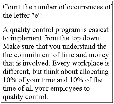
Variation exists in all processes. This is something that should be obvious, but we often forget it. Here’s a simple exercise to illustrate this. Perform the exercise in the box before you read any further.

There are several reasons why two different people could come up with different answers to this exercise. First, there is human error, it’s easy to miss things. Second there are ambiguous situations-did you include the sentence of instructions in your count? Third, people may apply different standards-do you include capital letters in your count?
If variation exists in a simple exercise like this, how much more likely is it to occur in a complex work process?
Exercise: Select a work process in your area. List all of the possible causes for variation in that work process.
Variation comes in two flavors. Not all types of variation are the same, and treating them so creates problems. Common causes of variation are factors that are present at all times that contribute to variation in all of the output from a work process. Special causes of variation are factors which appears sporadically and contribute to variation for only some of the output from a process. Special causes can usually be assigned to a particular source.
Deming had a “red bead” exercise that he used in all his course. Five volunteer workers would dip their paddles into a bag of red and white beads in order to “produce” white beads. Inspectors count the number of defective (red) beads and then Deming praises or chastises the workers according to their output. A second round of production ensues and the workers who did well the first time slip back and those who did poorly end up doing better. The cycle continues with Deming trying to exhort the workers to do better, when it was actually the process itself that was causing the variation.
The red bead experiment is a classic example of taking a common cause of variation and labeling it a special cause. Managers love to do this. Any small change in the process has to have a “variance report” that finds a specific person of thing to blame.
Exercise: examine the sources of variation in the previous exercise. Classify them as common cause or special cause variation.
There are established ways to reduce variation. There are good and bad ways to reduce variation, but unfortunately there are more bad ways than good ways. Here are some examples of bad ways to reduce variation:
- Rewards and punishments.
- Posters and slogans.
- Blame the workers.
The best way to reduce variation is to identify special causes of variation and then remove them. Once the special causes are gone, you have a stable process that is amenable to experimentation. Run experiments to remove common causes of variation.
Identify and remove special causes. This step has to come first. Monitor your process using a control chart when you find a point out of control, investigate and find the assignable cause to that out of control point. Fix that problem and continue to monitor the work process.
Identify and remove common causes. This step has to come second. Once the process is in control, you then have to identify common factors that influence all of the output. Manipulate these common factors in experiments to reduce variation.
It’s very important to remove all special causes first. You can’t run an experiment effectively if there are special causes which appear at unexpected times. They’ll contaminate the experiment and make the results much harder to interpret.
Step 2. Measure your process.
It was Socrates who first said that an unexamined life is not worth living. As a professional statistician, I believe that an unanalyzed data set is not worth collecting. There are several ways to measure a work process.
- Flow diagrams
- Pareto charts
- Cause and effect diagrams
- Control charts
There are plenty of resources for how to use each of these tools, but the key question should be, what should I measure? My advice is to start small and start well downstream.
Start small. There is a large start-up cost for a quality control program and you don’t want to try to do everything at once. Look for the low hanging fruit–those areas where it is easy to measure things and where there is a strong prospect for time/money savings.
Start well downstream. By “downstream,” I mean near the end of the entire work process. Measure something that represents the end-product–what the customer sees. As you start to understand the end-product better then you will need to look at some of the intermediate processes that contribute to the end-product. This is moving upstream.
Step 3. Experiment.
Once you have established a stable process, you want to improve that process, either by lowering the mean or shrinking the width of the control limits. Experimentation is the key to either approach.
When you run an experiment, you should follow the PDSA cycle (Plan-Do-Study-Act).
Plan. What sort of change to the work process are you considering? What is the current work process? How well/poorly does the current work process do?
Do. Implement the planned change. Measure the impact of the change.
Study. Analyze the measurements. Did the change make things better or worse?
Act. If the change is better, implement that change in all future work. Make sure that the change persists.
The whole experiment will probably raise new questions to study, which starts the whole cycle over again.
Exercise: All four steps in the PDSA cycle are important. What happens if skip the Study step? What happens if you skip the Act step?
Summary
Setting up a quality program is not easy. First get management support. Without that support all your efforts will be refocussed at the first work crisis. Second, measure your process. Start small and start well downstream. Third, experiment. Follow the plan, do, study, act cycle.
Web Resources
A Few Definitions. Clark TJ. Accessed on 2004-03-11. www.successthroughquality.com/glossary.htm
Turning Top Management Reluctance into Six Sigma Support. Devane T, iSixSigma. Accessed on 2004-03-11. www.isixsigma.com/library/content/c040308a.asp
PDCA Cycle. HCi Services. Accessed on 2004-03-11. www.hci.com.au/hcisite2/toolkit/pdcacycl.htm
Flow Charts. Kimbler DL. Accessed on 2004-03-10. deming.eng.clemson.edu/pub/tutorials/qctools/flowm.htm
Deming’s Red Bead Experiment. Martin JR. Accessed on 2004-03-11. www.maaw.info/DemingsRedbeads.htm
Understanding Variation [pdf]. Nolan TW, Provost LP. Accessed on 2004-03-11. www.apiweb.org/UnderstandingVariation.pdf
Pareto Chart. Simon K, iSixSigma. Accessed on 2004-03-11. www.isixsigma.com/library/content/c010527a.asp
Cause & Effect Diagram. Skymark Corporation. Accessed on 2004-03-11. www.skymark.com/resources/tools/cause.asp
Control Charts as a tool in SQC (Statistical Quality Control). Sweat S, Terala K, Troha K, Williamson K. Accessed on 2004-03-11. deming.eng.clemson.edu/pub/tutorials/qctools/ccmain1.htm
Common Control Chart Cookbook. Sytsma S, Manley K, Ferris State University. Accessed on 2004-03-11. www.sytsma.com/tqmtools/charts.html
Deming cycle PDSA model framework: Plan Do Study Act continuous improvement. Value Based Management. Accessed on 2004-03-11. www.valuebasedmanagement.net/methods_demingcycle.html
Books
An Application of Control Charts to Data Quality Improvement. [Additional informational information misplaced.]
Measuring Quality Improvement in Healthcare: A Guide to Statistical Process Control Applications. Carey RG, Lloyd RC (1995) New York: Quality Resources.
Understanding Statistical Process Control, Second Edition. Wheeler DJ, Chambers DS (1992) ISBN: 0-945320-13-2.
Understanding Variation: The Key to Managing Chaos. Wheeler DJ (1993) Knoxville, TN: SPC Press Inc. ISBN: 0-945320-35-3.
Appendix: Examples of control chart calculations
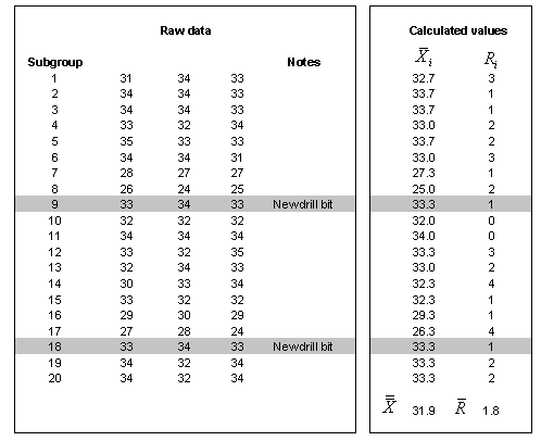
Here is some data on a work process that involves drilling. I’m not quite sure where I originally found this data.

Notice that the drill bit is replaced after nine days. The right had side shows some simple calculations for a control chart. You compute an average and a range for each subgroup. The averages are then averaged to get an overall mean (Xbarbar) and an average range (Rbar).

The formulas for the control limits are

where the constant, A2, can be found in any quality control text book. The chart for the range looks like

and the formulas for the control limits are

Again, the constants, D3 and D4, are in any quality control text book.
Exercise: What change to the work process does this control chart suggest?
Rules for identifying special causes.
There are many rules that have been proposed for deciding when a special cause has occurred. A good summary of these rules appears on pages 135-140 of Wheeler (1995).
The simplest rule, and the one that appears to be universally adopted is when a single point lies outside the control limits. This indicates a sudden large shift in the process.
A second rule is to declare a special cause variation when eight consecutive points lie on the same side of the center line. This rule is attractive because it is simple to apply and it is sensitive to gradual shifts or trends that the first rule might miss.
Other rules involve dividing the control chart into zones (e.g., more than one standard deviation from the center line, more than two standard deviations from the center line) and noting whether two out of three or three out of four points fall into certain zones. There are also rules about a sequence of consecutively increasing or consecutively decreasing points or a sequence that hops too frequently from one side to the other of the center line or a sequence that hugs too closely to the center line.
On page 139, Wheeler warns that too many rules increase the chances for a false alarm. The first two rules (one point outside control limits; eight consecutive points on the same side of the center line) work very well in practice and there is little justification for adopting more complex rules. This is especially true if you are just starting out with a quality control program.
Control charts for individual values
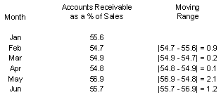
Sometimes, there is no easy way to grab a batch of two or more measurements. The measurements that you get are distinct and cannot be put into batches without some degree of “ad hoc”ery. For these situation, an XmR chart works well. Here is an example.


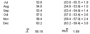
This example appears in section 6.4 of Wheeler and Poling (1998). The data represents accounts receivable as a percentage of sales. This is an important accounting ratio that describes how quickly bills are collected. A large percentage is bad and indicates that accounts receivable tends to be slow or overdue.
Rather than compute a range within a batch, a moving range is computed. The moving range is the range between each successive pair of observations. The moving range provides an alternative method for measuring short term variation. The average of the moving ranges is used to compute control limits using formulas similar to those shown above.
Here is what the control limits look like

There is also a moving range chart for this data, which I do not display.
Control charts for counts
There are several control chart choices when your data represents counts. The simplest choice is the c-chart. Here’s an example that appears on page 272 of
- SPC for the Rest of Us: A Personal Path to Statistical Control. Hy Pitt (1994) Reading, Massachusetts: Addison-Wesley Publishing Company, Inc. [BookFinder4U link]](http://www.bookfinder4u.com/detail/0201563665.html) (Statistics, Control Charts)
The data appears below:

The average number of defects is

The formula for the control limits is

In this example, the lower control limit is negative, which is impossible. When this happens, you should set the lower control limit to zero. The control chart looks like the following:

Note that any number of defects from 0 to 5 would be considered common cause variation. There are two special causes to investigate: hoods #6 and #13. Although the author of this example does not give a specific explanation for these two points, he does offer the following possibilities: differences in the diligence or training among inspectors; a counting/recording error; or some change in the manufacturing process itself.
The C chart has potential application to the surveillance of employee injuries and illnesses. An example of such a chart even appears in the book Wheeler and Poling (page 186). Nevertheless, there are several difficulties with using a C chart for injuries and illnesses.
First, the assumptions of a Poisson distribution are questionable. If injuries and illnesses events in one month are correlated with one another, then the assumptions are a Poisson distribution are violated. A simple example of correlation would be if one of the illness categories represented an infectious disease like influenza. The assumptions of the Poisson distribution are also violated if there is heterogeneity in the distribution of injury and illness events. This might occur if certain times of the months, certain employees, or certain areas of the workplace, are more prone (or less prone) to have specific injuries and illnesses.
Which chart should I use?
Eventually, you should learn how to run a wide range of control charts. But to start with, I would encourage you to learn the XmR chart first. This is the simplest and most versatile chart and can handle most commonly encountered situations. It is not always as efficient as an Xbar/Rbar chart, but simplicity rather than efficiency is more important when you are just starting.
You can find an earlier version of this page on my original website.