P.Mean >> Statistics webinar
>> The first three steps in a descriptive data analysis, with examples in PASW/SPSS
(to be presented in November 2009).
This talk uses material from my old website
as well as some new material.
Content: This training class will give you a
general introduction to descriptive data analysis using PASW (formerly known as SPSS)
software. This class is useful for anyone who needs to analyze
research data. Students should know how to use a mouse and how to o pen
applications within Microsoft Windows. No statistical experience is
necessary. There are three steps that will help you get started with
descriptive data analysis.
Objectives: In this class, you will learn how to:
- distinguish between categorical and continuous variables;
- compute ranges and frequencies; and
- examine relationships among variables.
You will use two SPSS data sets for practice exercises:
bf.sav, and
housing.sav. If you have trouble downloading these files, try
Teaching strategies: Didactic lectures and individual computer
exercises.
Outline:
- Seating in the computer lab
- Spreadsheet or database
- General guide to data entry
- Importing spreadsheet data into SPSS
- Importing database files into SPSS
- Inputting a two-by-two table into SPSS
- Date calculations in SPSS
You will use two SPSS data sets for practice exercises:
bf.sav, and
housing.sav. If you have trouble downloading these files, try
Objectives: In this class, you will learn how to:
- distinguish between categorical and continuous variables;
- compute ranges and frequencies; and
- examine relationships among variables.
Outline:
- Pitch the pie! Ban the bar!
- Definition: Categorical data
- Definition: Continuous data
- Description of the breast feeding data set
- Description of the Albuquerque housing data set
- Practice exercises
- Steps in a descriptive model
- How to draw a box plot
- Displaying tables of percentages
- SPSS dialog boxes for descriptive analysis examples
- Please fill out an evaluation form
Pitch the pie! Ban the bar! (June 5, 2003).
This is an outline of a speech that I gave to
Bluejacket Toastmasters on June 5, 2003. It was also published at
I work a lot with numbers and I've found
that there is usually a good way to display those numbers and a bad way.
Here's an example.

It's a pie chart with bright bold colors and a deep 3-D effect. Is this a
good way to display the data? WRONG! You should pitch the pie.
Here's another example.
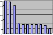
It's a bar chart with big bold purple bars. Is this a good way to display
the data? WRONG AGAIN! You should ban the bar.
These charts are useful once in a while, but most of the time all you need
is the numbers themselves. You don't have to surround them in a cloak of fancy
colors and graphic effects. The numbers by themselves are often all that you
need.
But you can't just toss the numbers onto a sheet of paper and hope that it
will work out well. You have to plan things. There are two things that can
help:
- a little bit of rounding, and
- a little bit of re-ordering.
Costs of pet ownership example
Shown below is a table loosely adapted from a web page on pet care. I've
taken a few liberties with some of the numbers to simplify this discussion,
but the numbers are fairly close to the values on that web page.
| |
Amphibians |
Birds |
Cats |
Dogs |
| Initial Cost1 |
113.41 |
354.17 |
298.70 |
341.92 |
| Food/Treats2 |
48.99 |
295.31 |
97.74 |
246.94 |
| Vet Bills/Meds2 |
48.70 |
354.39 |
193.08 |
317.24 |
| Misc. Costs2 |
41.11 |
116.06 |
64.19 |
211.57 |
| |
|
|
|
|
| |
Ferrets |
Fish |
Hermit Crabs |
Lizards |
| Initial Cost1 |
96.58 |
104.74 |
89.57 |
103.84 |
| Food/Treats2 |
101.86 |
58.68 |
32.79 |
296.84 |
| Vet Bills/Meds2 |
150.86 |
43.60 |
21.72 |
348.00 |
| Misc. Costs2 |
60.10 |
103.28 |
7.97 |
92.78 |
| |
|
|
|
|
| |
Rodents |
Snakes |
Tarantulas |
|
| Initial Cost1 |
53.16 |
97.31 |
101.11 |
|
| Food/Treats2 |
52.54 |
295.93 |
48.43 |
|
| Vet Bills/Meds2 |
52.00 |
153.83 |
23.68 |
|
| Misc. Costs2 |
61.56 |
70.06 |
43.32 |
|
1includes items like cost of the pet, initial shots, litter box,
collar, aquarium, etc.
2yearly cost. This cost will vary based on the size of the pet.
The initial cost would include the cost of the pet, litter box for a cat,
collar and leash for a dog, aquarium for fish, and so forth. These are also
averages and would not apply to someone who gets diamond studded collars for
their pets. Also the average food cost for a small Yorkie is not going to
compare the average food cost for a big Siberian Husky.
Look at this table and tell me what patterns you see. A few patterns might
appear
- snakes and lizards are more expensive than I would have thought.
- hermit crabs and rodents are fairly inexpensive.
But it takes a lot of squinting and staring to discover these patterns.
This table needs some work. The first thing is to do some rounding.
Rounding
Rounding is important because it reduces the strain on your brain. You
don't have to work so hard to uncover patterns in the data.
When you look at a table of numbers, the first thing you often do is to
make comparisons. These comparisons often involve an implicit subtraction.
For example, you might wonder to yourself "How much difference is there
between the average vet bills for a dog and for a cat?"
The respective numbers are
317.24
193.08
Take some time to subtract here. This would tell you how much you would
save on yearly vet bills if you got a cat instead of a dog.
Let's see, four minus eight is ummm, borrow the one, ow, ow, ow, my brain
hurts.
You can simplify life by rounding the data to one or two significant
figures. Here are the rounded costs
320
190
If I asked you to subtract those two numbers, you should be able to tell me
the answer quickly and painlessly--130. My wife, an avid dog lover, would tell
you that dogs are worth every penny!
When you round, you lose a little bit in precision. In this example, we're
off by about six dollars or so. But the small loss in precision is more than
made up for by the big gain in comprehension.
People I work with often don't like to round their numbers. It took a lot
of effort to get that 317.24, by golly, and I don't want to throw any of that
away.
Sometimes they will round their numbers but not enough. "Why can't I
keep a third digit?" they ask. It turns out that the third digit will give
you brain pain.
There's a reason for this. Inside your brain is a spot for short term
memory storage. It can usually hold about four pieces of information without a
problem. Anything more causes an overload and slows things down.
A pair of two digit numbers will fit into short term memory very easily,
but a pair of three digit numbers will not.
In the vet costs example, rounding to three significant figures means
rounding to the nearest dollar rather than to the nearest ten spot. This leads
to the following subtraction.
317
193
Ow, ow, ow, my brain hurts again.
Re-ordering
When you arrange these numbers, try to anticipate the possible comparisons
and then place the numbers close to one another. You have a choice here. You
can orient the numbers horizontally,
320 190
by placing them within the same row. You could also orient the numbers
vertically,
320
190
by placing them in the same column.
Which orientation is best for subtracting?
The vertical orientation appears far more natural for doing a subtraction.
Also be sure to place the larger number above the smaller one. If you had the
smaller one on top
190
320
it doesn't work as well.
Try to sort your numbers from high to low. If you have more than one column
of numbers, use the first column, use the last column, or use the average of
all the columns. It doesn't matter too much. A few of your numbers might not
be in perfect order, but these deviations are actually interesting, as you
will see in the example below.
Sorting by one of the columns will do a lot for your data, and if almost
always better than the usual approach of alphabetizing by labels.
Have you ever seen a list of numbers for each of the fifty states. It's
almost always alphabetical, but most of the time this places states next to
one another that have almost nothing in common. Alaska is always between
Alabama and Arkansas. Wisconsin is always between West Virginia and Wyoming.
There is nothing to recommend this approach.
Sure you can find your own state quickly, but then can you find other
states that are similar to your state?
A better approach would be to sort the states by some criteria. List the
states with the largest square miles at the top (Alaska, Texas, California)
and put the states with the smallest square miles at the bottom (Connecticut,
Delaware, Rhode Island).
Or list the states with the most people at the top (California, Texas, New
York) and with the fewest people at the bottom (Alaska, Vermont, Wyoming).
Costs of pet ownership example, reworked
Here is the same table reworked. I rounded each value, and re-oriented the
table so that the costs for each type of pet fell into the same column. I also
sorted the numbers based on the initial cost.
| |
Initial
Cost1 |
Food/
Treats2 |
Vet Bills/
Meds2 |
Misc.
Costs2 |
| Birds |
350 |
300 |
350 |
120 |
| Dogs |
340 |
250 |
320 |
210 |
| Cats |
300 |
100 |
190 |
60 |
| Amphibians |
110 |
50 |
50 |
40 |
| Fish |
100 |
60 |
40 |
100 |
| Lizards |
100 |
300 |
350 |
90 |
| Tarantulas |
100 |
50 |
20 |
40 |
| Snakes |
100 |
300 |
150 |
70 |
| Ferrets |
100 |
100 |
150 |
60 |
| Hermit Crabs |
90 |
30 |
20 |
10 |
| Rodents |
50 |
50 |
50 |
60 |
1includes items like cost of the pet, initial shots, litter box,
collar, aquarium, etc.
2yearly cost. This cost will vary based on the size of the pet.
This table is a lot easier to look at. You might notice a few new patterns
that weren't so obvious before.
- Birds, dogs, and cats all have about the same initial cost, but cats
have far smaller yearly costs.
- Lizards and snakes may not cost a lot at first, but they are expensive
to feed.
- Fish don't cost that much to buy and to feed, but have a lot of
miscellaneous costs, probably due to aquarium upkeep.
You will probably notice other interesting patterns.
Summary
If you are displaying numbers, pitch the pie and ban the bar. Most of
the time you are better off displaying the numbers themselves. Just be sure to
do a little bit of rounding and re-ordering first.
References
All of the ideas described above were championed by A.S.C. Ehrenberg three
decades ago. You can find more details in his book.
A Primer in Data Reduction. A.S.C. Ehrenberg (1982) New York: John
Wiley & Sons.
The web site where I got the numbers from is
How Much
Does it Cost to Own a Pet?. Steph Bairey. Accessed on 2003-06-04.
"There is plenty of information out there about how
to care for and train your pet. However, most leave out a very important
factor: what it will cost. The estimates below are expressed in US Dollars and
based on prices of food, accessories, and veterinary care in the Pacific
Northwest, USA; your expenses may vary. However, they are excellent
guidelines!" www.practical-pet-care.com/article_view.php?ver=22
The numbers on the web page were already rounded, so I had to "unround"
them for this example by adding a small random amount to each value. I also
replaced some of the zero values by a slightly larger number and made some
other minor adjustments. The costs reflected in my tables, however, are very
close to the ones on the web.
This webpage was written by Steve Simon on 2003-06-05, edited by
Steve Simon and was last modified on 07/08/2008.
Category: Graphical display
Categorical versus continuous variables
Many of the choices you will make in a descriptive data analysis depend on
whether the variable is categorical or continuous. Here's a brief reminder about
what these terms mean.
What is categorical data?
Data that consist of only small number of values, each
corresponding to a specific category value or label. Ask
yourself whether you can state out loud all the possible values of your data
without taking a breath. If you can, you have a pretty good indication that your
data are categorical. In a recently published study of breast feeding in
pre-term infants, there are a variety of categorical variables:
-
Breast feeding status (exclusive, partial,
and none);
-
whether the mother was employed (yes, no);
and
-
the mother's marital status (single, married,
divorced, widowed).
This webpage was written by Steve Simon on 2002-10-11, edited by
Steve Simon, and was last modified on 2008-07-08. This page needs major
revisions. Category: Definitions.
What is continuous data?
Data that consist of a large number of values, with
no particular category label attached to any particular data value. Ask
yourself if your data can conceptually take on any value inside some interval.
If it can, you have a good indication that your data are continuous. In a
recently published study of breast feeding in pre-term infants, there are a
variety of continuous variables:
- the infant's birth weight in grams;
- the mother's age in years; and
- the distance from the mother's home to the hospital in
miles.
This webpage was written by Steve Simon on 2002-10-11, edited by
Steve Simon, and was last modified on 2008-07-08. This page needs major
revisions. Category: Definitions.
Stats >>
Training >> Description of the breast feeding data set.
The file bf.sav contains data from a research
study done at Children's Mercy Hospital and St. Luke's Medical Center. The
data comes from a study of breast feeding in pre-term infants. Infants were
randomized into either a treatment group (NG tube) or a control group
(Bottle). Infants in the NG tube group were fed in the hospital via their
nasogastral tube when the mother was not available for breast feeding. Infants
in the bottle group received bottles when the mothers were not available. Both
groups were monitored for six months after discharge from the hospital.
Variable list
- MomID Mother's Medical Record Number
- BabyID Baby's Medical Record Number
- FeedTyp Feeding type (Bottle or NG Tube)
- BfDisch Breastfeeding status at hospital discharge (Excl, Part, None)
- BfDay3 Breastfeeding status three days after discharge (Excl, Part,
None)
- BfWk6 Breastfeeding status six weeks after discharge (Excl, Part, None)
- BfMo3 Breastfeeding status three months after discharge (Excl, Part,
None)
- BfMo6 Breastfeeding status six months after discharge (Excl, Part, None)
- Sepsis Diagnosis of sepsis (Yes or No)
- DelType Type of delivery (Vag or C/S)
- MarStat Marital status of mother (Single or Married)
- Race Mother's race (White or Black)
- Smoker Smoking by mother during pregnancy (Yes or No)
- BfDurWk Breastfeeding duration in weeks
- AB Total number of apnea and bradycardia incidents
- AgeYrs Mother's age in years
- Grav Gravidity or number of pregnancies
- Para Parity or number of live births
- MiHosp Miles from the mother's home to the hospital
- DaysNG Number of days on the NG tube.
- TotBott Total number of bottles of formula given while in the hospital
- BirthWt Birthweight in kg
- GestAge Estimated gestational age in weeks
- Apgar1 Apgar score at one minute
- Apgar5 Apgar score at five minutes
Note: as I revise and improve this data set, I may add or remove variables
from this list. So if the variables shown above don't match perfectly with the
data set you have, don't panic.
Also note that I use different notation ("treatment" instead of "ng tube"
and "control" instead of "bottle") in other parts of this website.
Source
Kliethermes PA; Cross ML; Lanese MG; Johnson KM; Simon SD [1999].
Transitioning preterm infants with nasogastric tube supplementation: increased
likelihood of breastfeeding. J Obstet Gynecol Neonatal Nurs 28(3): 264-273
Stats >>
Training >> Description of the breast feeding data set
Stats >>
Training >> Housing data
The file housing.sav (also available as
a text file) is "a random sample of records
of resales of homes from Feb 15 to Apr 30, 1993 from the files maintained by
the Albuquerque Board of Realtors. This type of data is collected by multiple
listing agencies in many cities and is used by realtors as an information
base." There are 117 records in this database.
Variable Names:
- Price = Selling price (in dollars)
- SquareFeet = Square feet of living space
- AgeYears = Age of home (years)
- NumberFeatures = Number out of 11 features (dishwasher, refrigerator,
microwave, disposer, washer, intercom, skylight(s), compactor, dryer,
handicap fit, cable TV access
- Northeast = Located in northeast sector of city (Yes or No)
- CustomBuild = Custom built (Yes or No)
- CornerLot = Corner location (Yes or No)
The original data set had selling price in hundreds of dollars, but I found
it useful to convert this to dollars. This data set also had a column for
annual taxes, which I did not include in this data set.
Source:
http://lib.stat.cmu.edu/DASL/DataArchive.html The Data and Story
Library. Link last checked on May 11, 2004. "DASL (pronounced
"dazzle") is an online library of datafiles and stories that illustrate the
use of basic statistics methods. We hope to provide data from a wide variety
of topics so that statistics teachers can find real-world examples that will
be interesting to their students. Use DASL's powerful search engine to locate
the story or datafile of interest."
Stats >>
Training >> Housing data
Stats >>
Training >> Stats #02: Practice Exercises
These exercises refer to three data sets:
- BF.SAV, a study of breast feeding in pre-term infants;
- HOUSING.SAV, a study of housing prices in Albuquerque.
You should have both files on a floppy disk, which is attached to your
handout.
1. For the breast feeding data, compute a frequency table for all the
values (not just the first ten) of the mother's medical record number. Verify
that no mother of triplets was included in this study.
2. For the breast feeding data, compute a frequency table for the infant's
medical record number. Confirm that no infant appears twice in this study.
3. Open the file HOUSING.SAV. How many houses are in this sample?
4. An important portion of the breast feeding study is an examination of
side effects of the treatment. Some of the important side effect variables
are:
- Sepsis (SEPSIS),
- Total apnea and bradycardia incidents (TOTAL_AB),
The first variable in this list is categorical and the second is
continuous. Compute and interpret frequencies and ranges as appropriate for
these of these variables.
5. Other important variables in this study are breast feeding status at
discharge (BF0), three days after discharge (BF1), three months after
discharge (BF3), and six months after discharge (BF4). All of these variables
are categorical. Summarize these variables using frequency tables. Note: BF2
refers to breast feeding status six weeks after discharge, but because this
variable was not evaluated prospectively, the researchers decided not to
include it in any analysis.
6. In the housing data set, three important variables are the size of the
house (SQFT), whether the house was custom built (CUST) and the sales price of
the house (PRICE). Which of these variables are continuous and which are
categorical? Summarize the continuous variables using frequencies and ranges
as appropriate.
7. In the breast feeding study, examine the relationship between the
treatment group (FEED_TYP) and all of the side effect variables discussed
above.
8. In the breast feeding study, examine the relationship between the breast
feeding at discharge (BF0) and the treatment group (FEED_TYP), Mother's age (MOM_AGE),
type of delivery (DEL_TYPE), birth weight (BW), gestational age (GEST_AGE),
one and five minute Apgar scores (APGAR1, APGAR5), and age at discharge (DC_AGE).
9. In the housing study, examine the relationship between sales price
(PRICE) and all other variables in the data set.
10. In the housing study, examine the relationship between whether a home
was custom built (CUST) and whether it is more likely/less likely to be found
on a corner lot (COR) or in the northeast region of the city (NEC).
Stats >> Model
>> Steps in a descriptive model (October 11, 2001)
Every data analysis should start with
a descriptive or exploratory analysis. If you have no research
hypotheses, then you can stop with this. If you do have research hypotheses,
the analysis will provide a solid foundation for any further
statistical analysis.
Here are three steps that seem to work well
for many descriptive analysis:
- Know your count.
- Compute ranges and frequencies.
- Examine relationships.
These steps may not be appropriate for every
analysis, but they do serve as a general guideline. In this presentation, you
will see these steps applied to data from a breast feeding study, using SPSS
software.
Learning objectives
In this presentation, you will learn how to:
- Organize a plan for a
descriptive data analysis.
- Produce and interpret statistics
for a descriptive analysis
- Examine relationships
using tables and graphs.
Know your count
You need to get a feel for how much
data you have. This includes the number of subjects
in your study; and the number of data values that are missing.
When you have a count of the number of subjects in your study, keep that in
mind when you examine any statistical procedures. If the total sample size in
any of these procedures is less than your count, you may have problems with an
undetected missing value.
This seems like a simple thing, but often
there are subtle details that you can't ignore. For example, the following
table lists the first 10 mothers in the study.
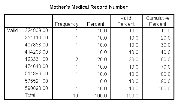
Notice that one mother appears twice.
Further investigation shows that she is the mother of twins,
both of whom were enrolled in the study. In this study, there were other
twins, so the full data set includes 84 infants, but only 72 mothers.
The presence of twins in the study greatly complicates the analysis, but we
will not discuss those complications in this presentation.
Pay very special attention to counts
when you are dealing with clusters or repeated measurements. An
example of clusters would be when you randomly select families of subjects.
For this type of study, you should note both the number of families in the
study and the number of family members in the study. An example of repeated
measurements would be when you examine a patient several times. For this type
of study, note both the total number of patients and the total number of
exams.
Compute ranges and frequencies
You should know what the maximum and
minimum values are for all the important variables in your data set.
If any of these are surprising, you should investigate. You should also know
how many observations fall into each level of any important
categorical variables.
Our outcome measure, the age when breast
feeding was stopped is a continuous variable. Here is a table of statistics
for this variable, including the minimum and maximum variables.
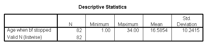
At first glance, the maximum value (34 weeks)
seems a bit large (the study followed infants for only 24 weeks after
discharge). But when I talked to the nurses involved, they explained that the
length of breast feeding included the time the infants were in the hospital.
Also notice that the sample size for this
table (82) is less than the total number of data points. This serves as a
reminder that some of the data are missing for the age when breastfeeding was
stopped
Other tables (not shown) tell us that the
birth weights ranged from 1 kilogram to 2.4 kilograms and the gestational age
from 26 to 36 weeks. These are reasonable values for a population of pre-term
infants. The youngest and oldest mothers are 16 and 44 years old respectively,
which is also quite reasonable.
Race/ethnicity is a categorical variable. Here
is a table for frequencies for this variable.
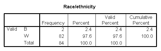
This table shows that the patient
population is almost exclusively white. Not only is this valuable for
writing up the description of the patient population in your research paper,
it also indicates that any attempt to account for race in later models
is probably a waste of time.
Examine relationships
You should have a general idea of how
one variable changes as another one changes. For two categorical
variables, we can examine this using crosstabs. For two
continuous variables, we can examine this using a scatterplot.
For a relationship between a continuous and a categorical variable, we can use
boxplots.
The following is a crosstabulation of
feeding type versus delivery type. Notice that I have placed feeding
type as the rows of the table.
Sometimes these tables are easier to interpret
with percentages. I selected the row percentages option to get the following
table.
We can see that there was a roughly 50-50
change for a C-section birth to find itself in the treatment or control group.
In the vaginal birhts, however, there was a slightly greater tendency to be
found in the control group. This is an imbalance which might cause problems
with interpretation of the results.
Does delivery type also influence duration of
breast feeding? The following box plot shows that c-section births tend to
have longer durations than vaginal births, a somewhat surprising finding.
Because delivery type is related to both feeding type and duration of breast
feeding, we should be sure to examine delivery type as a potential confounding
variable in any analysis.
The mother's age is an important factor in any
breast feeding study. Here is a boxplot comparing ages in the two feeding
groups.
We see that the NG tube group has older
mothers than the bottle group. Further statistical analysis shows that the
average age is 29 in the NG tube group and 25 in the bottle group, a
difference of 4 years.
We also should examine the relationship
between mother's age and duration of breast feeding. The following scatterplot
shows a slight tendency for older mothers to breast feed longer.
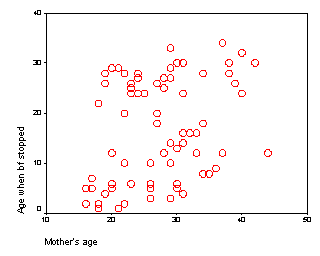
As with delivery type, we we should be careful
to adjust for mother's age in any comparison of the two feeding groups.
This webpage was written by Steve Simon and was last modified on
07/08/2008.
What is a boxplot? (October 15, 2002)
The box plot is a graphical display of a five number summary. Sometimes the
box plot is also known as a box and whiskers plot.
Here are the four steps you follow to draw a boxplot.
- Draw a box from the 25th to the 75th
percentile.
- Split the box with a line at the median.
- Draw a thin lines (whisker) from the 75th percentile up to the
maximum value.
- Draw another thin line from the 25th percentile down to the
minimum value.
The length of the box in a box plot, i.e., the distance between the 25th
and 75th percentiles, is known as the interquartile range. You can use this
box length to detect outliers. If any whisker is more than 1.5 times
as long as the length of the box, then we have evidence of
outliers. A common variation on the box plot is to draw the whisker
to the value which is just shy of 1.5 box lengths away, and highlight each
individual data point more than 1.5 box lengths away.
This webpage was written by Steve Simon on 2005-08-18, edited by
Steve Simon, and was last modified on 2008-07-08. This page needs minor
revisions. Category: Definitions,
Category: Graphical display.
How to set up tables.
It's not always clear how to best set up a crosstabs in SPSS. Here are some
guidelines that might help.
Displaying tables of percentages (November 6, 2002)
Category: Ask Professor Mean,
Category: Writing
research papers
Dear Professor Mean, My colleagues and I argue over the most appropriate
way for displaying tables of percentages. Must the row or column always add to
100%? Also, in cases where it is difficult to know which variable is dependent,
how does one decide the best way to present the results? -- Garrulous Gail
Dear Garrulous,
When you are deciding how to display two by two (or larger) tables, you
have a variety of ways to do this. No way is correct all the time, and some of
choices reflect subjective judgment. But here are some rules I use.
1. Never display more than one type of number in a table.
Statistical software like SPSS can produce counts, row percents, column
percents, cell percents, expected counts, residuals, and/or cell contribution
to chi-squared values. At one time or another you might want to use each of
these statistics, but never all at one time. Two or more numbers in a table
causes confusion and makes your tables harder to interpret.
Present a single summary statistic in the table if at all possible. If you
need to display two summary statistics (for example, both counts and row
percentages), then place the counts in one table and the row percentages in a
different table. If you have to fit them in the same table, place the two
numbers side by side with the less important number appearing second and in
parentheses For example, 54% (257).
2. Row percentages are usually best. Row percentages are
the percentages you compute by dividing each count by the row total. Row
percentages place the comparison between two numbers within a single column,
so that one number is directly beneath the number you want to compare it to.
This is usually better than column percents, where the numbers you want to
compare are side by side. If you find that column percentages make more sense.
Consider swapping the rows and columns.
If you find that cell percentages make the most sense, consider creating
composite categories that combine the row and column categories. Cell
percentages are the percentages that you get when you divide each cell count
by the overall total. When cell percents are interesting, it usually means
that you are interested in the four distinct categories in your two by two
table. For example, you are interested in seeing what fraction of job
candidates are white males, rather than seeing how the probability of being
male influences the probability of being white. For this type of data, treat
it as a single categorical variable with four levels (white males, white
females, black males, black females) rather than two categorical variables
with each having two levels (black/white, male/female).
3. Place the treatment/exposure variable as rows and outcome
variable as columns. This relates to the above item. You usually are
interested in the probability of an outcome like death or disease, and you are
interested in how this probability changes when the treatment or exposure
changes. Arranging the table thusly and using row percents usually gets you
the comparison you are interested in.
4. If one variable has a lot more levels than the other variable, place
that variable in rows. A table that is tall and thin is usually easier to
read than a table that is short and wide. It is easier to scroll up and down
rather than left and right. For a really large number of levels, you might
have to print your table on two or more pages. Usually it is a lot easier to
align these pages if the table is tall and thin. A short wide table that is
split on two or more pages is often a disaster.
5. Whenever you report percentages, always round. A change
on the order of tenths of a percent are almost never interesting or important.
Displaying that tenth of a percent makes it harder to manipulate the numbers
to see the big picture.
6. Don't worry about whether your percentages add up to 99% or
101%. First of all, it can't happen with a two by two table unless
you round incorrectly. For a larger table, it can happen, but your audience is
sophisticated enough to understand why this is the case. No one, for example,
is going to be upset when 33% plus 33% plus 33% adds up to less than 100%.
7. When in doubt, write out your table several different ways.
Pick out the one that gives the clearest picture of what is really happening.
Don't rely on the first draft of your table, just like you would never rely on
the first draft of your writing.
Examples
A simple fictitious example will help illustrate these points.
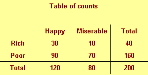
We classify people by their income (rich/poor) and also by their attitude
(happy/miserable). There are, for example, 30 rich happy people in our
sample and 70 poor miserable people.
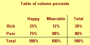
This figure shows column percentages. We compute this by dividing each
number by the column total.
We see for example that only 25% of all happy people are rich. This is a
conditional probability and is usually written as P[Rich | Happy]. Read the
vertical bar as "given." So this probability is read as the probability of
being rich given that you are happy.
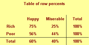
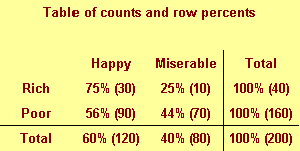
This figure shows row percentages. We compute this by dividing each number
by the row total.
We see, for example that 75% of rich people are happy. This is a different
conditional probability, P[Happy | Rich]. Read this as the probability of
being happy given that you are rich.
Notice the distinction between the two probabilities. Only a few happy
people are rich, but most rich people are happy.
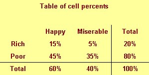
This figure shows cell percentages. We compute this by dividing each number
by the grand total. Each percentage represents the probability of having two
conditions. For example, there is a 15% chance of being rich and happy.

The table above shows a good format for combining two numbers in a single
table.
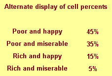
This is an alternate way of displaying cell percentages.
If we had a six categories for attitude rather than just two, we might
arrange the table differently.
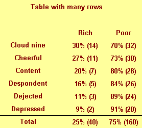
Notice that this table would not require any sideways scrolling.
Summary
- Never display more than one type of number in a table.
- Row percentages are usually best.
- Place the treatment/exposure variable as rows and outcome variable
as columns.
- If one variable has a lot more levels than the other variable, place that
variable in rows.
- Whenever you report percentages, always round.
- Don't worry about whether your percentages add up to 99% or 101%.
- When in doubt, write out your table several different ways.
This webpage was written by Steve Simon and was last modified on
07/08/2008.
Stats >> Model
>> SPSS dialog boxes for a descriptive analysis (June 21, 2002)
This handout will show the SPSS dialog boxes that I used to create the
examples in the descriptive data analysis handout. I will capitalize variable
names, field names and menu picks for clarity.
Compute frequency counts
Select ANALYZE | DESCRIPTIVE STATISTICS | FREQUENCIES from the SPSS menu.
You will see the following dialog box:
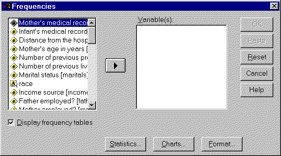
Click on RACE and then click on the right arrow button to add it to the
VARIABLE(S) field.
Find minimum and maximum values.
Select ANALYZE | DESCRIPTIVE STATISTICS | DESCRIPTIVES from the SPSS menu.
You will see the following dialog box.
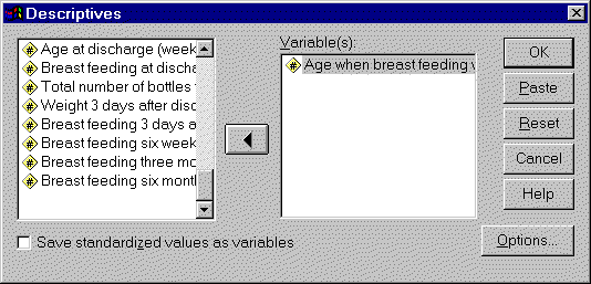
Select your variable in the list on the left and click on the arrow button
to add it to the VARIABLE(S) field. You can repeat this for additional
variables if needed.
Compute cross tabulations
Select ANALYZE | DESCRIPTIVE STATISTICS | CROSSTABS from the SPSS menu. You
will see the following dialog box.
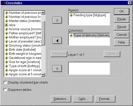
Select variables from the list on the left. Add one to the ROW(S) field and
another to the COLUMN(S) field. Click on the OK button to continue.
To produce row percents, select ANALYZE | DESCRIPTIVE STATISTICS |
CROSSTABS again. Notice that SPSS remembered your previous choices. How nice!
Now click on the CELLS button to get the following dialog box.
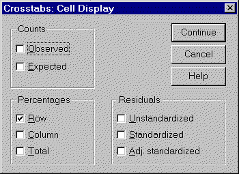
Check the ROW option. Now click on the CONTINUE button in this dialog box
and the OK button in the previous dialog box.
Drawing boxplots
Select GRAPHS | BOXPLOT from the SPSS menu. You will see the following
dialog box.
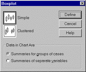
We will select the SIMPLE option and the SUMMARIES FOR GROUPS OF CASES
option here. A good rule of thumb is to always try the default options first.
You can always experiment with other options if needed, but the defaults in
SPSS usually work well.
You would use the CLUSTERED option if you want to see separate box plots
across the combination of two different categorical variables. You would
select the SUMMARIES OF SEPARATE VARIABLES if you wanted box plots for several
columns of data simultaneously.
When you click on the DEFINE button, you will see the following dialog box.
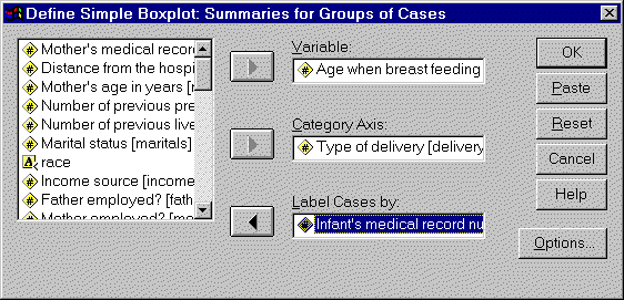
Select a continuous variable and add it to the VARIABLE field. Select a
categorical variable and add it to the CATEGORY AXIS field. You can leave the
LABEL CASES BY field blank if you like. The variable in this field provides
labels for any outliers that might be found in the box plots. If the field is
blank, SPSS labels outliers with the row number.
Draw a scatterplot.
Select GRAPHS | SCATTER from the SPSS menu. You will see the following
dialog box.
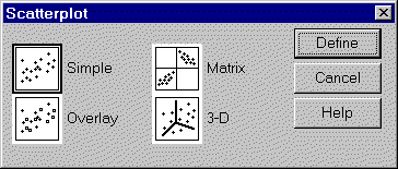
We will select the SIMPLE, the default option. You would select the OVERLAY
option instead if you wanted to plot more than two columns of data
simultaneously. You would select the 3-D option if you wanted to examine the
relationship among three continuous variables simultaneously. These 3-D graphs
look fancy, but they are often difficult to interpret. Another option which
works for three (or even more) variables in the scatterplot matrix. This
arranges graphs of all possible pairs of your data in a nice grid. When you
click on the DEFINE button, you will see the following dialog box:
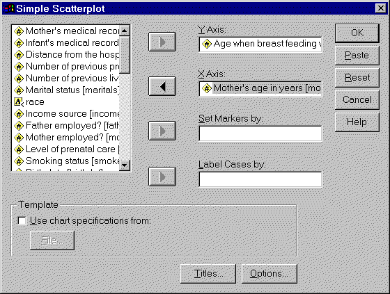
Select continuous variables for the Y-AXIS field and the X-AXIS field. The
remaining two fields are optional. If you place a categorical variable in the
SET MARKERS BY field, SPSS will use different marks for each level of your
categorical variable. If you place a variable in the LABEL CASES BY field,
thenvalues of that variable will appear as labels by each data point. With a
graph like ours with 87 points, those labels would make our graph far too
cluttered.
You may wish to modify or customize the graph that SPSS produces. To make
changes, double click on the graph. You will get a chart editor window that
looks like the following.
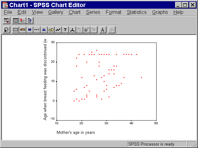
For example, the points displayed in this graph are too small and the wrong
shape. To modify this, select FORMAT | MARKER from the SPSS menu. You will see
the following dialog box.
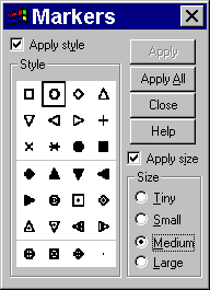
Select the open circle marker and the MEDIUM size option. Then click on the
APPLY ALL button. If you like this choice, click on the CLOSE button in the
above dialog box and select FILE | CLOSE from the chart editor window. The
modified graph will appear in the SPSS output window.
Stats >> Model
>> SPSS dialog boxes for a descriptive analysis
What now?
Go to the main page of the P.Mean website
Get help
 This work is licensed under a
Creative
Commons Attribution 3.0 United States License. This page was written by
Steve Simon and was last modified on
2017-06-15.
This work is licensed under a
Creative
Commons Attribution 3.0 United States License. This page was written by
Steve Simon and was last modified on
2017-06-15.