StATS: Examples of Pareto charts (created 2006-04-05)
The Pareto chart is a graphical display of categorical data that is intended to show the relative frequency of different events that all impact the quality of a process. The graph is typically drawn to examine the Pareto principle, also known as the 80-20 principle. The Pareto principle, which does not always work in the real world, but occurs often enough to merit its own name, says that 80% of the problems in a system can be attributed to 20% of the causes. There are applications in other areas as well (80% of the wealth in a country might be held by the richest 20% of the population, for example). The 80-20 split might actually be closer to 90-10 in some situations, or perhaps closer to 70-30 in other situations. Still it is worth remembering the a very few things in your workplace are responsible for most of your quality problems.
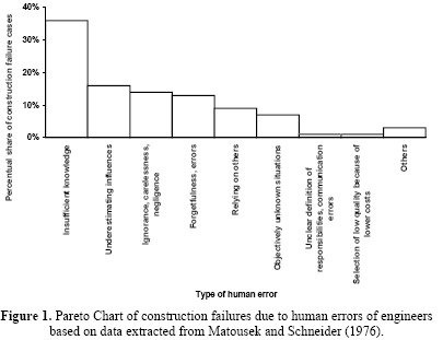
Here's an example of a Pareto chart.
Figure taken from Quality Improvement in the Construction Industry: Three Systematic Approaches [PDF]. Ilías Ortega, Soren Bisgaard, published February 2000 in Quality Management and Technology Report No. 10, February 2000. Accessed on 2006-04-05. www.domica.ch/pubs/report10.pdf
The vertical axis on the chart represents percentage of construction failure cases. The categories on this chart are
A pair of Paerto charts shown below have an interesting story.
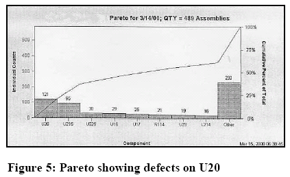
This Pareto chart shows defects on components of a circuit board. The categories are U20, U215, U225, U16, U17, R114, U23, L214, and Other.
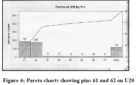
This Pareto chart focuses just on component U20 and examines pin defects. The categories are 61, 62, 67, 68, 64, 65, 58, 74, and Other.
The paper describes the investigative process
After sorting by board type, defect type and component reference designator, defects on U20, a .020” pitch QFP64 package on the top of the board were found to be much higher than on any other part. Setting up another quick series of Pareto charts indicated that the vast majority of defects were solder bridges. The next Pareto showed that they were on pins 61 and 62. (Figures 5 and 6) The process engineer took this information to this to the stencil print step, where a minute “dimple” was found in the stencil material between the apertures for pins 61 and 62. This allowed paste to be squeezed onto the board between the pins, causing a high occurrence of bridging. As this example demonstrates, performing a Pareto analysis usually requires several ad hoc queries to drill down to the root of the problem. A tool that allows quick and easy resorting and charting makes this process is needed to make the Pareto process efficient for the troubleshooter. quoted in Using Production Defect Data to Improve an SMT Assembly Process Glen Leinbach, published in the Proceeding of SMTA International, 2000. Accessed on 2006-04-06. www.smta.org/files/SMTAI00-Leinbach.PDF
A final Pareto chart is found in a study of chest xrays.
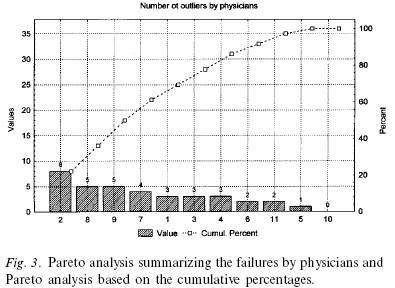
Figure taken from Quality assurance in radiotherapy of breast cancer--variability in planning target volume delineation. M. A. Pitkanen, K. A. Holli, A. T. Ojala, P. Laippala. Acta Oncol 2001: 40(1); 50-5. [Medline] [PDF]
This chart showed reading failures by physicians. I do not like this chart very well as it tends to place the focus of quality improvement on the individual doctors rather than in the work environment itself.
Further reading
This page was written by Steve Simon while working at Children's Mercy Hospital. Although I do not hold the copyright for this material, I am reproducing it here as a service, as it is no longer available on the Children's Mercy Hospital website. Need more information? I have a page with general help resources. You can also browse for pages similar to this one at Category: Quality control.