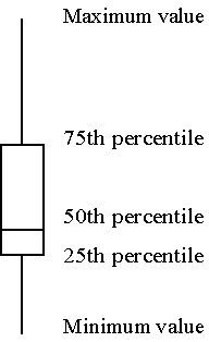
The box plot is a graphical display of a five number summary. Sometimes the box plot is also known as a box and whiskers plot.
Here are the four steps you follow to draw a boxplot.
- Draw a box from the 25th to the 75th percentile.
- Split the box with a line at the median.
- Draw a thin lines (whisker) from the 75th percentile up to the maximum value.
- Draw another thin line from the 25th percentile down to the minimum value.
The length of the box in a box plot, i.e., the distance between the 25th and 75th percentiles, is known as the interquartile range. You can use this box length to detect outliers. If any whisker is more than 1.5 times as long as the length of the box, then we have evidence of outliers. A common variation on the box plot is to draw the whisker to the value which is just shy of 1.5 box lengths away, and highlight each individual data point more than 1.5 box lengths away.
