[Previous issue] [Next issue]
Monthly Mean newsletter, January 2009
You are viewing the webpage version of the Monthly Mean newsletter for
January 2009. This newsletter was sent out on January 18, 2009.
The monthly mean for January is 16.0.
Welcome to the Monthly Mean newsletter for January 2009. If you are having
trouble reading this newsletter in your email system, please go to
www.pmean.com/news/2009-01.html. If you are not yet subscribed to this
newsletter, you can sign on at
www.pmean.com/news. If you no longer wish to receive this newsletter, there is a link to unsubscribe at the bottom
of this email. Here's a list of topics.
- Monthly Mean Quote.
- What is a boxplot?
- Crude versus adjusted comparisons.
- A false sense of frugality.
- Hide that randomization list.
- Monthly Mean Article: If we're so different, why do we keep overlapping?
When 1 plus 1 doesn't make 2.
- Monthly Mean Blog: Health Care Renewal.
- Monthly Mean Book: The Survey Research Handbook. Guidelines and
Strategies for Conducting a Survey.
- Monthly Mean Website: Regression with SAS Chapter 5: Additional coding
systems for categorical variables in regression analysis.
- Nick News: Nick the rollerblader.
- Very bad joke: Two statisticians were traveling in an airplane from LA
to New York.
- Tell me what you think.
1. Monthly Mean Quote.
Excellence in statistical graphics consists of complex ideas
communicated with clarity, precision, and efficiency. Graphical displays
should
- show the data
- induce the viewer to think about the substance rather than about the
methodology, graphic design, the technology of graphic production, or
something else
- avoid distorting what the data have to say
- present many numbers in a small space
- make large data sets coherent
- encourage the eye to compare different pieces of data
- reveal the data at several levels of detail, from a broad overview to
the fine structure
- serve a reasonably clear purpose: description, exploration,
tabulation, or decoration
- be closely integrated with the statistical and verbal descriptions of
a data set.
Edward Tufte, The Visual Display of Quantitative Data, Second Edition,
page 1. This excerpt summarizes Tufte's overall philosophy on design of
statistical graphics. Dr. Tufte continued an outline of his design philosophy
in two further books, Envisioning Information and Visual
Explanations: Images and Quantities, Evidence and Narrative. I've read all
of these books and highly recommend them. Dr. Tufte has a new book,
Beautiful Evidence, that I have not read, but which has received mixed
reviews. See commentary by
National Public Radio, Yuri
Engelhardt, and Stephen
Few.
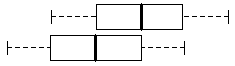
2. What is a boxplot?
The boxplot (sometimes called a box and whiskers plot) is a simple and very
useful graphic display. I provided a nice
definition of a boxplot at my
old website. Other good
explanations are at
The boxplot is useful for comparing the distributions of two different
groups. If the median in one box exceeds the end of the box of the other
group, that is evidence of a "large" discrepancy between the two groups. What
passes as the median for one group would actually be the 25th or 75th
percentile of the other group.
Just about any statistical software program (SAS, SPSS, Stata, R, etc.) can
produce boxplots and you can find code to produce boxplots in many programming
languages.
3. Crude versus adjusted comparisons
Many research papers describe crude versus adjusted comparisons. Here's an
example:
- Murray LJ, McCarron P, McCorry RB, Anderson LA, Lane AJ, Johnston BT,
Smith GD, and Harvey RF. �Inverse association between gastroesophageal
reflux and blood pressure: results of a large community based study..� BMC
gastroenterology 8 (2008). Full free text is available at
http://www.biomedcentral.com/1471-230X/8/10.
This study was a secondary analysis of a randomized controlled trial of
eradication of Helicobacter Pylori. The authors suspected that there may be an
inverse relationship between blood pressure and stomach problems.
In 2003 we reported reduced stroke mortality among patients with
oesophageal columnar epithelium (Barrett's oesophagus), with cerebrovascular
deaths in patients with specialised intestinal metaplasia of the oesophagus
being half that of the general population [1]. Subsequently, a postmarketing
surveillance study of 18,000 patients on omeprazole in the United Kingdom
has not shown any reduction in stroke mortality in these patients compared
to the general population [2] but this drug is often prescribed for upper
gastrointestinal conditions other than gastro-oesophageal reflux and
Barrett's oesophagus. We hypothesised that the association we observed may
be due to individuals with reduced lower oesophageal sphincter (LOS)
pressure, (a risk factor for gastro-oesophageal reflux and Barrett's
oesophagus) also having low vascular tone and blood pressure, resulting in
reduced stroke risk. To investigate this, we examined whether blood pressure
is associated with symptoms of gastro-oesophageal reflux.
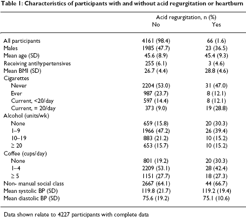
There were 4,227 patients eligible for the secondary analysis, with 107 and
66 experiencing daily heartburn or acid regurgitation, respectively. The
average systolic/diastolic pressure was 119.8 / 75.6 for patients without acid
regurgitation and 119.2 / 75.1 for patients with acid regurgitation. This
difference was small, (0.6 / 0.5) but the comparison was not quite fair. The
groups were not similar in their demographics. In particular, there was a
large disparity in gender (48% males in the first group versus 36% males in
the second group). There were also differences in lifestyle factors, with much
less alcohol and coffee use in the acid regurgitation group. A portion of
Table 1 is reproduced below.
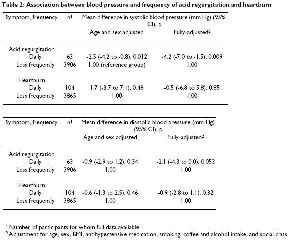
When you adjust for demographic and lifestyle factors, there is a 4.2 / 2.1
unit difference in systolic / diastolic blood pressure (see Table 2,
reproduced after slight reformatting below).
How do these statistical adjustments work? In essence, you fit a regression
model with both the treatment effect and all the relevant covariates. I describe the process in
briefly in Chapter 1 of Statistical Evidence.
The explanation given below is an adaptation and enhancement (as I am hoping
with vain optimism that there might be a second edition of my book sometime in
the future).
There is an interesting data file on Albuquerque housing prices at the Data
and Story Library website. I have a
nice description of the data set on my old website, and there is also a
nice description
at the DASL website.
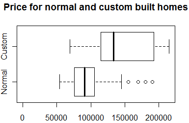
There is a large disparity between the prices of custom built homes and
normal homes (see boxplot shown above). The average prices are 145 and 95
thousand dollars, respectively. Is this 50 thousand dollar disparity real, or
can it be accounted for by other factors? One important factor is the size of
the homes.
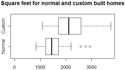
Not too surprisingly, custom built homes are a lot larger than normal homes
(see boxplot shown above). The average sizes for custom built and normal homes
are 2,100 and 1,500 square feet, respectively. Could the 50 thousand dollar
difference in price be accounted for solely by the difference in sizes? A
multiple linear regression model can help us answer this question.
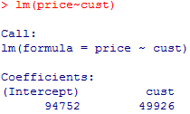
The model evaluating the effect of custom build on price without any
information about square footage (see below) has an intercept of 94,752 and a coefficient
associated with the indicator variable for custom build (cust) of 49,926. The
intercept tells you that the estimated average price of normal houses is 95
thousand dollars. The custom build term
tells you that the estimated average change in price when you switch from a
normal house to a custom built house is 50 thousand dollars.
When you include the size of the house (sqft) in the regression model (see
below), the
coefficient for custom build is reduced to 14,285.99. This tells you that there is
indeed a difference in price between custom built and normal homes, but it is
only 14 thousand dollars, not nearly as large as the crude comparison might lead you to believe.
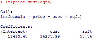
Notice that the slope for sqft is 55.36, which tells you that each
additional square foot adds about 55 dollars to the price of either a normal
or a custom built house. There was originally a discrepancy of about 650
square feet in the sizes of the two types of homes. This tells you that
approximately 36 thousand dollars ( = 55 * 650, approximately after rounding) dollars of the difference in average price
between custom built and normal houses can be accounted for by the difference
in sizes. Thus 14 ( = 50 - 36) thousand dollars of the difference in price
remains after adjusting for house size.
There's another way to look at this adjustment. Place a trend line through
the average square footage and average sales price of regular homes. The trend
line should have a slope equal to 55.
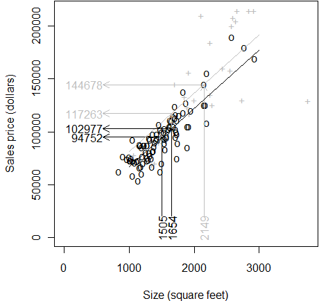
I am using gray in this graph to temporarily de-emphasize the custom build
data. Now if you project the price for a regular home at 1,505 (the average size
of all regular homes) you would get an unadjusted mean price of 94,752. What
would we project the sales price to be, however, if the size were 1,654 (the
average size of all homes, both regular and custom built)? It would have to be
higher, of course. The sales price when you adjust the size upward is 102,977.
Note that when you increase the size by about 150 square feet, you get an
increase of about 8 thousand (approximately 150*55, but I am rounding a bit
for simplicity).
Place a similar trend line in place for the custom built homes. The trend
line has a slope of 55 again and it goes through the mean square footage and
mean size for custom built homes only. This trend line is higher than the
previous trend line because of the location of the means are different.
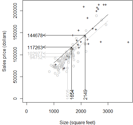
If you project the price for a custom built home at 2,149 (the average size
of all custom built homes) you get the unadjusted mean price of 144,678. What
would the price be if we adjusted the size downward to 1,654? It's 117,263
which is lower, or course. When the size of the house decreases by about 500
square feet, the price is adjusted downward by about 27,500 (=500*55).
The bottom line is that there is about a 50 thousand dollar discrepancy in price
between custom built and normal homes, but after you account for the differing
sizes of custom built and regular homes, the discrepancy decreases to about 14
thousand dollars. Thus, about 70% of the difference in prices can be
accounted for by the difference in average sizes.
Going back to the example with adjustments for systolic and diastolic blood
pressure, the concept is the same, but you can't display the data graphically
because there are too many variables. You fit
a multiple linear regression model with systolic or diastolic blood pressure
as the dependent variable. Then you include an indicator variable for acid
regurgitation and all the covariates (age, sex, bmi, antihypertensive
medication, smoking, coffee, and alcohol intake, and social class). Get a
predicted value for acid regurgitation at the overall average values of the
covariates and compare it to the predicted value for no acid regurgitation at
the overall average values of the covariates.
4. A false sense of frugality
A while back I received a data set that was very well documented, but there
was one thing that I wish that the data entry person had not done. The
demographic data was listed as 45f, 52m, 22m, 21f, etc. This was obvious
shorthand for a 45 year old female, 52 year old male, and so forth.
When you squeeze both pieces of information into the same cell, you lose
the ability to compute simple statistics. Most statistical software
programs, for example will not know to drop the last letter before computing
the average age, or to ignore the first two digits when computing the
percentages of males and females.
I explain what Microsoft Excel functions I used to split this information
into two separate cells at
www.pmean/08/FalseFrugality.html. I also offer five fundamental rules of
data entry on my old website at
www.childrens-mercy.org/stats/data/entry.asp.
This is not the first time that I have encountered someone who wants to
squeeze two pieces of information in the same cell. A common problem is when a
data entry person records blood pressure as 120/60. This is a problem for two
reasons. First, it is impossible to compute an average of either the systolic
or diastolic blood pressure when the data is recorded like this. Second, some
systems may misinterpret 120/60 as a division and produce a value of 2.
Another researcher decided to use ID values of 1A, 2A, 3A, ..., 25A
followed by 1B, 2B, ..., 25B. This was not a terrible thing in itself, but
nowhere other than the last character of the ID was it apparent which
observations belonged to group A and which belonged to group B. This means
that there is no easy way to calculate statistics just on group A or group B. It would have
been simpler to label the ID values as 1 through 50 and include As and Bs in a
separate column.
5. Hide that randomization list
One of the many things I learned from Evidence-Based Medicine is the
importance of concealed allocation. That's a fancy term for "hide that
randomization list." Why you need to hide the randomization list says a lot
about research practice and the problem with ethical conduct during a clinical
trial.
In a randomized trial, it is effectively the flip of a coin that decides
what therapy each volunteer patient in the trial gets. The patient willingly
cedes authority of the choice of medical therapy. The amazing thing is that
the patient cedes this choice not to a trusted authority like his/her doctor,
but rather to a totally random device. This makes the conduct of a clinical
trial quite different than the process in which health care is normally
delivered. In a normal clinical setting, the patient and doctor will discuss
the various treatment options and reach a mutually agreeable course of action.
Patients can subvert the randomization process if they wish. For example,
if a patient is randomly allocated to a surgical arm of a study, he or she is
perfectly within their rights to "chicken out" after the study starts and ask
for a non-surgical intervention instead. Principles for the
ethical conduct of research established during the Nuremberg trials require
that patients be allowed to withdraw from a research study at any time.
The patient's doctor has an obligation in a clinical trial to let the
patient know what treatment options are (in the doctor's opinion) best for the
patient. If a doctor has a reasonable belief that one of the therapies being
offered in a clinical trial is not in the best interests of the patient, that
doctor should advise the patient not to enter the trial. If there is a 50% chance at getting an inferior therapy
by participating in a clinical trial, then you
have to explore treatment options outside the research study.
The key concept in this is equipoise, a genuine uncertainty about which
treatment is better. If a doctor has more than just a hunch that one arm of
the trial is superior for all patients, he/she cannot participate in the
trial. If the doctor has more than a hunch that one arm of the trial is
superior for this particular patient, that doctor can still refer other
patients to the trial, but not this particular patient.
Sometimes doctors will try to subvert the randomization process. They
encourage their patients to participate in the trial, but they try to steer
some or all of their patients into a particular arm of the study. There are
several reasons they might do this.
Perhaps the doctor is trying to earn more money through the recruiting
bonuses in a trial. If the recruiting bonuses are so large as to encourage
this sort of behavior, then part of the problem lies with the researcher who
set up these financial incentives.
Another possible motive would appear if a certain therapy was available
only through the clinical trial. This happens a lot, and the ethical question
raised is whether society has the right to withhold a promising therapy from
patients who are unwilling or unable to participate in a randomized trial.
There is a societal imperative to insure that therapies are tested in a rigorous
setting before they are made generally available to all patients, but it is
unclear (at least to me) whether this societal responsibility trumps the
individual patient's needs.
A third motivation might be a desire to protect the patient. If, for
example, one therapy in a study is thought to be possibly better, but
possibly with harsher side effects, doctors might be tempted to steer their
weaker patients away from this therapy. This can happen in very subtle and
possibly even subconscious ways. For example, an older frailer patient wants
to enter the clinical trial, and you know that he/she will be assigned to the
more toxic but potentially more efficacious drug. You might interpret the
inclusion criteria quite carefully and cautiously. If the less toxic drug were
the one waiting for assignment to that incoming patient, you might be a little
more lax in your interpretation of the inclusion criteria.
This last motivation might seem to be in the patient's best interest, but
even if it is, it totally destroys the scientific integrity of the research study. The weak
and frail patients are more likely to be excluded from one arm of the study
than the other.
It is really important, therefore, that you hide the randomization list
from the physicians who are recruiting patients into a study until after the
patient and doctor both agree that it is in the patient's best interest to be
part of the study. One way to do this is to give the doctor a series of sealed
envelopes. Only after there is agreement to participate in the randomized
trial is the envelope opened, revealing which therapy the patient is randomly
assigned to.
Envelopes will prevent subconscious bias in the application of inclusion
criteria, but there is nothing to prevent a determined physician from peeking
in the envelopes ahead of time and then arranging for a given patient to be
entered into the study when the preferred envelope is due to be opened.
Better protection against peeking is the use of an 800 number for
recruitment. If a doctor and patient agree to be part of the study, then they
call an 800 number and talk to a centralized operator who takes down all the
relevant information and then provides the treatment allocation over the
phone.
Concealed allocation is very important for many studies, but it
doesn't make sense in some situations.
First, and most obviously, you can only hide the randomization list only if
the study is truly randomized. Observational studies do not try to allocate
therapies as part of the research process, so concealed allocation is a non
sequitur.
Second, in a blinded study, the randomization list is already hidden from
everybody except the person in the back of the pharmacy who prepares the pill
packages. So a blinded study would automatically have concealed allocation.
Finally, in a small study where the principal investigator is also the
person who does all the recruiting, concealed allocation is overkill. You can
presume that the person who designed the study would not try to subvert the
study.
I hope to elaborate on this topic in greater detail on my website soon. I
want to discuss some of the empirical evidence that has been published about
this problem. I also want to describe an excellent book on this topic, Berger
V. Selection Bias and Covariate Imbalances in Randomized Clinical Trials. 1st
ed. Wiley; 2005, but I have to read the book first!
6. Monthly Mean Article: If we're so different, why do we keep
overlapping? When 1 plus 1 doesn't make 2.
Wolfe R, Hanley J. If we're so different, why do we keep overlapping? When 1
plus 1 doesn't make 2. CMAJ. 2002;166(1):65-66. Available at: http://www.cmaj.ca/cgi/content/full/166/1/65
[Accessed January 5, 2009].
You've all seen graphs like this one (I removed some identifying information
to preserve privacy).
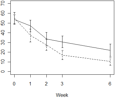
In this graph, the error bars represent 95% confidence intervals for the
individual means. When the intervals don't overlap, as they do at week 3 and 6,
that is a safe indication that there is a statistically significant difference
between the averages of the two groups. But what about the other weeks. If the
confidence intervals overlap, but only by a little bit, then it is still
possible that there may be a statistically significant difference between the
two means. The article by Wolfe and Hanley explains why this happens.
7. Monthly Mean Blog: Health Care
Renewal, Bernard Carroll, Cetona, Roy M. Poses MD, MedInformaticsMD,
Wally R. Smith, MD, wiswal, APeticola, Kimball Atwood MD. hcrenewal.blogspot.com
The Health Care Renewal blog is is dedicated to "addressing threats to
health care's core values, especially those stemming from concentration and
abuse of power." Note that some of the authors use their real names and
others use pseudonyms. A large portion of this blog is devoted to abuses of the
research enterprise. The blog entries that discuss these issues are, for the
most part, labeled with one of the following categories:
conflicts of interest,
evidence-based medicine,
manipulating clinical research,
pseudo-evidence based medicine,
suppression of medical research, and/or
transparency.
8. Monthly Mean Book: The Survey Research Handbook. Guidelines and
Strategies for Conducting a Survey
The Survey Research Handbook. Guidelines and Strategies for Conducting a
Survey. Pamela L. Alreck, Settle, Robert B. (1995) Chicago, IL: Irwin
Professional Publishing. Description: A very practical reference on surveys
with a lot of emphasis on planning. There are useful guidelines and checklists
throughout the book. It is an excellent book for beginners because there are
very few mathematical formulas.
9. Monthly Mean Website:
Regression with SAS Chapter 5: Additional coding systems for categorical
variables in regression analysis, Xiao Chen, Phil Ender, Michael
Mitchell and Christine Wells.
When you have a categorical variable with k levels in a regression model,
you can replace it with (k-1) indicator variables. For example, if your
categorical variable has five levels: A, B, C, D, and E, then the four
indicator variables would be I1 = 1 if category A and 0 otherwise, I2= 1 if
category B and 0 otherwise, I3 = 1 if category C and 0 otherwise, and I4 = 1
if category D and 0 otherwise. The resulting coefficients represent the
estimated mean of the level being indicated by 1 minus the estimated mean of
the level not coded by any of the indicator variables (usually the last
level). For example, the coefficient associated with I1 would be the estimated
mean for level A minus the estimated mean for level E.
There may be times, however, where you want to use a different coding
scheme. For example, forward difference coding would have I1 = 1 if level B,
-1 if level A, and 0 otherwise; I2 =1 if level C, -1 if level B and 0
otherwise; and so forth. The interpretation of the regression coefficients for
this coding scheme, is quite surprisingly different from what you'd expect.
The coefficient for I1 would be the mean for level A minus the mean for levels
B through E. The coefficient for I2 would be the mean for levels A and B
minus the mean for levels C through E. The coefficient for I3 would be the
mean for levels A through C minus the mean for levels D and E. The coefficient
for I4 would be the mean for levels A through D minus the mean for level E.
One explanation for the counterintuitive interpretation is that the estimated
slope coefficient in a multiple linear regression model is only sensible if
the other variables are held constant.
I have never found a good source for the variety of ways that you can code
a categorical variable until I ran across this website. It explains how to set
up the following systems.
- Simple Coding: Compares each level of a variable to the reference level
- Forward Difference Coding: Adjacent levels of a variable (each level
minus the next level)
- Backward Difference Coding: Adjacent levels of a variable (each level
minus the prior level)
- Helmert Coding: Compare levels of a variable with the mean of the
subsequent levels of the variable
- Reverse Helmert: Coding Compares levels of a variable with the mean of
the previous levels of the variable
- Deviation Coding: Compares deviations from the grand mean
- Orthogonal Polynomial Coding: Orthogonal polynomial contrasts
The examples all use SAS, as you might have predicted from the title of the
webpage. Still, these methods can easily be adapted to other statistical
software programs. URL: www.ats.ucla.edu/stat/sas/webbooks/reg/chapter5/sasreg5.htm
10. Nick News: Nick the roller blader
During Christmas break, students at Nicholas's school were given a coupon for
a free admission to a roller skating session at Skate City. Nicholas loves
skating (meaning roller blades, not ice skating). We both took him on December
30,
but Steve, having done skating with Nicholas before, wisely decided to let
Nicholas do all the skating and he'd do the watching. It's not that I fall down
less than Nicholas does, it's that when I fall, it is farther to the ground, and
my weight produces greater momentum. Nicholas just picks himself back up and
keeps going. Cathy had skated a lot as a child, so she rented some skates to go out
with Nicholas. You can imagine how this turned out, but you can find the full
story and a picture of Nicholas at
11. Very bad joke: Two statisticians were traveling in an airplane from
LA to New York
This story is found at the
R.A. Fisher Hall (joke
#24) of the Gary
Ramseyer's Internet Gallery of Statistics Jokes, and it shows the true
meaning of the term "dangerous extrapolation." I use this joke at the start of
my class on regression analysis.
Two statisticians were traveling in an airplane from LA to New York.
About an hour into the flight, the pilot announced that they had lost an
engine, but don't worry, there are three left. However, instead of 5 hours it
would take 7 hours to get to New York. A little later, he announced that a
second engine failed, and they still had two left, but it would take 10 hours
to get to New York. Somewhat later, the pilot again came on the intercom and
announced that a third engine had died. Never fear, he announced, because the
plane could fly on a single engine. However, it would now take 18 hours to get
to New York. At this point, one statistician turned to the other and said,
"Gee, I hope we don't lose that last engine, or we'll be up here forever!"
12. Tell me what you think.
How did you like this newsletter? I have
three short open ended questions
that I'd like to ask. It's totally optional on your part. Your responses will
be kept anonymous, and will only be used to help improve future versions of
this newsletter.
I only received feedback from two people (that's okay, since feedback is
totally optional). One person had an interesting take on my newsletter.
I don't think I read your newsletter to learn specific things as much as
to be reminded of a way of thinking. I see so much use of statistics that I
suspect is really lousy that it is useful to just immerse myself in the words
of someone who knows what he's talking about, loves the field, and is able to
teach/communicate well. I think I read your newsletter for inspiration ... for
the fact that it returns me to a place of clarity and dare I say hope??
I'm not sure I always know what I'm talking about, but I do try to get
people to think about how statistics are used in the real world. You don't
have to be a rocket scientist or a brain surgeon to be able to critically
evaluate the use of statistics in the real world. If one person finds this
inspiring, then I'm happy.
Another respondent liked my discussion on overfitting, but found my
discussion on combining measures on different scales of measurement confusing.
I'll see if I can clarify the latter point in a future webpage or newsletter
entry.
Both respondents had interesting suggestions for future discussion.
One suggestion was about the use of propensity score, and whether it should
used as a matching factor, a weighting factor, or a categorizing factor. This
is something I am actively working on for a client, and I hope to put some of
this up soon.
Another suggestion was an explanation of adjusted odds ratios in logistic
regression. I have some material on this at my old website and I'll try to
elaborate further on this.
A third suggestion was for "basic statistics" although there was some
concern that this might be boring for other readers. I generally have found
that people who are interested in help will invariably use the term
"statistics for beginners." Actually, they will use a more
perjorative term like "idiots" or "complete dummies" but this is not true. The
people who ask for help are almost always very well educated and well read.
They just lack experience in a particular area that I happen to know a few
things about. In all the classes I've taught recently and all
the webpages I've written, I've only received one request to make the
discussion more technical. Even in people who I recognize understand
statistics well, their desire is still for more basic information. I'm all in
favor of getting a more solid understanding of the fundamentals.
A final request came in more of the form of a complaint. In some studies, a single patient may have
more than one procedure. This can lead to some confusing situations and the
researchers themselves often fail to distinguish between patients and
procedures. I think it is critical to always know how much data you have and
of what type. The classic example that I encountered was a breastfeeding study
with a data set of 84 infants born to 72 mothers because 12 of the
mothers had given birth to twins. I'll try to write up something about this
and about a closely related topic, pseudo-replication, for a future
newsletter.
What now?
Sign up for the Monthly Mean newsletter
Review the archive of Monthly Mean newsletters
Go to the main page of the P.Mean website
Get help
 This work is licensed under a
Creative
Commons Attribution 3.0 United States License. This page was written by
Steve Simon and was last modified on
2017-06-15. Need more
information? I have a page with general help
resources. You can also browse for pages similar to this one at
Category: Website details.
This work is licensed under a
Creative
Commons Attribution 3.0 United States License. This page was written by
Steve Simon and was last modified on
2017-06-15. Need more
information? I have a page with general help
resources. You can also browse for pages similar to this one at
Category: Website details.