[Previous issue] [Next issue]
[The Monthly Mean] February/March 2010--Specific advice about a sensitive topic
Welcome to the Monthly Mean newsletter for February/March 2010. If you are having
trouble reading this newsletter in your email system, please go to
www.pmean.com/news/201003.html. If you are not yet subscribed to this
newsletter, you can sign on at
www.pmean.com/news. If you no longer wish to receive this newsletter, there is a link to unsubscribe at the bottom
of this email. Here's a list of topics.
Lead article: Specific advice about a sensitive topic
2. Relying on experts in an area where you have no particular
expertise
3. Using weights to correct for over and under sampling
4. Monthly Mean Article (peer reviewed): Multiple imputation for
missing data in epidemiological and clinical research: potential and pitfalls
5. Monthly Mean Article (popular press): Bending the Rules of
Clinical Trials
6. Monthly Mean Book: Fourth Generation Management
7. Monthly Mean Definition: Control chart
8. Monthly Mean Quote: Statistical thinking...
9. Monthly Mean Unsung Hero Award: Statistics without Borders
10. Monthly Mean Website: Devilish Dictionary for Statisticians
11. Nick News: From sixty degrees to six inches of snow
12. Very bad joke: An actuary, an underwriter, and an insurance
salesperson...
13. Tell me what you think.
14. Upcoming statistics webinars
15. If you like The Monthly Mean, spread the word
1. Specific advice about a sensitive topic
Whoever invented the terms sensitivity and specificity should be shot. Those
words are too easy to confuse, even under ideal circumstances. Here's how I
describe sensitivity and specificity in my classes.
Evaluation of a diagnostic test requires a population of people that includes
a mix of healthy people and people with disease. You give everyone in the sample
the diagnostic test and also evaluate all of them using a gold standard, an
evaluation that provides definitive evidence of whether someone actually has
disease or is healthy.
There are complex issues when the gold standard is imperfect. If there are
times when the gold standard would miss an existing disease or falsely indicate
a disease, then the standard calculations for sensitivity and specificity will
be biased.
There are also problems when the gold standard is not given to every possible
patient. Sometimes the gold standard involves an invasive procedure like
surgery, and for someone who tested negative on the diagnostic it is pretty hard
to convince them to get cut open just to insure the integrity of the research
study.
Here, we'll assume that the gold standard is error free and that it is given
to every patient who got the diagnostic test. The crossclassification of the
results of the diagnostic test and the gold standard produces four possible
results:
* TP (true positive) = patients who test positive and who have the disease,
* FN (false negative) = patients who test negative and who have the disease,
* FP (false positive) = patients who test positive and who are healthy, and
* TN (true negative) = patients who test negative and who are healthy.
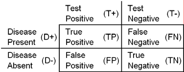
The two diagonal entries (true positives and true negatives) are good events
and we hope that most of the probability is concentrated in these two cells. The
two off-diagonal entries (false negative and false positives) are bad events and
we hope that very little probability is concentrated here. These off-diagonal
cells should not necessarily be treated symmetrically. If the false negative
cell is small, then the diagnostic test is good at ruling out the disease. If
the false positive cell is small, then the diagnostic test is good at ruling in
the disease.
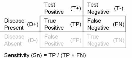
The sensitivity (Sn) of a test is the probability that the test is positive
when given to a group of patients with the disease. Notice that the denominator
for sensitivity (TP+FN) is the number of patients who have the disease.
Sensitivity is large when the number of false negatives is small.
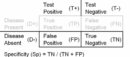
The specificity of a test is the probability that the test will be negative
among patients who do not have the disease. Notice that the denominator for
specificity (TN+FP) is the number of healthy patients. Specificity is large when
the number of false positives is small.
A large sensitivity means very few false negatives which tells you that a negative test can rule out the disease.
David Sackett coined the acronym "SnNOut" to help us remember this. Ruling out a
disease is very important if the cost of treating a disease is low, but leaving
a diseased patient untreated is very bad.
A large specificity means very few false positives which tells you that a
positive test can rule in the disease. David Sackett coined the acronym "SpPIn"
to help us remember this. Ruling in a disease is very important if the cost of
treating a disease is high, but leaving the diseased patient untreated is not so
bad.
Consider patients who come to the Emergency Department of a hospital with a
neck injury and there is suspicion that there might be a cervical fracture. If
you had to make a diagnosis on the basis of the history and physical, the next
step would be to send them home if you concluded that there was no cervical
fracture, or send them to radiology for x-rays if you concluded that there was a
cervical fracture. Xrays are not that expensive, and while there is some harm
due to radiation exposure, it is not that severe. So xraying someone who didn't
really need it, a false positive, is not all that bad. But sending someone home
who actually has a broken bone in their neck is very problematic. You'll
probably see that patient again in your hospital and the next time you see them,
they will probably be in a wheelchair.
So in cases like this, you want sensitivity to be very high, even at the
expense of having a substantial proportion of false positives (equivalent to low
specificity). Now, I'm not a doctor, so I am only discussing this in
hypothetical terms. If you decide to get an xray based on advice from a
statistician, it will probably discover rocks in your head.
Consider patients who come to the Emergency Room with a possible case of
appendicitis. Your choice if you believe based on the history and physical, that
the patient has appendicitis, will be to send them to the operating room. If you
believe that it is not a case of appendicitis, you would admit them to the
hospital for 48 hours and watch them closely for deteriorating signs. Now the
cost of operating on a person who has a healthy appendix is quite high. Failing
to operate on a patient with appendicitis can also be troublesome, but since you
are keeping a close eye on the patient, you would be unlikely to operate after
the appendix had burst.
So in cases like this, you want specificity to be very high, even at the
expense of having a substantial proportion of false negatives (equivalent to
poor sensitivity). Again, this is a hypothetical setting, and I am not
suggesting what the best course of action should be for a patient with suspected
appendicitis.
2. Relying on experts in an area where you have no
particular expertise
Often we need to rely on experts in areas that we just don't know a lot
about. We can't be expected to understand all the nuances of a controversial
area like global warming, but
it is tricky when there are experts who do understand all the nuances, but who
come to different conclusions. How do we choose between these competing experts?
How can you tell the real experts from the pretenders? I've thought a lot about
this question. Here are a few rules that I use.
1. How does this person use language? If they use terms imprecisely (like
confusing libel and slander), that is a bad sign.
2. Can the person able to explain competently the perspective of the "opposite"
side? If they do so without oversimplifying or stereotyping, that is a good
sign.
3. Does the person get the details right? If they can accurately provide the
name of the person behind a quote they are using (as opposed to "A wise man once
said"), if they can name the title AND author of a book they like, and if they
can accurately tie historical events to a particular place and year, that is a
good sign.
4. Does the person openly acknowledge their limitations? If they talk about
legal issues but include a disclaimer that they are not a lawyer or if they talk
about medical issues but include a disclaimer that they are not a doctor, that
is a good sign.
5. Does the person speak in absolutes? If every statement that a person makes
includes no qualifications or limitations, that is a bad sign.
6. Does the person have the right credentials? If they have earned an advanced
degree, published in the peer-reviewed literature, received major awards, and/or
attained positions of authority, that is a good sign.
All of these questions will only provide general guidance, of course. Also, keep
in mind that a person can be an intellectual in one area, but a
pseudo-intellectual in another area.
3. Using weights to correct for over and under sampling
Someone asked how to use weights to adjust for the fact that certain strata
in a study were recruited more vigorously than other strata. For example,
suppose you sampled at four communities and noted the age distribution as 0-14
years, 15-39 years, and 40+ years. How would you adjust for differential
age distributions.
The key is to calculate the sampling probability. Let nij
represent the number of patients sampled in community i and age strata j. Let
Nij represent the total number of patients in the population in
community i and age strata j. The probability of sampling, pij,
is nij/Nij. The inverse of this probability, 1/pij
is an interesting quantity. It tells you how many people in the population are
represented by a single individual in the sample. So if the sample size is
100 and there are 2 million people in the population, each person in the
sample represents 20,000 people in the population. If that same sample of 100
people was drawn from a population of 8,000, the each person in the sample
represents 80 people in the population.
If you weight the data by the inverse of pij, this will give
greater weight to those strata where you undersample, because each person in
the sample represents a larger number of individuals in the population than
you had hoped for. Similarly, this will give less weight to those strata where
you oversample.
Suppose you don't know the total number of patients in the population, but
you do know the relative proportions in each community. So in community 1, the
age group 0-14 years constituted 40% of your sample, but you knew that in the
population for community 1, age group 0-14 years corresponded to 50% of the
community. Let pij be the proportion of sample patients in
community i and age strata j relative to the total number sampled in community
i across all strata. Let Pij be the proportion of the population in
community i who belong to strata j. If you weight the data by Pij/pij,
you will give greater weight to those patients who are undersampled (Pij
> pij) and lesser weight to those patients who are oversampled (Pij
< pij). You will give weight 1 to those patients who are
sampled correctly (Pij = pij). In the above example
assign a weight of 0.5/0.4 = 1.25 to the age group 0-14 years.
4. Monthly Mean Article (peer reviewed): Multiple
imputation for missing data in epidemiological and clinical research: potential
and pitfalls
J. A C Sterne, I. R White, J. B Carlin, et al. Multiple imputation for
missing data in epidemiological and clinical research: potential and pitfalls.
BMJ. 2009;338(jun29 1):b2393-b2393. Excerpt: "Missing data are unavoidable
in epidemiological and clinical research but their potential to undermine the
validity of research results has often been overlooked in the medical
literature. This is partly because statistical methods that can tackle
problems arising from missing data have, until recently, not been readily
accessible to medical researchers. However, multiple imputation�a relatively
flexible, general purpose approach to dealing with missing data�is now
available in standard statistical software, making it possible to handle
missing data semiroutinely. Results based on this computationally intensive
method are increasingly reported, but it needs to be applied carefully to
avoid misleading conclusions." [Accessed February 8, 2010]. Available at:
http://www.bmj.com/cgi/data/bmj.b2393/DC1/1.
5. Monthly Mean Article (popular press): Bending the Rules
of Clinical Trials
Bending the Rules of Clinical Trials
http://www.nytimes.com/2009/10/29/health/29chen.html. Here is an exceprt:
"There is an essential conflict for doctors involved in clinical research. As
collaborators in research, they want to obtain information that is valid and
able to be generalized for all future patients; but as doctors working within a
patient-doctor relationship, they need to focus only on improving the condition
of the patient before them. A patient in a chemotherapy clinical trial, for
example, might complain of severe nausea after receiving a dose of an
experimental drug. While the doctor as researcher might place a high priority on
limiting the types of antinausea medications because of fears they could
interact with and affect the experimental drug�s effects, that same doctor as
patient advocate might choose to ignore the list of �approved� antinausea
medications to use one that has previously worked."
The article goes on to document that this is not an isolated problem.
"In the current issue of the bioethics journal IRB: Ethics & Human Research,
investigators from four different institutions surveyed over 700 clinicians
involved in clinical trials and found that 90 percent believed that ignoring
certain entry criteria was acceptable if a patient could, in their estimation,
benefit from the trial. In addition, over 60 percent of those surveyed also
believed that researchers should deviate from study rules if doing so might
improve a patient�s care."
6. Monthly Mean Book: Fourth Generation Management
Brian L. Joiner, Sue Reynard, Yukihiro Ando. Fourth generation
management. McGraw-Hill Professional; 1994. It's a bit dated, but if you
want some practical advice about how to adopt a quality effort in your
organization (be it Total Quality Management, Six Sigma, the Deming Management
Method, or whatever you call it), then this book, written by a prominent
statistician, is an excellent start. Excerpt: "I knew that it was important to
find better ways to do things and to eliminate waste and inefficiencies; that
data could shed light on murky situations; that people needed to work together.
But it took another 20 years working with large companies and small, with
government, service, and manufacturing organizations, with top managers, with
operators on the shop floor, before I had a good understanding of how all these
pieces fit into a system of management that brings rapid learning and rapid
improvement. It's a system I've come to call 4th Generation Management."
7. Monthly Mean Definition: What is a control chart?
A control chart (sometimes called a Shewhart chart) is a graphical tool for assessing the stability of a work
process. Typically, measurements are made for the work process at regular time
intervals. These measurements are plotted in time sequence and connected by
straight lines (1). A horizontal reference line (2) is drawn at the center of
the data (typically the mean or the median of all the data points). In addition,
horizontal lines are drawn representing the upper (3) and lower (4) control
limits of the chart. Here is an example of a control chart from the Engineering
Statistics Handbook published by the National Institute of Standards and
Technology (with numeric annotations added by me).
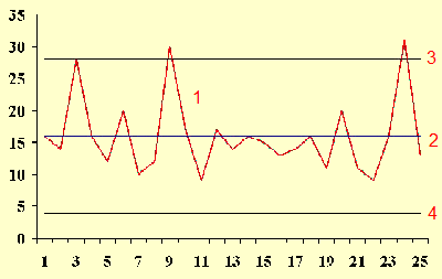
(Source: NIST/SEMATECH e-Handbook of Statistical Methods,
Accessed March 24, 2010.
www.itl.nist.gov/div898/handbook/pmc/section3/pmc331.htm)
The work process is said to be in control if all of the data points lie
between the upper and lower control limits. Any data point above the upper
control limit or below the lower control limit is said to be out of control and
represents a special cause of variation. Typically, you should investigate an
out of control data point when it appears to see if you can find and fix the
problem that created this out of control point. If the control chart is
constructed properly, there should be very few false positives (points outside
the control limit which are simply part of the normal variation of the work
process).
The control charts are often defined with a formula involving plus/minus
three sigma, but the term sigma here does not literally mean standard deviation.
It is not a standard error, either. Typically, sigma is a quantity that
represents short term variation. It is sometime calculated by computing a range
or standard deviation within a batch of measurements, averaging across all
batches, and then multiplying by a specific constant to adjust for bias. If
there are no batches, then sometimes a moving range is computed and used in a
similar fashion. Other times, sigma is defined in terms of a particular
distribution, such as binomial or Poisson. Some people try to use customer
specifications instead of the upper and lower control limits, but this change
effectively negates all the statistical properties of the control chart.
Sometimes the interior of the control chart is divided into zones. Zone 1 is
anything within plus/minus one sigma of the center line. Zone 2 is anything
within plus/minus two sigma. Zone 3 is anything within plus/minus three sigma.
This allows more sophisticated rules for declaring a point out of control. For
example, the "Western Electric rules" declare that a process is out of control
if:
- any point falls outside zone 3 (same as the rule I mentioned above);
- two out of three consecutive points fall outside zone 2, and on the same
side of the centerline;
- four out of five consecutive points fall outside zone 1, and on the same
side of the centerline; or
- nine consecutive points falling on the same side of the centerline.
There's lots of debates about these rules and lots of variations. Some people,
for example,
will argue that eight consecutive points, not nine, on the same side of the
centerline, should represent an out of control condition. These debates obscure the
value of control charts. If you use control charts with ANY reasonable set of
rules (ideally something not too complicated), you should be able to identify
quality problems early and fix them.
Simply showing that a work process is in control is only half the battle,
though. It may be that the process is consistent, with no special causes of
variation, but the process is producing values much too large to be acceptable
by your customers. Or maybe there is normal variation but within a range so wide
that your products frequently way off from the proper size
cannot be counted on to fit where they are supposed to fit.
If a process is in control, but does not conform to a customer's
specifications, then you need to plan some type of system wide intervention to
change your process. Don't, however, try a system wide intervention if your
process is out of control. It's like a laboratory that has multiple methods at
work for their assays. Maybe these mutliple methods aren't explicitly stated,
but they still occur. So one method might be at work for the first batch of
output in the morning and a different method for the second, third, and later
batches. Or one method might be at work on Monday through Thursday, but another
method might be at work on Fridays. If you try a system wide intervention on a
system with multiple methods, you will not get any reliable and helpful results,
because an intervention might work well for one method but make things worse
when a different method suddenly appears. Only when a process is in control and
you are sure that a single method is applied at all times does it make sense to
implement a system wide intervention.
8. Monthly Mean Quote: Statistical thinking...
"Statistical thinking will one day be as necessary for efficient
citizenship as the ability to read and write." H.G. Wells, as quoted at
www.causeweb.org/cwis/SPT--FullRecord.php?ResourceId=1240
9. Monthly Mean Unsung Hero Award: Statistics without
Borders
If you thought that statisticians spent their time at menial tasks that have
little impact on the world, you might be right about me. But there is a group, Statistics without Borders,
that defies this stereotype. Statistics without Borders are volunteer professionals working with nonprofit
organizations across the globe for humanitarian or human rights causes.
There is currently a team in Haiti trying to get an accurate count of the losses
caused by the recent earthquake. They have a Facebook page:
*
www.facebook.com/pages/Statistics-without-Borders/118114963213
and were highlighted in the January 2010 issue of Amstat News:
*
magazine.amstat.org/2010/01/statisticswithoutbordersjan10/
10. Monthly Mean Website: Devilish Dictionary for
Statisticians
Don Zimmerman. Devilish Dictionary for Statisticians. Description:
This webpage offers some irreverent definitions of statistical terms, akin to
Ambrose Bierce's The Devil's Dictionary. They are all very cynical and very
funny. Here's an example: "Sample--a rag-tag, bob-tailed bunch of atypical
misfits who have volunteered to participate in an experiment." [Accessed
March 25, 2010]. Available at:
mypage.direct.ca/z/zimmerma/devilsdictionary.htm.
11. Nick News: From sixty degrees to six
inches of snow
We had our first taste of spring weather in mid-March with sixty degree
weather. Nicholas spent a lot of time outdoors. Here are a few pictures of him
playing basketball with an invisible basketball hoop, and riding his scooter.


Then six inches of snow fell.

See more pictures at
*
www.pmean.com/personal/SixtyDegrees.html
*
www.pmean.com/personal/Shovel.html
12. Very bad joke: An actuary, an underwriter, and an
insurance salesperson...
An actuary, an underwriter, and an insurance salesperson are riding in a
car. The salesperson has his foot on the gas, the underwriter has his foot on
the brake, and the actuary is looking out the back window telling them where
to go. Quoted at
www.workjoke.com/actuaries-jokes.html#585.
13. Tell me what you think.
How did you like this newsletter? I have three short open ended questions at
*
https://app.icontact.com/icp/sub/survey/start?sid=6283&cid=338122
You can also provide feedback by responding to this email. My three
questions are:
- What was the most important thing that you learned in this newsletter?
- What was the one thing that you found confusing or difficult to follow?
- What other topics would you like to see covered in a future newsletter?
Two people provided feedback to the last newsletter. One liked the
description of the stem and leaf diagram, especially the explanation of how you
might use two digits in the stems. The other liked the recent entry in the seven
deadly sins of researchers (wrath) and the comments about heterogeneity in
clinical trials. There was nothing unclear to either respondent. One suggestion
for future topics was some of the issues associated with random effects
meta-analysis, such as the use of confidence intervals versus prediction
intervals. The other suggestion was how to do power calculations when you have
the wrong standard deviation.
14. Upcoming statistics webinars
All these statistics webinars are free and open to anyone. These webinars
are announced in my website:
* www.pmean.com/webinars
and also, of course, in The Monthly Mean.
Putting it all together: meta-analyses and systematic overviews. Free to all!
Wednesday, March 31, 11am-noon, CDT. Abstract: This class helps you assess the
quality of a systematic overview or meta-analysis. In this class you will
learn how to: recognize sources of heterogeneity in meta-analysis; identify
and avoid problems with publication bias; and explain the ethical concerns
with failure to publish and with duplicate publication.
The first three steps in selecting a sample size. Free to all!
Wednesday, April 28, 11am-noon, CDT. Abstract: One of your most critical
choices in designing a research study is selecting an appropriate sample size.
A sample size that is either too small or too large will be wasteful of
resources and will raise ethical concerns. In this class, you will learn how
to: identify the information you need to produce a power calculation; justify
an appropriate sample size for your research; and examine the sensitivity of
the sample size to changes in your research design.
The first three steps in a linear regression analysis with examples in
IBM SPSS. Free to all!
Wednesday, May 26, 11am-noon, CDT. Abstract: This class will give you a
general introduction in how to use SPSS software to compute linear regression
models. Linear regression models provide a good way to examine how various
factors influence a continuous outcome measure. There are three steps in a
typical linear regression analysis: fit a crude model, fit an adjusted model,
and check your assumptions These steps may not be appropriate for every linear
regression analysis, but they do serve as a general guideline. In this class
you will learn how to: interpret the slope and intercept in a linear
regression model; compute a simple linear regression model; and make
statistical adjustments for covariates.
15. If you like The Monthly Mean, spread the
word.
I write this free newsletter (and offer free statistics webinars) because it
is fun and because I want to build up some publicity and goodwill for my
consulting business. It takes a lot of time to prepare these newsletters and
it is hard to
justify the effort for such a small subscriber base. I need to expand and I
need your help to do it. If you like this newsletter, please forward it to
others and encourage them to subscribe. My goal is to have 1,500 subscribers
by the end of this calendar year.
What now?
Sign up for the Monthly Mean newsletter
Review the archive of Monthly Mean newsletters
Go to the main page of the P.Mean website
Get help
 This work is licensed under a
Creative
Commons Attribution 3.0 United States License. This page was written by
Steve Simon and was last modified on
2017-06-15. Need more
information? I have a page with general help
resources. You can also browse for pages similar to this one at
Category: Website details.
This work is licensed under a
Creative
Commons Attribution 3.0 United States License. This page was written by
Steve Simon and was last modified on
2017-06-15. Need more
information? I have a page with general help
resources. You can also browse for pages similar to this one at
Category: Website details.