[The Monthly Mean] January 2010--We need more research about the research process
Welcome to the Monthly Mean newsletter for January 2010. If you are having trouble reading this newsletter in your email system, please go to www.pmean.com/news/201001.html. If you are not yet subscribed to this newsletter, you can sign on at www.pmean.com/news. If you no longer wish to receive this newsletter, there is a link to unsubscribe at the bottom of this email. Here's a list of topics.
Lead article: We need more research about the research process
2. The fifth deadly sin of researchers: wrath
3. Heterogeneity in clinical trials--is it a bad thing or a good
thing?
4. Monthly Mean Article (peer reviewed): From Evidence-based
Medicine to Marketing-based Medicine: Evidence from Internal Industry
Documents
5. Monthly Mean Article (popular press): Corporate Backing for
Research? Get Over It
6. Monthly Mean Book: Half the Sky. Turning Oppression into
Opportunity for Women Worldwide
7. Monthly Mean Definition: What is a stem-and-leaf diagram?
8. Monthly Mean Quote: As a USENET discussion grows longer...
9. Monthly Mean Unsung Hero Award: Michael R. Chernick
10. Monthly Mean Website: Missing Data
11. Nick News: Nicholas and fun in the snow
12. Very bad joke: I used to think correlation implied
causation
13. Tell me what you think.
14. Upcoming statistics webinars
15. Are you on Facebook or LinkedIn?
1. We need more research about the research process
I'm just as guilty of this as anyone else, but I think that we statisticians too often rely on subjective opinions or follow the recommendations of prominent members of our discipline rather than demanding empirical evidence.
I participated in a debate about stem-and-leaf diagrams on an Internet discussion group. There were a lot of opinions, pro and con, but very little data. You could collect data on this problem, of course. Present some data to subjects using a stem-and-leaf diagram, then an alternative. Randomize the order of presentation. Present several different types of data. Ask some simple questions about the data. Measure how quickly and how accurately people answer the questions. If the stem-and-leaf diagram provides faster and/or more accurate answers on average than the alternative, then you have solid support for its continued use. There's some work in evaluating the effectiveness of various graphical presentations, but we need more.
Another example I'm interested in is how often do researchers fail to meet their enrollment targets in clinical trials? How often do they fall short of the planned sample size and how often do they take longer than they had originally planned to reach their proposed sample size. This sort of data has profound impacts on the economics of research. If a granting agency pays a million dollars for research involving a thousand patients, and the researchers only enroll 200, then the agency is wasting a lot of money. There are possibly ethical issues as well. If an Institutional Review Board (IRB) is relying on a sufficient sample size to allow a good risk-benefit balance, and the researcher comes up with only half of the planned subjects, is that balance upset, making the research project unethical? Should researchers who routinely fail to meet projected sample sizes be barred by the IRB from doing more research?
It's an important issue, but as far as I know there is no hard data out there on the scope and magnitude of sample size shortfalls. I did a small study of this at my old job. Bottom line, more than half of the studies fell short of the proposed sample size and the average shortfall in those studies was 55%. The project was fall-off-a-log-simple. If anyone wants to replicate this at their organization, I'd love to see it done. I'd be glad to provide any support that I can.
A third example is perceptions about placebo controlled trials. There are a lot more opinions from experts about placebos than there are interviews with actual research subjects. There are some exceptions, such as
* Zelda Di Blasi, Fay Crawford, Colin Bradley, Jos Kleijnen. Reactions to treatment debriefing among the participants of a placebo controlled trial. BMC Health Services Research. 2005;5(1):30. Available at: www.biomedcentral.com/1472-6963/5/30.
but there needs to be a lot more articles like this.
I'm sure that you all can come up with more examples like this where subjective impressions and expert opinions are more plentiful than hard data.
I've often argued that we need more research about the research process. We statisticians offer lots of suggestions during the design of research studies, but how often are those suggestions based on the evidence. Whatever happened to "In God we trust, all others must bring data"? As I said, I'm just as guilty of spouting opinions not backed up by data as anyone else, but thanks for letting me vent anyway.
2. The fifth deadly sin of researchers: wrath
In previous newsletters, I have mentioned four deadly sins of researchers:
* pride, (May/June 2009)
* sloth, (July/August 2009)
* gluttony, and (September/October 2009)
* lust, (November 2009)In this newsletter, I want to describe "wrath". Wrath, or anger, occurs when researchers feel so passionately about certain research findings that they view as "the enemy" anyone who publishes contradictory findings. This leads to some very unhelpful behaviors.
Ad hominem attacks. Rather than attack the contradictory research findings directly, critics attack the researchers themselves. They will mock them, insult them, and cast aspersions on their motives. Susan Clancy conducted research into child abuse by interviewing adult survivors of sexual abuse. Her counter-intuitive findings, which were carefully corroborated, showed that children were confused by the abuse, but that the trauma (fear, shock, and horror) occurred only when the child grew old enough to understand the true nature of the abuse. This did contradict decades of previous research, but instead of examining the data and considering an alternative hypothesis, the researchers reacted with fury, characterizing Dr. Clancy as a friend to pedophiles. Note that Dr. Clancy was not claiming that abuse was benign, but rather trying to better characterize the effects of abuse. The findings if they hold up, would actually benefit child victims of abuse because therapy based on a misguided notion of how and when children suffer from abuse is likely to be ineffective. More details about this case are at www.nytimes.com/2010/01/26/health/26zuger.html.
Accusations of conspiracies. When a researchers fail to get one of their papers published or when their papers receive harsh criticism, or when they suffer an adverse action like tenure denial, there is a natural tendency to blame others for their problems. It's not your fault. "They" are out to suppress your research. The refereeing process is largely anonymous (a bad thing in my opinion) which tends to reinforce beliefs in conspiracies. If you see these referees as real people, then it is harder to assign them to a nameless conspiracy. Richard Sternberg, editor of Proceedings of the Biological Society of Washington published an intelligent design article. Dr. Sternberg bypassed the normal peer review process and allowed a poorly written paper to be published. The paper was eventually withdrawn. Dr. Sternberg claims that this is evidence of a conspiracy against intelligent design research, but it just as easily could be an effort to correct a bad publication vetted through a flawed publication process. More details about this case are at www.expelledexposed.com/index.php/the-truth/sternberg.
Attempts to ruin the lives of opposing researchers. The most powerful way to silence researchers who publish the "wrong" results is to accuse them of fraud or research misconduct. Even tenure is no protection against these types of accusations. The allegations don't even have to be upheld. The time lost defending against baseless charges can have a chilling effect. Dr. Gretchen LeFever made some enemies by publishing research that showed that Attention Deficit Disorder (ADD) and Attention Deficit/Hyperactivity Disorder (ADHD) were overdiagnosed and overmedicated. An anonymous complaint was lodged against her for fraud. In one of her publications, a survey question was described as Has your child been diagnosed with attention or hyperactivity problems known as ADD or ADHD? but the original question was actually Does your child have attention or hyperactivity problems, known as ADD or ADHD? There is indeed an important distinction between the two questions, and a clarification would be in order. But the complaining party was out to harass Dr. LeFever, as this error is clearly a clerical error and hardly rises to the level of fraud. More details about this case are at www.bmj.com/cgi/content/extract/330/7493/691-a and www.bmj.com/cgi/content/full/331/7521/865-a.
I will deal with the two remaining deadly sins: greed and envy, in future newsletters. I might then move to the seven heavenly virtues of researchers (purity, temperance/self-control, charity/generosity, diligence/persistence, patience/peace, kindness/empathy, and humility/modesty).
3. Heterogeneity in clinical trials--is it a bad thing or a good thing?
When you design a research study, you often make many subtle choices. Do you include a broad range of patients, or do you strongly restrict the types of patients that can enter the trial? Do you specify the details of the intervention or do you allow some latitude or discretion to the treating physician? Do you limit the treating physician to a small group with special expertise, or do you let a wide range of physicians offer the treatment? In a general sense, these types of choices boil down to whether you want heterogeneity in your clinical trial.
At first blush, purposely introducing heterogeneity would seem like a bad thing. Heterogeneity introduces noise into the equation. Noise is bad because it decreases the precision of all of your estimates.
Too little heterogeneity, however, can backfire. If the patients are narrowly drawn, if the intervention is tightly defined, if the practitioners are limited to the true experts, then the trial becomes artificial and does not represent fairly how medicine is practiced in the real world.
Sometimes you have no choice about heterogeneity. Many medical interventions rely strongly on the skill and experience of the practitioner and can only be performed by a small pool of elite physicians. Surgery trials are an excellent example of this.
Other times, you're forced to live with heterogeneity. For example, strong physician or patient preferences may make it difficult to recruit for a study that allows little room for physician discretion.
The good news about heterogeneity is that while it adds noise, it does not normally produce biases. Noise can be overcome with a large enough sample size, provided that your budget allows this.
You can view this as a trade-off between internal validity and external validity. A rigorously defined intervention and control group makes the statistical comparison good (internally validity) but makes it harder to extrapolate to a real world setting (external validity). As a general rule, studies of new and emerging interventions should stress internal validity (proof of concept trials) and studies of interventions that are already well established should stress external validity (pragmatic trials).
4. Monthly Mean Article (peer reviewed): From Evidence-based Medicine to Marketing-based Medicine: Evidence from Internal Industry Documents
Glen Spielmans, Peter Parry. From Evidence-based Medicine to Marketing-based Medicine: Evidence from Internal Industry Documents. Journal of Bioethical Inquiry. Abstract: "While much excitement has been generated surrounding evidence-based medicine, internal documents from the pharmaceutical industry suggest that the publicly available evidence base may not accurately represent the underlying data regarding its products. The industry and its associated medical communication firms state that publications in the medical literature primarily serve marketing interests. Suppression and spinning of negative data and ghostwriting have emerged as tools to help manage medical journal publications to best suit product sales, while disease mongering and market segmentation of physicians are also used to efficiently maximize profits. We propose that while evidence-based medicine is a noble ideal, marketing-based medicine is the current reality." [Accessed February 3, 2010]. Available at: freepdfhosting.com/ebaef05bfe.pdf.
5. Monthly Mean Article (popular press): Corporate Backing for Research? Get Over It
John Tierney. Corporate Backing for Research? Get Over It. The New York Times. January 26, 2010. Excerpt: "Conflict-of-interest accusations have become the simplest strategy for avoiding a substantive debate. The growing obsession with following the money too often leads to nothing but cheap ad hominem attacks." [Accessed January 26, 2010]. Available at: www.nytimes.com/2010/01/26/science/26tier.html.
Yes, I know that these two articles are taking different sides. I think they are both worth reading and both make important points.
6. Monthly Mean Book: Half the Sky. Turning Oppression into Opportunity for Women Worldwide.
Nicholas Kristof, Sheryl WuDunn (2009). Half the Sky. Turning Oppression into Opportunity for Women Worldwide. New York, NY: Knopf. ISBN: 0307267148. This is not a Statistics book, but it does offer a couple of important lessons regarding Statistics. First, an endless recitation of statistics is not going to help get people involved in a cause. In fact, presentation of statistics typically has a numbing effect and makes people less generous. The authors describe some revealing research:
"Frankly, we hesitate to pile on the data, since even when numbers are persuasive, they are not galvanizing. A growing collection of psychological studies show that statistics have a dulling effect, while it is individual stories that move people to act. In one experiment, research subjects were divided into several groups, and each person was asked to donate $5 to alleviate hunger abroad. One group was told the money would go to Rokia, a seven-year-old girl in Mali. Another group was told that the money would go to address malnutrition among 21 million Africans. The third group was told that the donations would go to Rokia, as in the first group, but this time her own hunger was presented as part of a background tapestry of global hunger, with some statistics thrown in. People were much more willing to donate to Rokia than to 21 million hungry people and even a mention of the larger problem made people less inclined to help her."
I cited this example, by the way, for Chance News, a Wiki site devoted to current events involving Statistics:
* chance.dartmouth.edu/chancewiki/index.php/Chance_News_58#Statistics_make_you_stingy
But there's a flip side to the coin that the authors mention. Too many aid programs have exaggerated estimates of their effectiveness because the agency in charge of the aid program also collects statistics on the success of the program. The authors repeatedly make a call for "relentless empiricism" in measuring the impact of a program with scientific rigor. They praise one program, Oportunidades, for taking such an approach.
"Oportunidades provided for rigorous evaluation--something that is lacking in too many aid programs. In this case, outside experts get contracts to perform the evaluations, making comparisons with control villages (villages are assigned randomly either to the experiment or to the control group), so that it is possible to measure how well the program worked."
I don't want to pretend that the messages about Statistics are the most important messages in this book. Clearly, the authors have identified serious issues about sex trade trafficking, honor killings, rape as a weapon to terrorize opponents in wartime, and female mortality during childbirth. They also have inspiring stories of women who have suffered great oppression, survived, and then became fervent advocates fighting to insure that other women don't suffer like they have. This is a very inspiring book, and a call to action that you can't ignore. If you notice the important messages about Statistics when you read this book, all the better. But read the book even if you don't care about Statistics.
7. Monthly Mean Definition: What is a stem-and-leaf diagram?
A stem and leaf diagram provides a visual summary of your data. This diagram provides a partial sorting of the data and allows you to detect the distributional pattern of the data.
There are three steps for drawing a stem and leaf diagram.
1. Split the data into two pieces, stem and leaf.
2. Arrange the stems from low to high.
3. Attach each leaf to the appropriate stem.It's easiest to understand these steps through an example. Let�s construct a stem and leaf diagram for the following data:
80, 85, 110, 95, 95, 100, 45, 95, 130, 75, 80, 70, 80, 100, 120, 110, 125, 75, 100, 40, 75, 110, 150, 75, 95
- Split the data into two pieces, stem and leaf. Here the leaf would be the single rightmost digit and the stem would be the leftmost one or two digits.
- Arrange the stems from low to high. Here the stems range from 4 to 15.
- Attach each leaf to the appropriate stem.
80 -- Attach the 0 leaf to the 8 stem,
85 -- Attach the 5 leaf to the 8 stem,
110 -- Attach the 0 leaf to the 11 stem,...
as so forth.This is what you get when you are done.
04 50
05
06
07 50555
08 0500
09 5555
10 000
11 000
12 05
13 0
14
15 0Notice that the stem and leaf diagram is also a sideways histogram. The stem and leaf is also useful because it partially sorts the data. In this example, the third smallest score is 70.
Here is second example:
3.84, 5.57, 5.85, 4.80, 3.68, 2.96, 4.41, 3.72, 3.49, 3.84, 5.26, 3.73, 1.84, 4.14
Let the first digit be the stem and the last two digits be the leaf. We could have made a different choice: letting the first two digits be the stem and the last digit be the leaf. Don't agonize over the choice, but it's good to have not too many and not too few stems.
When you arrange the leaves on the appropriate stems you get the following diagram.
1 84
2 96
3 84,68,72,49,84,73
4 80,41,14
5 57,85,26Again, this is a partial sort of the data. The third smallest LDL value is 3.49.
Sometimes you may have too few (or too many) stems to get a good picture of your data. When this happens, considering splitting the stems. Here is an example.
The stem and leaf diagram for the LDL data has only five stems. We can get a slightly different perspective by doubling the number of stems. We do this by splitting each stem in two. Put small leaves (00-49) on the first stem and large leaves (50-99) on the second stem. This is what you get.
1
1 84
2
2 96
3 49
3 84,68,72,84,73
4 41,14
4 80
5 26
5 57,85Another option is to split the stems into five. Here is the first example again, with the digit zero representing values below 100 and the digit one representing values 100 and above. These two stems are then split five ways. The numbers up to 19 go on the first zero stem, 20-39 to the second zero stem, 40-59 to the third zero stem, and so forth.
0
0
0 45,40
0 75,70,75,75,75
0 80,85,95,95,95,80,80,95
1 10,00,00,10,00,10
1 30,20,25
1 50
1
1Splitting the stems into two or five pieces is optional. You can't split into three or four stems, of course, because 10 is only evenly divisible by 2 and 5.
There is no rule for deciding how many digits belong in the stem versus the leaf and whether you should split the stems into 2 or 5 pieces. Your choice is akin to deciding how many bars to use in a histogram. Try to make a choice that doesn't give you too many or too few stems.
The material for this article was taken from my old website:
8. Monthly Mean Quote: As a Usenet discussion grows longer...
"As a Usenet discussion grows longer, the probability of a comparison involving Nazis or Hitler approaches one." Godwin's Law, as quoted at Wikipedia (en.wikipedia.org/wiki/Godwin%27s_Law)
9. Monthly Mean Unsung Hero Award: Michael R. Chernick
I've decided to start something new in this newsletter, The Monthly Mean Unsung Hero Award. This award is given to someone who has been working hard on Statistics in an area where he/she may not get a lot of recognition. The first of these awards goes to Michael R. Chernick. I do not know Dr. Chernick, but I see his work all the time on the Amazon website. He provides detailed reviews of Statistics books, and I almost always find his reviews to be very helpful. He has a reviewer's profile on Amazon at
* www.amazon.com/gp/pdp/profile/AQ7ZQWXAYT8HZ/ref=cm_cr_pr_pdpI was shocked to find out that he has published 639 reviews on Amazon, as well as 41 lists (examples: Statistics in Sports, Books about R and its statistical applications).
10. Monthly Mean Website: Missing Data.
James Carpenter, Mike Kenward. Missing Data. Excerpt: "This site exists to support researchers from the social and medical sciences with the analysis of incomplete datasets, and as a focus of statistical research." [Accessed February 4, 2010]. Available at: missingdata.lshtm.ac.uk/index.html
11. Nick News: Nicholas and fun in the snow
In the last newsletter, I talked about a big snow storm during Christmas break and how Nicholas used that opportunity to sled down the steep hills near Cleveland Chiropractic College. Since then, we've had a couple more storms and a couple more times to try out new things and explore new opportunities. Here are some pictures.
If you want to see more pictures and read some stories about these adventures, go to
* www.pmean.com/personal/snowfun.html
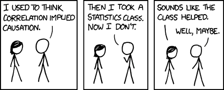
12. Very bad joke: I used to think correlation implied causation
This comic strip is available at xkcd.com/552/. The author, Randall Munroe, makes these comics available for any not-for-profit publication. Thank you, Mr. Munroe.
13. Tell me what you think.
How did you like this newsletter? I have three short open ended questions at
* https://app.icontact.com/icp/sub/survey/start?sid=6239&cid=338122You can also provide feedback by responding to this email. My three questions are:
- What was the most important thing that you learned in this newsletter?
- What was the one thing that you found confusing or difficult to follow?
- What other topics would you like to see covered in a future newsletter?
Two people provided feedback to the last newsletter. Both liked the description of the ROC curve. For one person, it was more a review and a clarification. I'm glad to do this. Sometimes the first time you learn something, it doesn't sink in. It's when you hear a second explanation, from a slightly different perspective, that it takes for an abstract idea to take hold. One person found the description about power and the minimum clinically relevant difference to be tough to follow. There were no suggestions this month for new topics. I do want to consider earlier suggestions about mixed models, generalized estimating equations, and mutlilevel models in future newsletters, but these topics take a lot of time to prepare well. I'm also going to try to talk about missing data. It's a very important topic, but again one that takes some work to prepare well.
14. Upcoming statistics webinars
What do all these numbers mean? Sensitivity, specificity, and likelihood ratios. Free to all! Wednesday, February 17, 11am-noon, CST. Abstract: This one hour training class will give you a general introduction to numeric summary measures for diagnostic testing. You will learn how to distinguish between a diagnostic test that is useful for ruling in a diagnosis and one that is useful for ruling out a diagnosis. You will also see an illustration of how prevalence of disease affects the performance of a diagnostic test. Please have a pocket calculator available during this presentation. This class is useful for anyone who reads journal articles that evaluate these tests. No statistical experience is necessary. No special hardware/software is needed. For more information, go to www.pmean.com/webinars.
15. Are you on Facebook or LinkedIn?
At the urging of several friends and colleagues, I joined Facebook and LinkedIn. You can find my profiles at
* www.facebook.com/pmean
* www.linkedin.com/in/pmeanI have an embarrassingly small number of friends/contacts. If you are a member of Facebook or LinkedIn, please look up my profile and offer me an invitation to be a friend/contact. Also, let me know how you use these social networking sites. For someone who has spent a lot of his life on the Internet, I'm embarrassed to admit that I don't know a lot about Facebook and LinkedIn.
What now?
Sign up for the Monthly Mean newsletter
Review the archive of Monthly Mean newsletters
![]() This work is licensed under a
Creative
Commons Attribution 3.0 United States License. This page was written by
Steve Simon and was last modified on
2017-06-15. Need more
information? I have a page with general help
resources. You can also browse for pages similar to this one at
Category: Website details.
This work is licensed under a
Creative
Commons Attribution 3.0 United States License. This page was written by
Steve Simon and was last modified on
2017-06-15. Need more
information? I have a page with general help
resources. You can also browse for pages similar to this one at
Category: Website details.